Re-Post from September 09, 2014:
I’ve decided to get a tattoo. It’ll be across my forehead in bold, black font. It will read as follows…
HOLD ON… I know you’re tempted to close your laptop and run to the paint store but wait just one second. Here’s where things get tricky. My wall color may not be for you. What?!? Yes, just like your lipstick color may look atrocious on me and fabulous on you, the same exact thing goes for paint colors. Let me explain…
Of course I am kidding. I am honestly flattered that every picture I post on instagram gets the same question, “what is your wall color?”. However, I cringe every time I see it. I want to respond but I don’t want everyone to spend thousands of dollars painting their home “Ponder” and then wonder why it looks completely different in their home than it does mine. You see, I LOVE color. I am sure you are well aware of that by now between my bedding work and my personal home but you may not know that I really study color. I am obsessed actually. I feel like that may be my “gift” with the risk of sounding crazy. I studied color in my interior design classes in college and I feel like I have a pretty good eye at seeing undertones, knowing what colors work together and using a whole lot of color in one space. And that is exactly why I want to help you choose the right color for you.
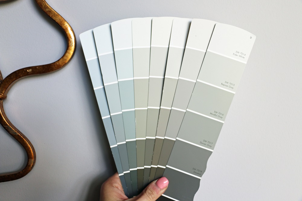
Choosing paint color very well may be the number one reason you need a designer, decorator or a second opinion. If there was one thing I would suggest you hire a designer for, it would be in choosing the right color. Just like every good work of art needs a good canvas, your home needs the perfect canvas as well. The problem is that every canvas is different. Confused yet? I promise I am trying to explain more than I am trying to confuse. Point in case is the assortment of greys in just one paint deck…
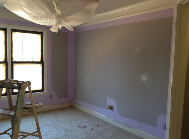
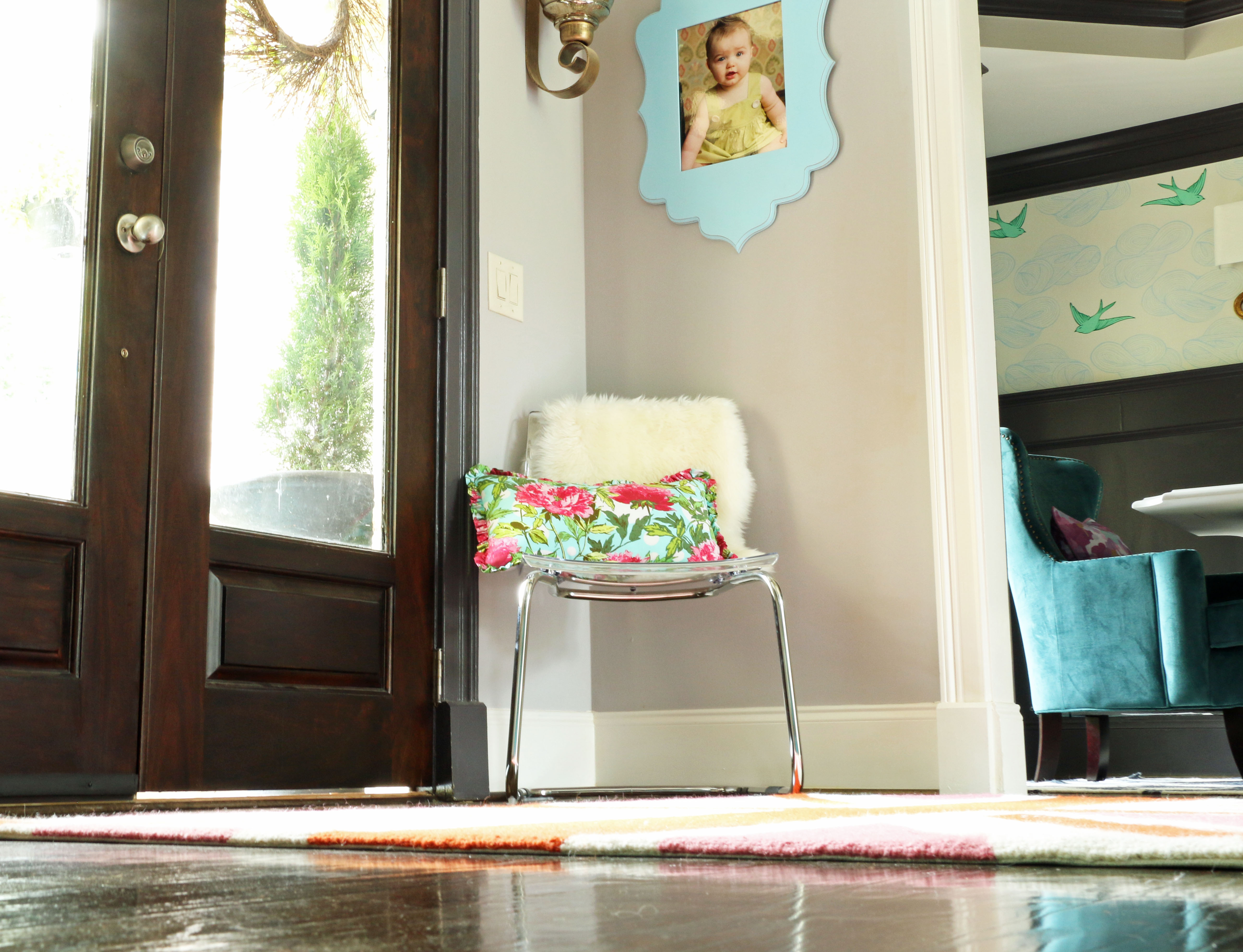
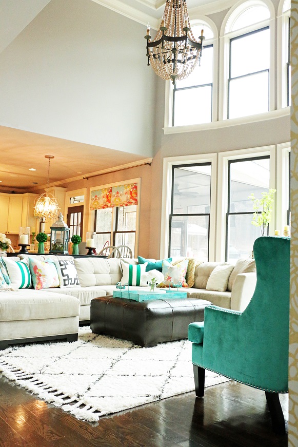
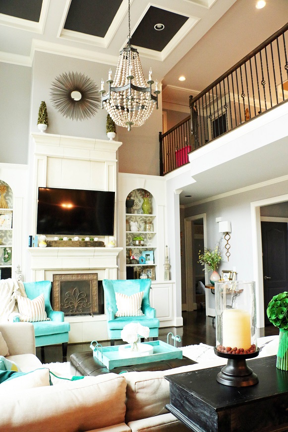
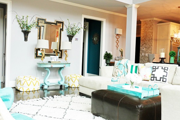
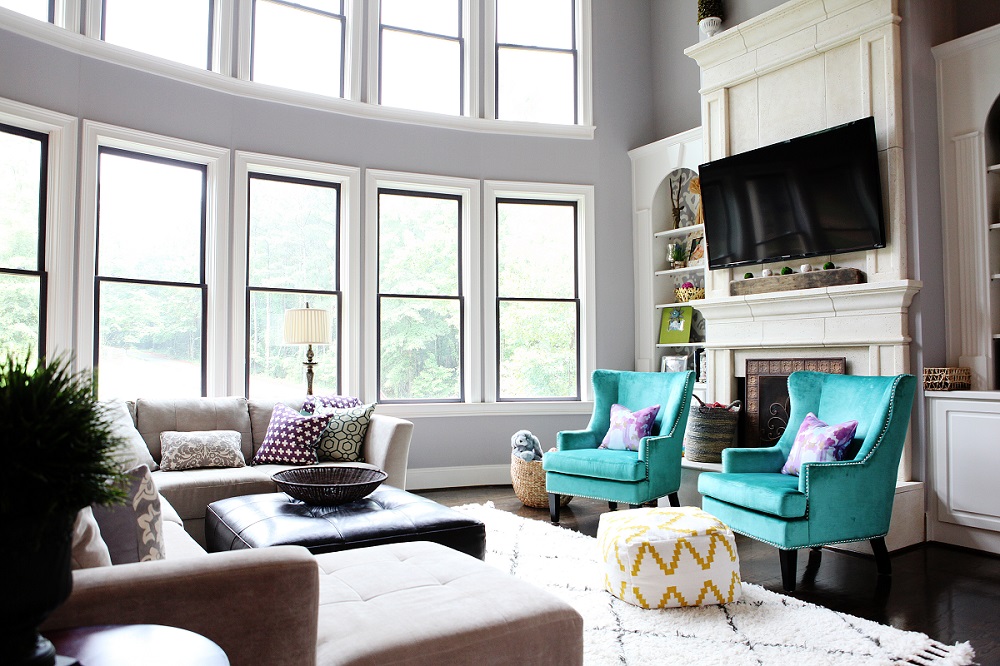
Ponder is a beautiful grey, yes. I am obsessed with it actually. However, it has violet undertones that may not work in every interior. I thought long and hard about our wall color because it extends into every main living area. Like I said before, Ponder has violet undertones which makes it a cool neutral. When we purchased our home and started renovations, the paint was one of the first projects we tackled. At the time, our home was empty. The floors were the original “orange-ish” oak color and the lighting fixtures were oil rubbed bronze which has a red undertone. Once the paint went up, I got a phone call. “Umm babe, are our walls purple?” I am not going to lie, I had a slight freak out moment. They really looked lilac. I thought I had just painted our entire home purple. Crap. I stuck with it though, trusted my instinct, and kept moving right along. Once everything was complete, the wall color is perfection.
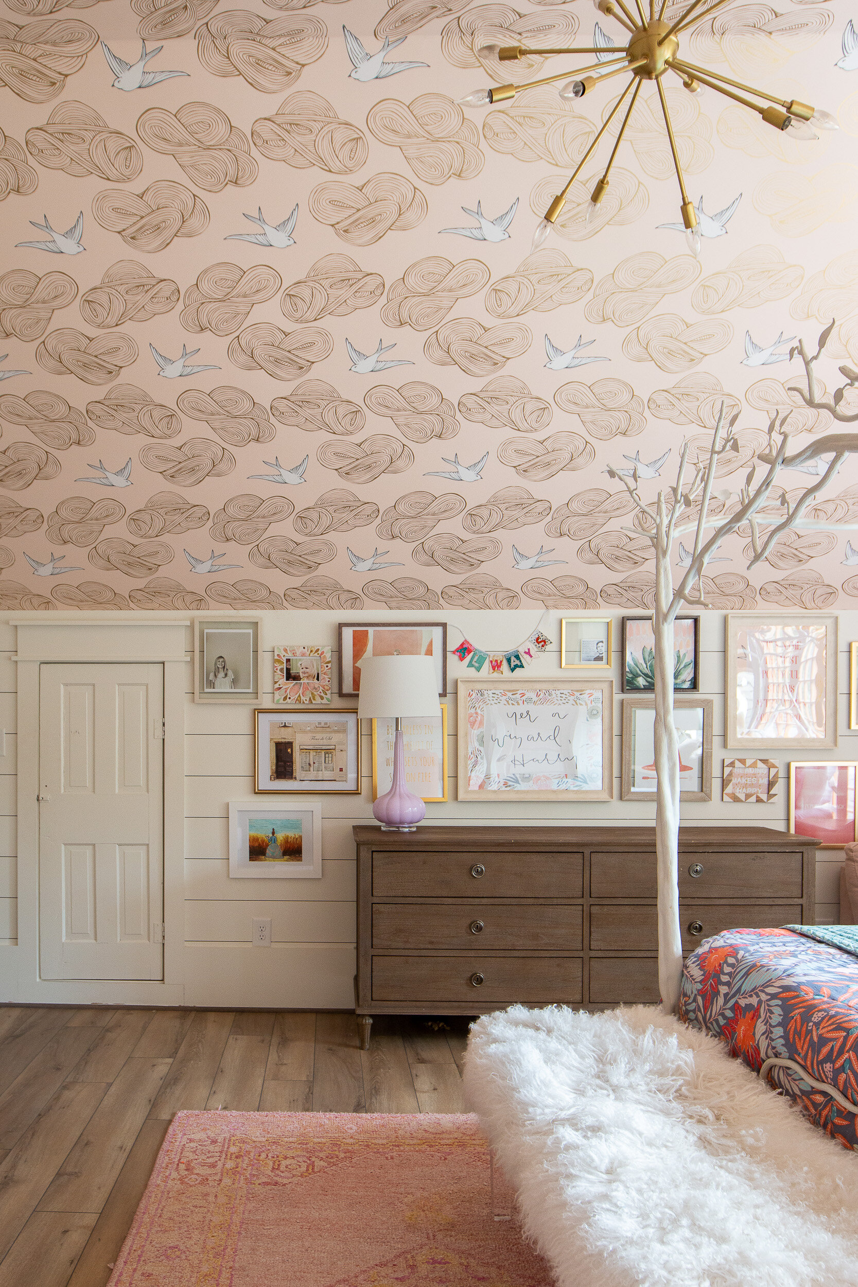
I remember sending this picture to my husband of our daughter’s room being painted purple after they’d sprayed every room with a primer of Ponder to prove to him that the grey wasn’t actually purple…
So, why does this work in my home?
1. I primarily decorate with cool colors. Teal, blue, green, are all cool colors and I use a lot of those colors in my home.
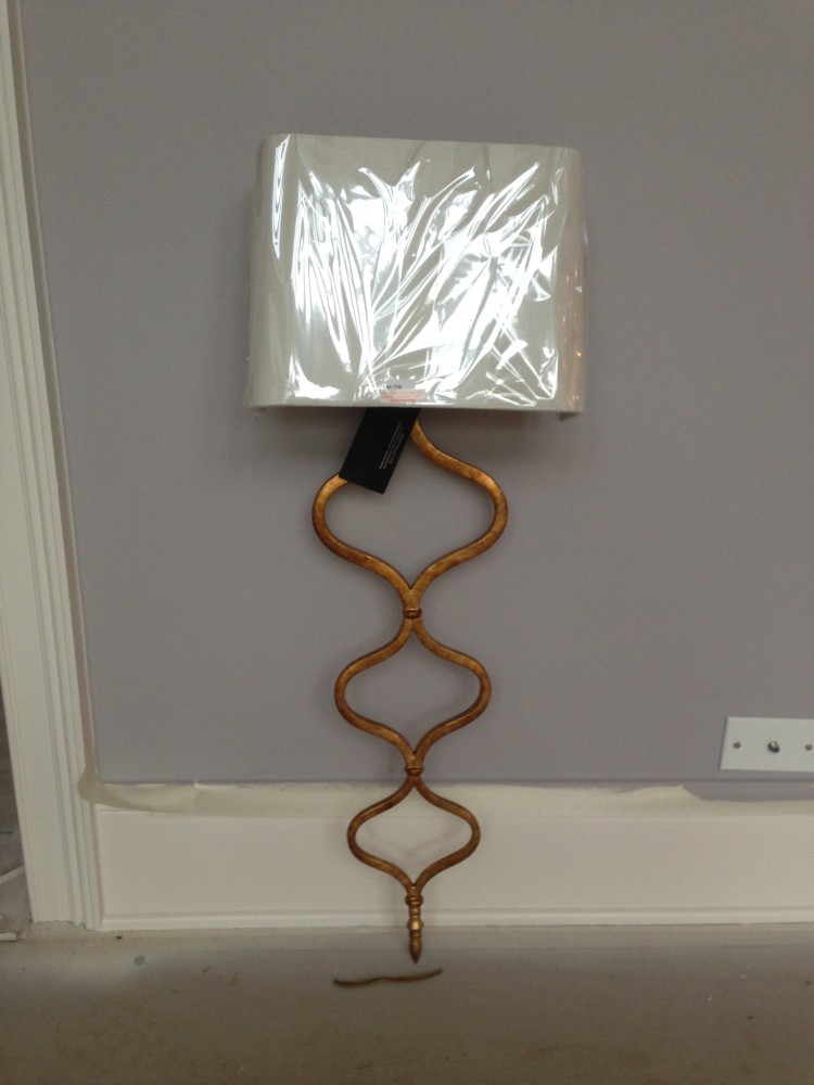
2. I love gold. I adore gold lighting and most all of the fixtures in our home are gold. Gold has a yellow undertone. Purple and yellow are complimentary colors therefore they look splendid together.
3. Our re-stained hardwoods are super dark and no longer have the orange tint which accentuated the violet in the wall color.
4. We have a LOT of natural light. Natural light will show a color in it’s purest form whereas incandescent and fluorescent lights can give off different warm and cool tones changing the look of the color.
So maybe you’ve decided that Ponder will not actually work in your home. What next? I will be putting together a comprehensive list of MY suggestions of beautiful greys that work with every style and color scheme so stay tuned!
SHOP OUR LIVING ROOM:
XOXO, Brittany Hayes
+ view the comments
