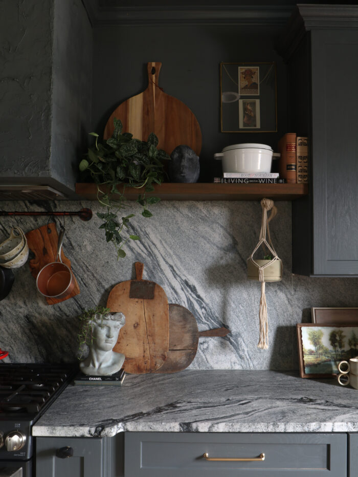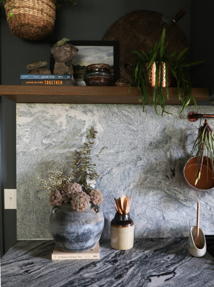
A little while back, I finally got around to hanging shelves in my kitchen. This project had been sitting on the back burner for quite a while because I was struggling to figure out how to get the finish that I wanted. The tone of the wood was super red, and every sample I tried out just wasn’t cutting it.
Back when I was renovating the house, my dad brought over the most beautiful piece of lumber from a job site. The client was about to toss it so he snagged it and dropped it in my driveway. I planned on cutting it down and using it for beams, but when the time came to install, I decided to add few extras and there wasn’t enough material. I held on to it for floating shelves and had our local wood shop had it cut it down for me. Come to find out, I had a $2000 piece of mahogany sitting in my driveway all of that time.
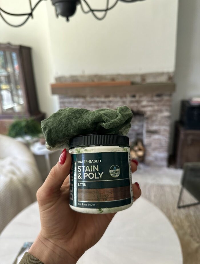
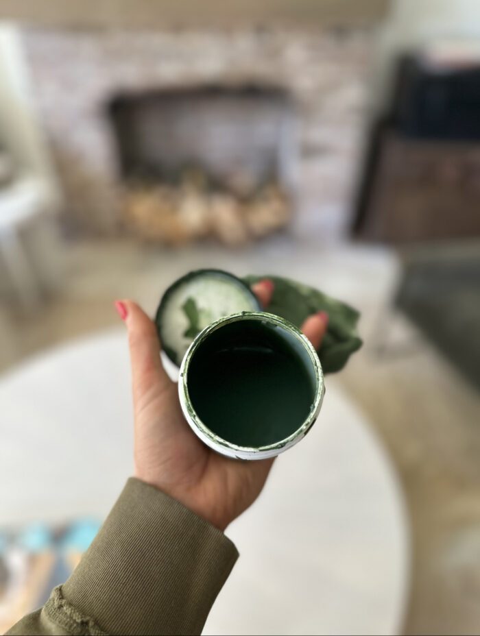
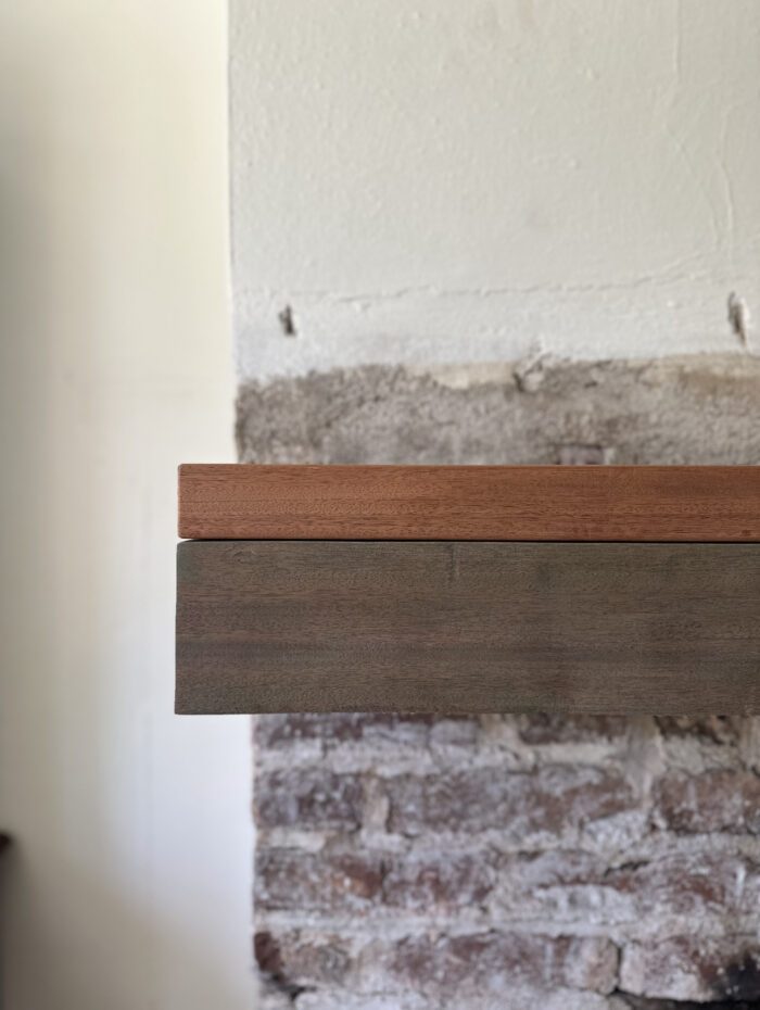
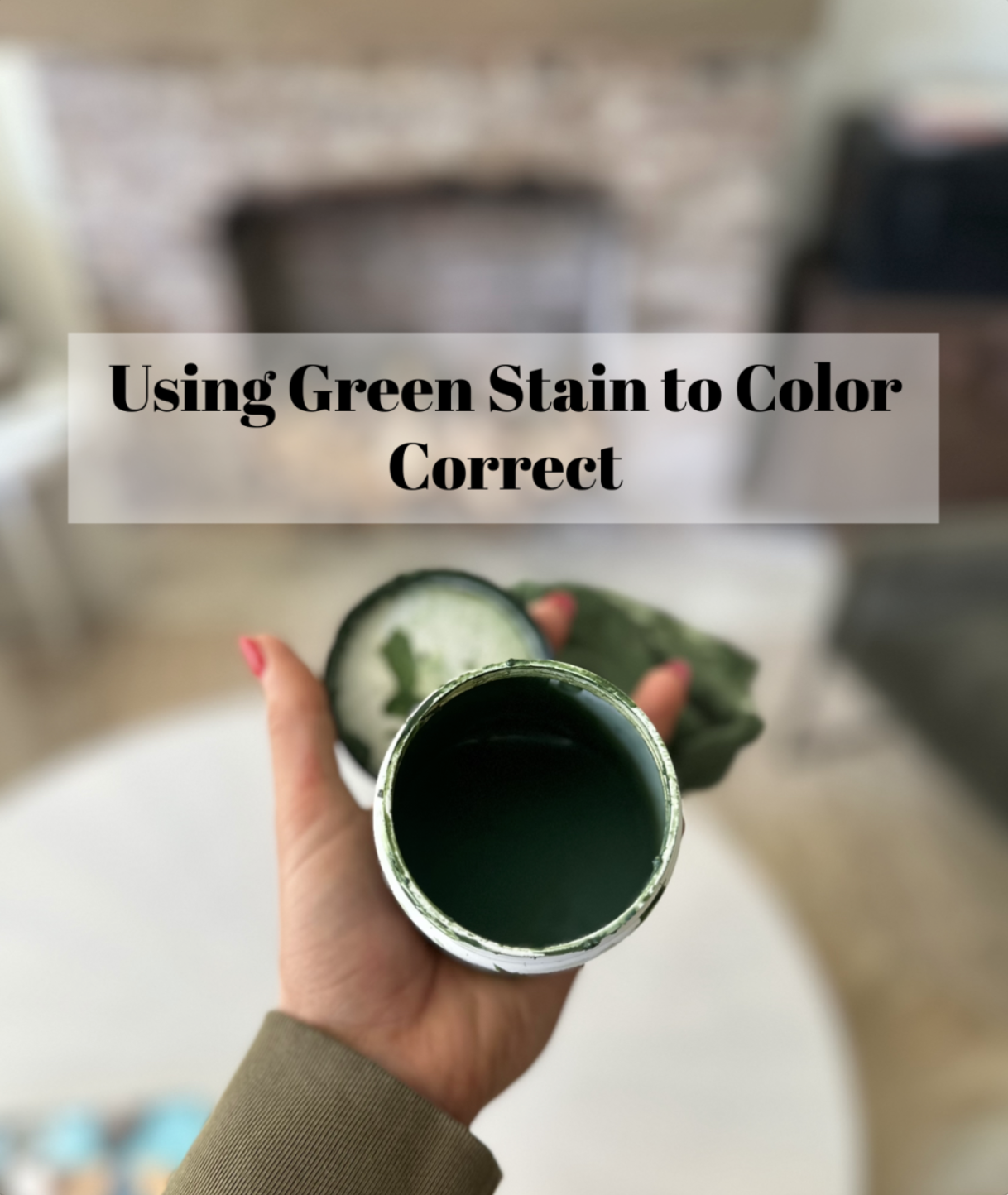
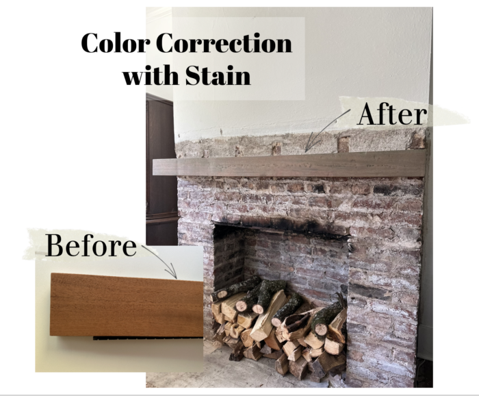
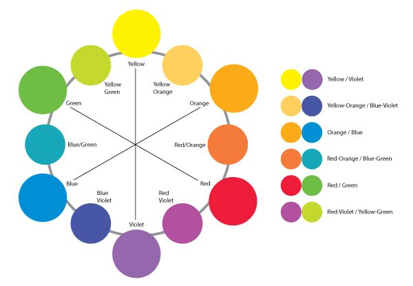
Once they were sanded down, the wood finished beautifully, but I still wasn’t crazy about the red undertones. It clashed with everything I had going on in the kitchen and I wanted some thing a little bit more neutral. So, I tapped into my color theory lessons from ninth grade art and started testing out different stains. I can’t promise that this exact stain will work on any red toned wood, however, it’s a great place to start if you have some pieces to refinish. The biggest thing when neutralizing color is to utilize its complementary color to cut it. In this case, green is the complementary color of red, so I grabbed a GREEN stain and sure enough, it completely neutralized the red. Depending on what look you want, I always recommend mixing stains to achieve your ultimate vision, but starting with some thing that can neutralize you undertone gives you a clean slate to start with.
Complementary Colors on the Color Wheel:
The Stain That I Used:
Some of the other common wood undertones that we see are yellow and orange. Lots of oak and pine will finish in this range if you only use a clear finishing coat. My recommendation is to start with a stain that will cut the color you are trying to neutralize, and then add some others to the mix… depending on what finish you are trying to achieve. For instance, the floors in my house were original yellow oak, and they pulled a little bit warmer than what I was hoping for. We started with a classic grey stain which helped to neutralize and from there, I added back a little bit of the brown and a little bit of a white wash until the sample had a good balance.
Common wood species you might run into:
White Oak
You can probably tell by the name, but this material is going to be a more neutral option. Most stains will take very well, and it’s not as much of a guessing game here.
Birch
This is going to be one of the easiest materials to stain. It is a very neutral wood, and for the most part, it will stain as described by your selection. It does have a tendency to pull a little bit pink in its undertone but it normally isn’t super strong.
Pine
This is definitely one of the more yellow materials. This is a wood type that definitely requires a stain with less orange/brown and more gray/white in order to neutralize it. Unless you love the warmth… in that case, this is the material for you!
Maple
This material stains really beautifully and even with a clear coat, the tones are gorgeous. It is going to be a little bit subtly pink/golden compared to some of the other neutral wood species . Chances are, if you’re going with a maple, you’re probably not looking to find a finish that manipulates the natural color.
There are a million different scenarios, but these are among some of the more common that you might see. As always, these “rules” are not a one size fits all, which is why I recommend sampling, sampling, and then sampling some more. But I hopefully this will be a good starting point!
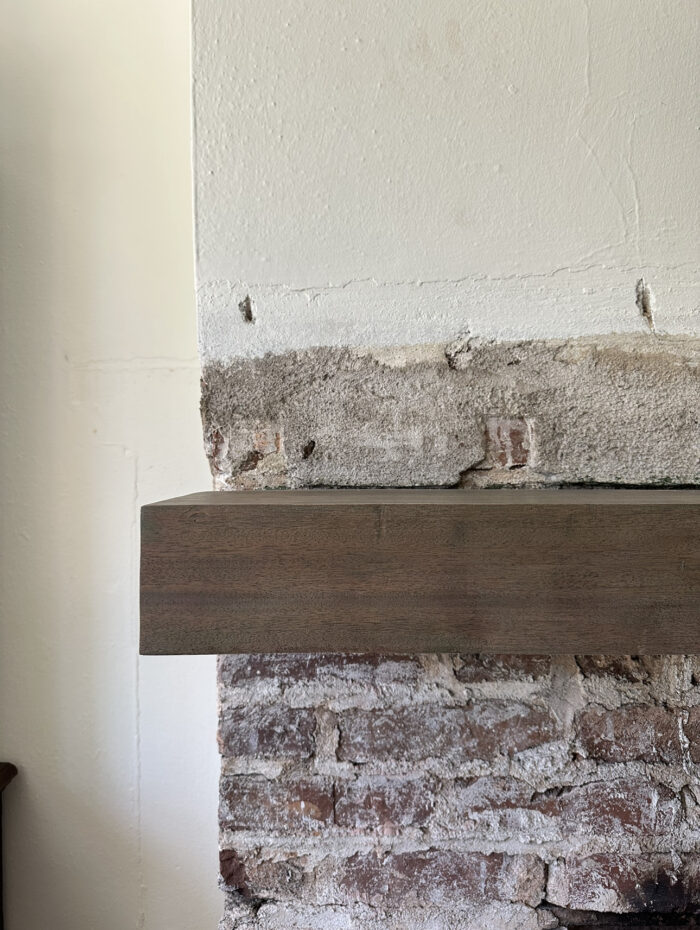
Mantle Before and After:
Kitchen Shelving Finished:
As always, if you have questions always feel free to reach out! Hope you guys have a wonderful hump day!
XO,
Ab
+ view the comments
