Hallway Lanterns / Mural / Cabinet Pulls / Accessories / Pendants
Hi friends! I’ve got my laptop in my lap writing this post and John has his in his writing an arched doorway tutorial! Never did I ever think when John and I started dating almost five years ago now that one day we’d be doing this blog/renovation/design thing as one. I dreamed of it but never actually thought it would happen!
Two weeks ago now I started a series right here on the blog John named Wonderland Workshop! Wonderland Workshop is a peek inside the design ramblings in my head where I have put together design rules and thoughts and ideas over the years that have led to my colorful, pattern filled style. On my first post you can READ HERE I kicked things off chatting about how I work my way through creating a colorful home that still overall feels colorfully COHESIVE.
In that first post I shared how I typically choose a color (or two) and pepper it throughout a home. In my design mind, if that color works with the unique designs of each individual room, that color will bring the home together cohesively. Today I am using our historic renovation home to share another example of this as well as a little expansion on the idea…
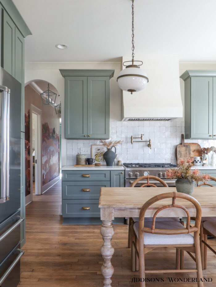
First up, THE COLOR! For this home I chose Pigeon by Farrow & Ball…
All Appliances
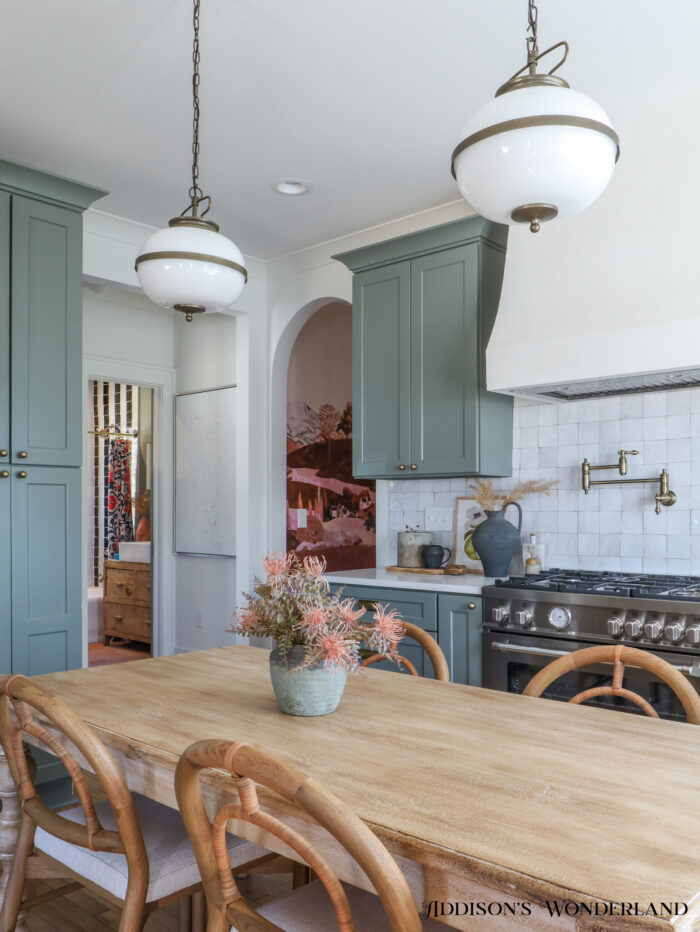
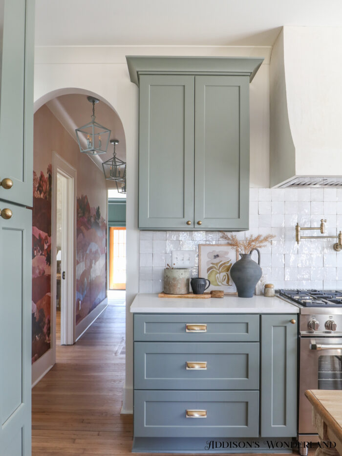
With this paint color, we actually only used the exact paint color three times in the home but this same-ish color can be seen in the hallway wallpaper and then with a much darker, coordinating green in the family room at the end of the hallway. This home is much smaller than ours so too much repetition wasn’t needed but even just in these initial front rooms, sprinkle of this beautiful gray-green creates such a pretty palette. Here’s a viewpoint where you can see the kitchen cabinets in this color, the pops of green in the wallpaper and Pigeon as a wall color in the hall bathroom…
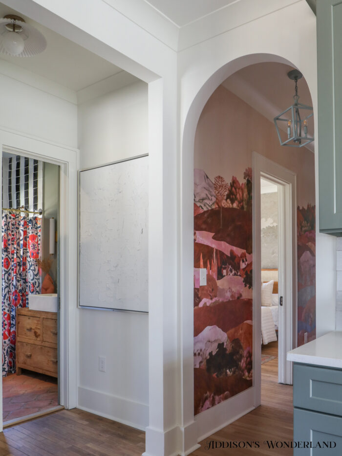
Shower Curtain / Bathroom Sink / Black & White Shower Tile / Decor
And once again in the end of the hallway nook that will be the laundry room…
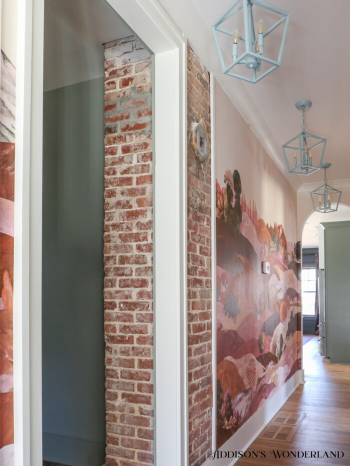
Now let’s take it a step further… I didn’t just use this color a few times throughout the home, I also used Beetle Black by Farrow & Ball twice which also helps carry a little color cohesion throughout the space. I always feels like the repetition lets you introduce new accent colors in each room without making things feel too crazy. The front living room right inside the front door is this color…
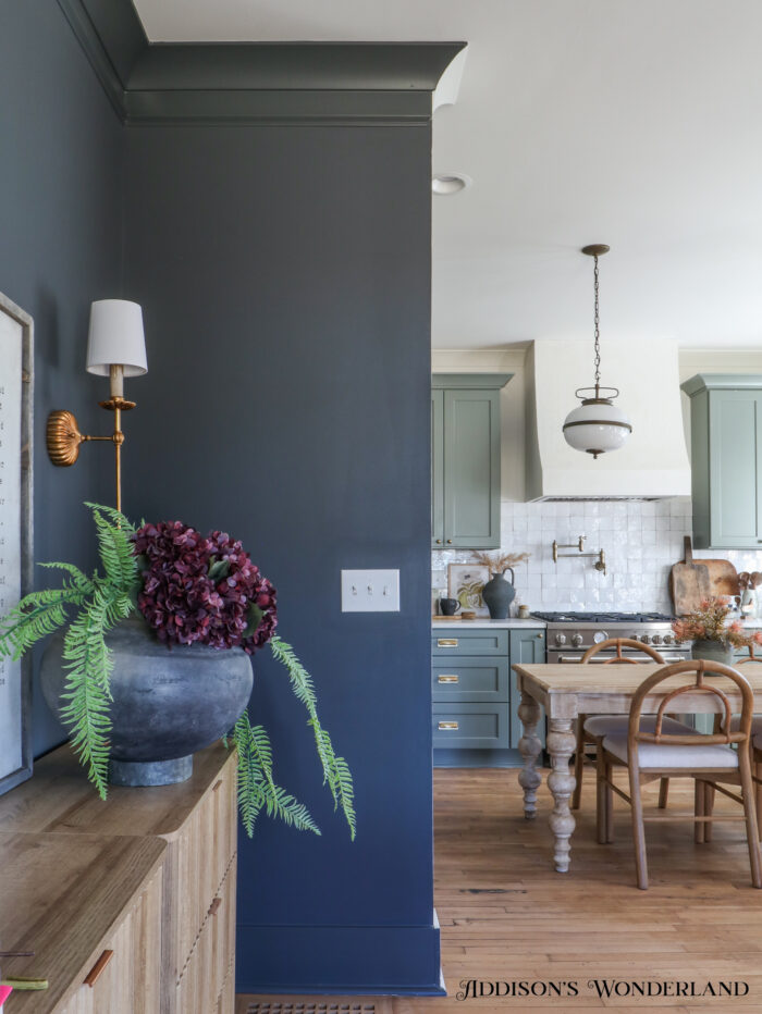
Sconce / Fluted Dressers / Vessel & Florals
And here Beetle Black is again right around the corner in one of the bedrooms…
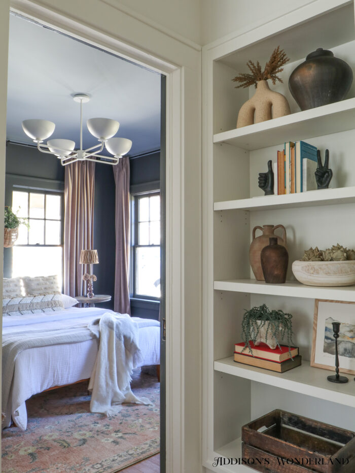
Chandelier / Bedding / Curtains / All Decor
THANKS FOR BEING HERE!
XOXO, Brittany Palazzo
+ view the comments
