Good morning!!! Sitting here sipping my coffee and listening to hour two of Abigail on speaker-phone with my wireless router company trying to fix my internet that is down. AGAIN. It has worked just fine these two months when I didn’t really “need” internet and now that I have a million and one things to do work-wise… it’s down. So, I am currently streaming from John’s iPad which somehow disconnects itself about every six minutes. Meaning I have to re-type at least three sentences about every six minutes as well. Happy Wednesday! LOL.
Today I am sharing my second full room reveal inside #winnieswoodsywonderland and it just might be one of my personal FAVES. I absolutely LOVE creating girlie spaces and adding a little tiny bit of a rustic touch in this one for those cabin-y mountain vibes made it a little extra fun this time around. If you’ve been following me forever and a day you know that girlie bedrooms are where Addison’s Wonderland all began so it’ll forever be my favorite kinds of room designs.
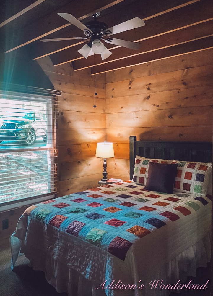
For this cozy little cabin bedroom, I knew my two main goals were to have a fun, colorful, girlie space with a little touch of rustic and for it to comfortably sleep both of my girls. Preferably without them kicking one another off the side of the bed. Hence the decision for TWO TWIN BEDS! LOL. They shared one queen bed during most of the two months of renovations… the original one in the “before” picture… and let’s just say I figured out very quickly that they’re way too old and way too opposite to be sharing a bed.
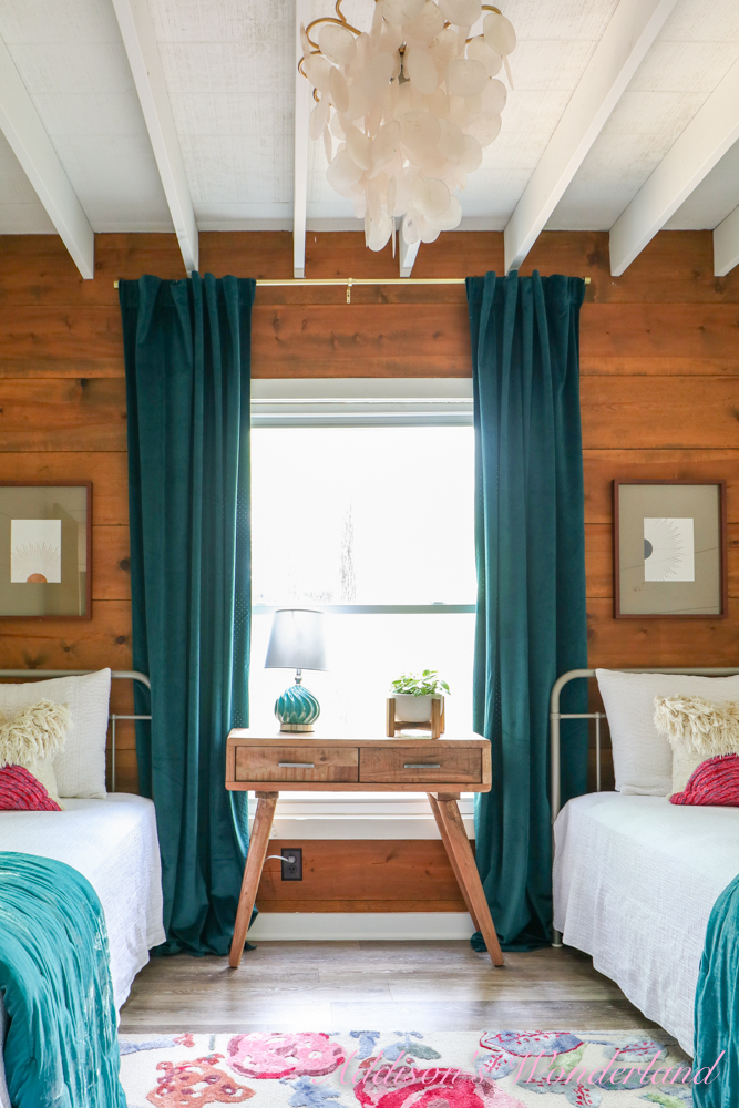
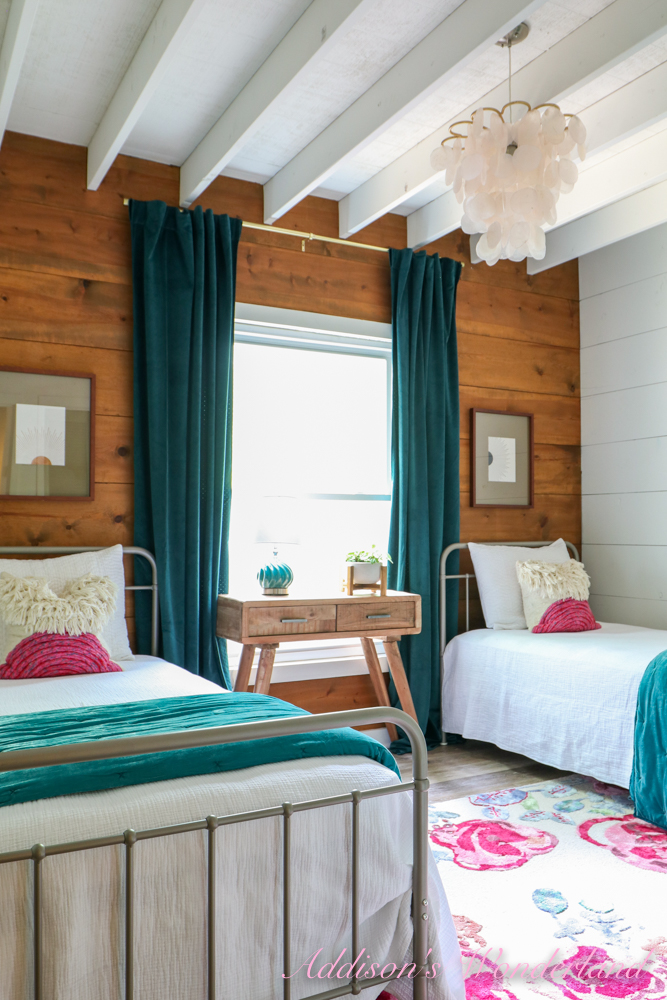
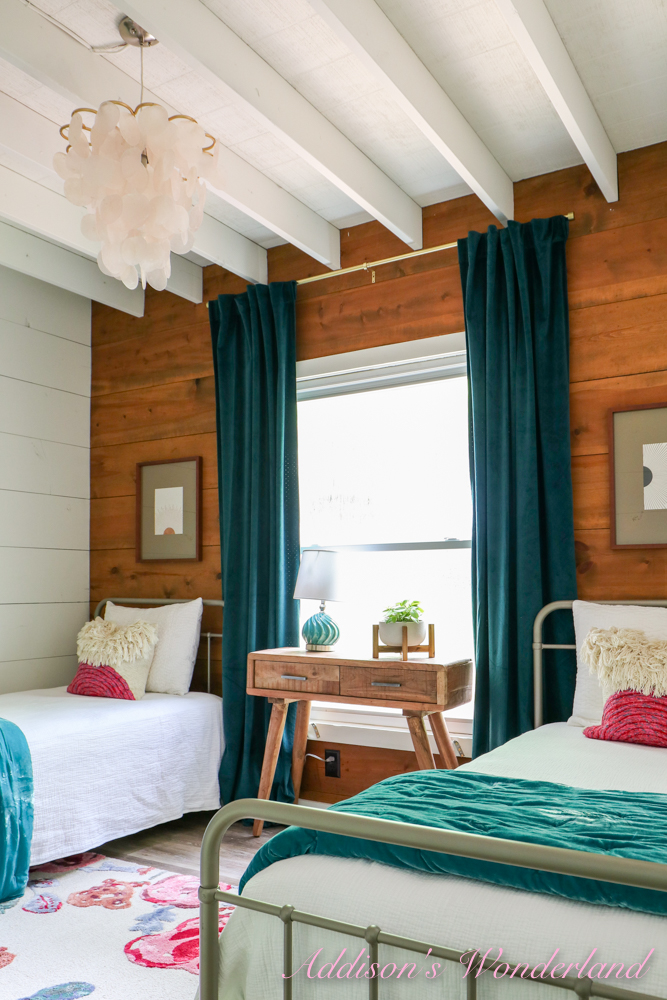
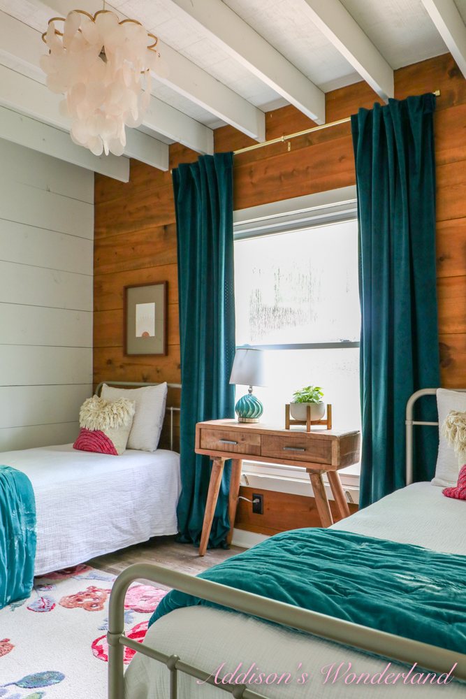
The very first big design decision I made in the space was to have it all painted white (SW Pure White) except the back window wall which measured out to fit two twin beds just perfectly! I chose to keep that wall the original wood color for that rustic touch I was wanting. In our last cabin, all of the wood was soooo orange but in this one, it was a really beautiful tone that I wanted to keep and showcase in several rooms. For the two twin beds, I chose these beautiful Florence Metal Platform Twin Beds. I LOVE the light warm gray color and the simple yet elegant spindle details. They pop against the white side walls and the back wood wall without standing out too too much. I had thought about doing white or black but both colors just seemed like they’d be too visually busy.
With the paint color and beds chosen, I then set out to find some color and pattern for that signature AW look. I first found this gorgeous floral rug at the Anthro outlet that was the PERFECT pop of color and pattern. And it was a STEAL too! I loved that it was super girlie and colorful and would make such a statement in the space. It then became my inspiration for everything else I chose!
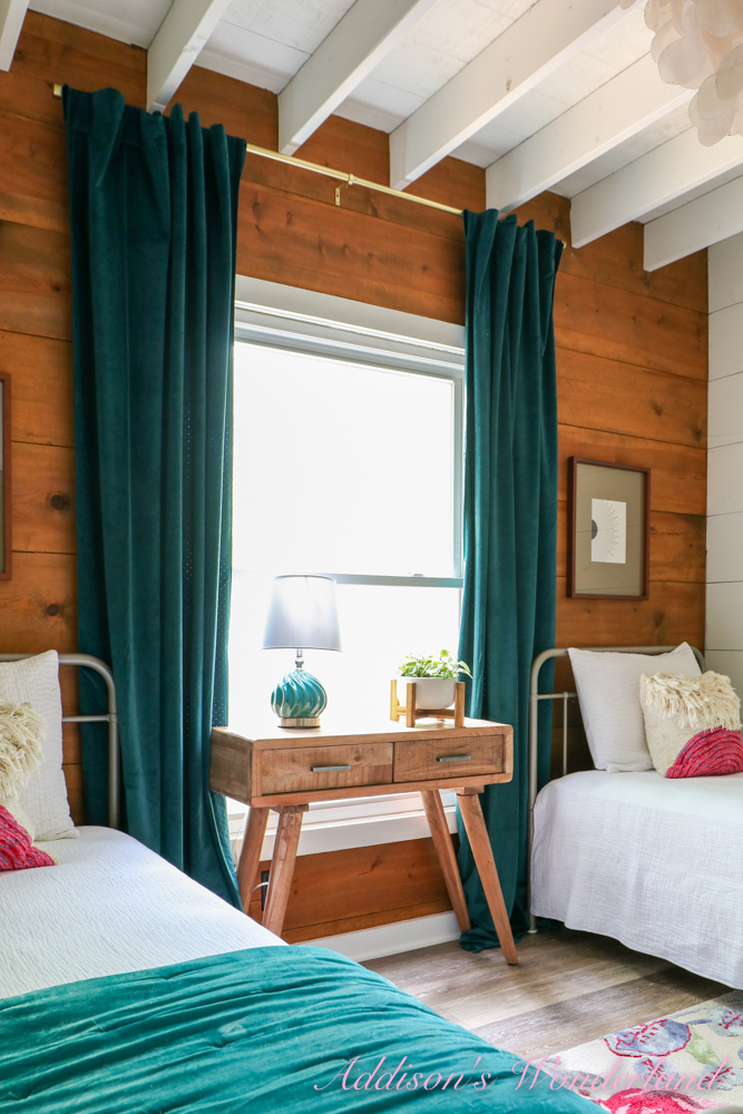
Next, I found these White Stonewashed Organic Cotton Quilt & Shams from Garnet Hill that would be a fresh, clean look against the walls and for any extra layered pillows and bedding with color. The quilts are sooooo soft and such a great lightweight selection for bedding. I then chose these teal velvet quilts and curtains to compliment the rug and POP against the white bedding. It also helped bring the teal accents in the kitchen, breakfast/dining space and living room further into the cabin. Last was a few HomeGoods finds including this cute little desk and lamp and this Capiz chandelier Abigail found on clearance at World Market. Here is a peek at the completed space!
BEFORE…
TODAY!


XOXO, Brittany Hayes
+ view the comments

