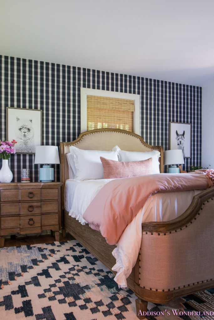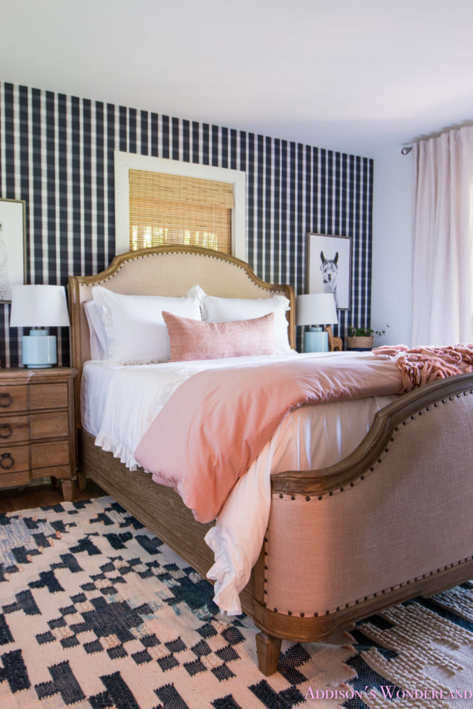
Another day and guess what??? Another cabin room reveal! I told you guys I would be pumping them out fast! I have to share a little secret… this one just might be one of my faves. Eeeeeek!!! Every time I tackle a new design project, I try and reinvent my own design wheel. The idea of creating the same look twice bores me to tears and I sometimes find myself not even wanting to use the same paint color twice! This time around with our cabin, I really really wanted to expand my portfolio and create something super unique to me and my aesthetic but still keeping with my “look”. Lots of color and pattern and unexpected touches.
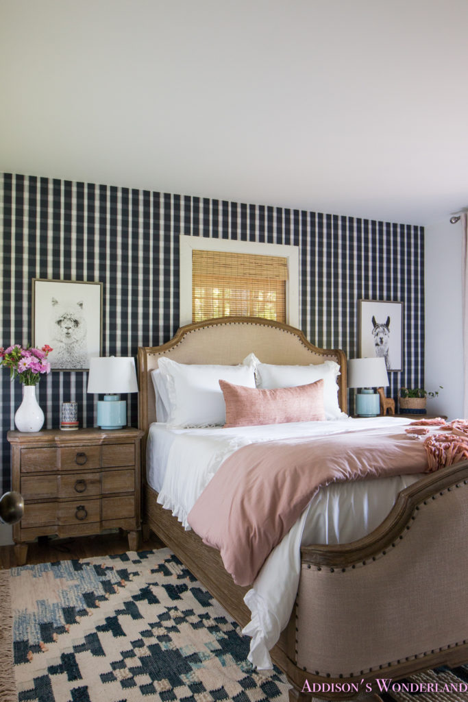
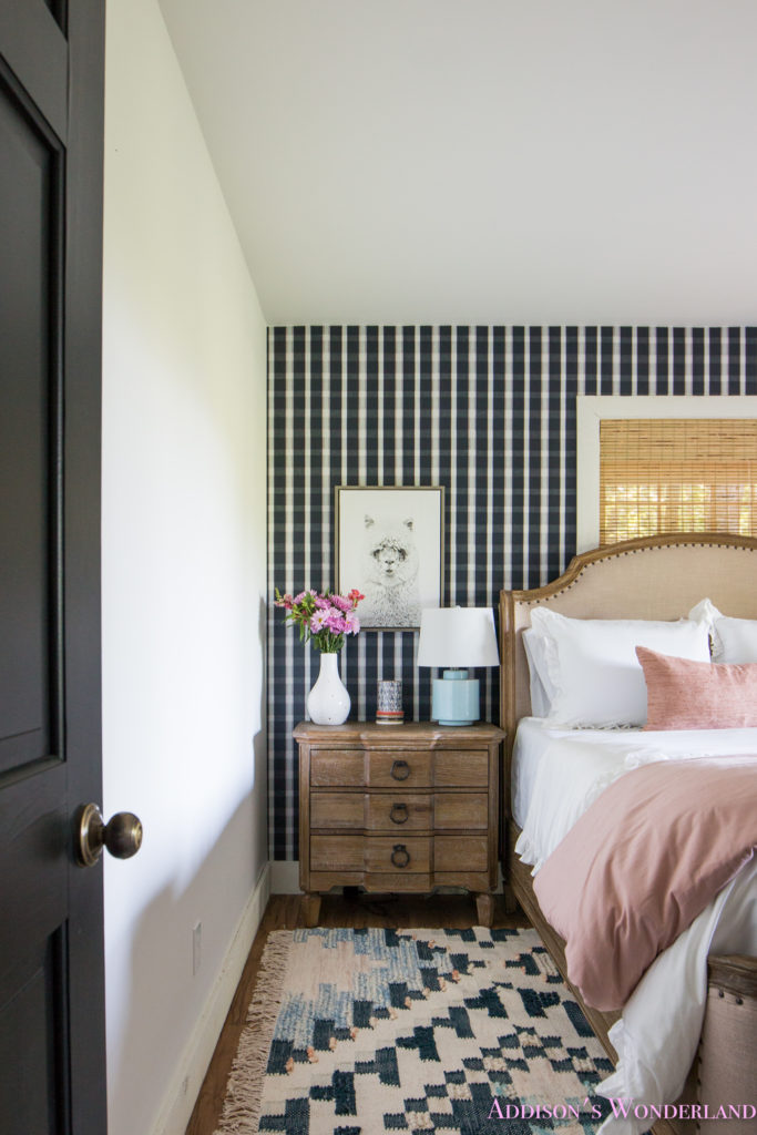
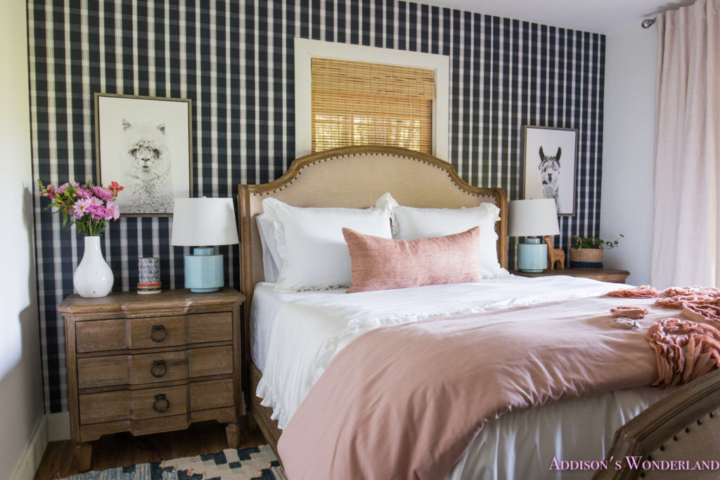
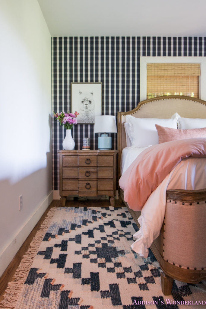
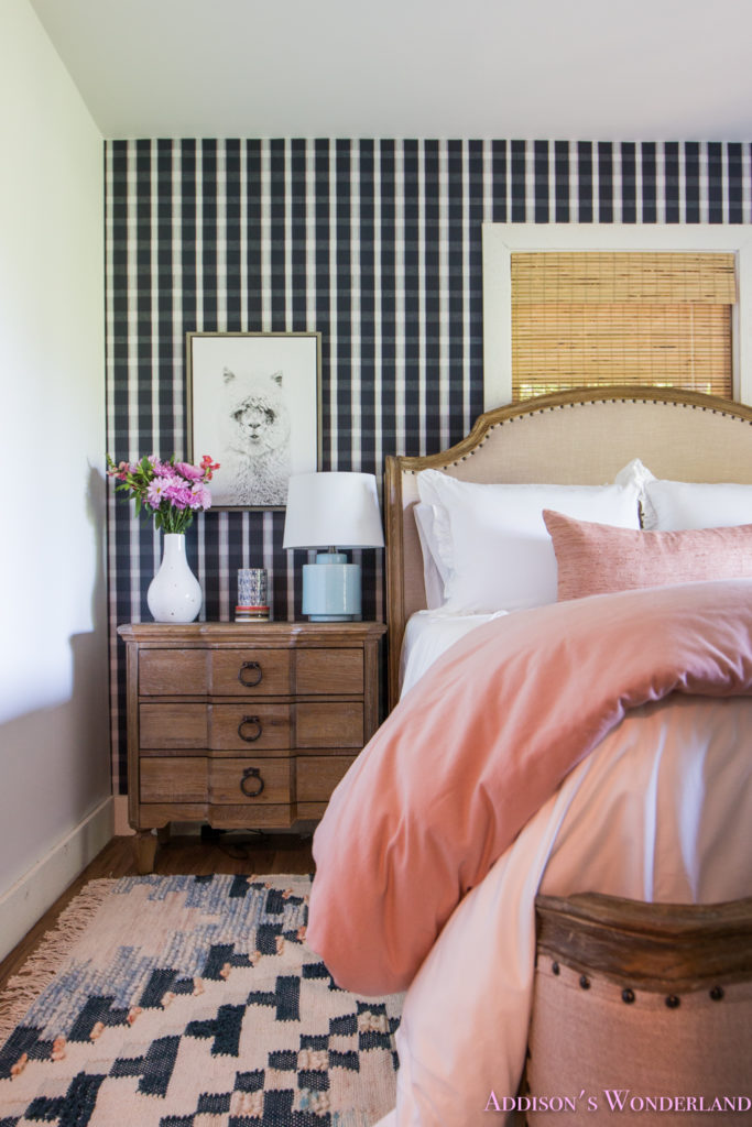
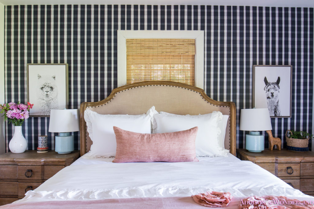
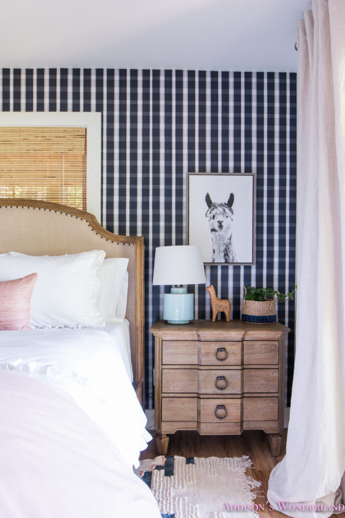
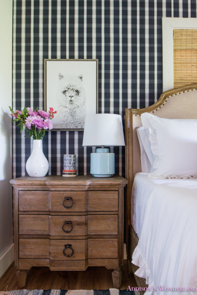
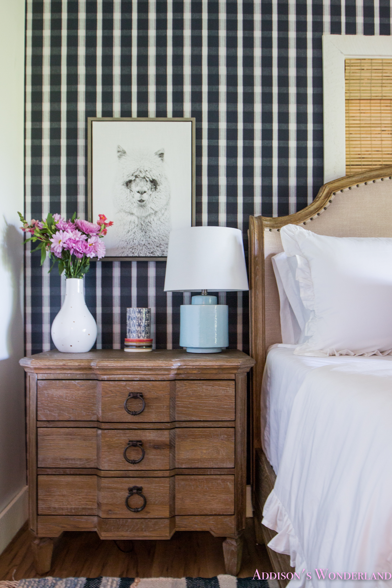
It all started with the wallpaper! I found this amazing plaid print from Milton & King and as I shared in my living room reveal, I decided to take the plaid plunge thanks to some mega inspiration from my plaid loving designer friend Brian Patrick Flynn. It’s their Monarch Wallpaper and I am OBSESSED! Once that was chosen, I then pondered if I wanted this room to be pretty classic and neutral or take the fun route and infuse some mega pattern. So ya know… I did what I normally do and I went for the pattern! I found this kilim inspired aztec rug and fell in LOVE with the blue on blue punch of pattern!
With the wallpaper and rug all set, it was time to shop for furnishings! One thing that I really love doing when I am designing a project is to play with mixing up styles. I love to layer traditional with modern with preppy with hip. Since the wallpaper has that super country/preppy vibe and the rug is very aztec chic, I wanted to go super classic and traditional with the furniture and bedding. I truly feel like mixing up styles in this way really keeps a room from looking “store bought” or “gimicky”. The very last thing I ever want in creating a space is for it to look “themed”. Ugh. I cannot even handle that word! LOL!
Let me interrupt this post for a quick for a quick ShopBop SALE Reminder…
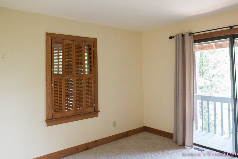
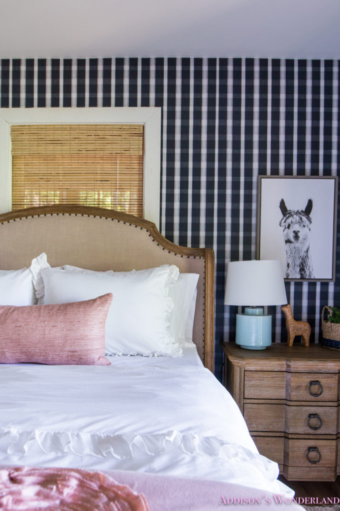
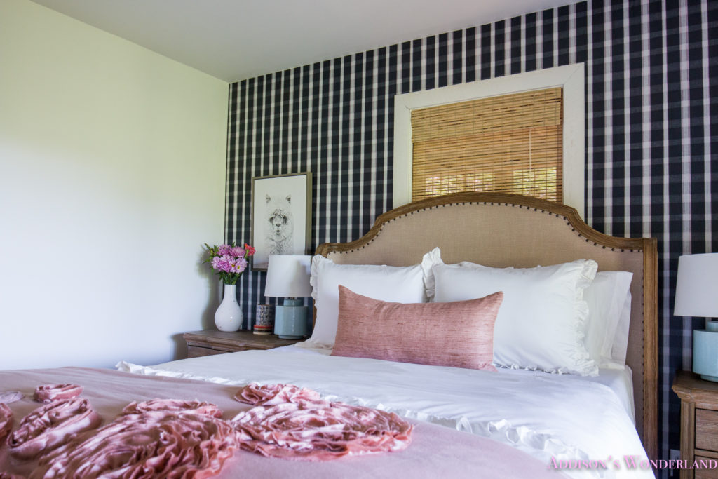
I can honestly say that I have shopped at American Signature Furniture for years and years and years now. I literally think that half of our very first home way back in 2003 came from our local American Signature Furniture store. It honestly didn’t take me long to decide on their Regents Park Queen Bed in Oak and two matching nightstands. I LOVE the vintage style frame and the neutral upholstery really pops against the dark wallpaper. And finally, it was down to bedding! I wanted something classic and traditional once again as well as something fresh and white to pop against the funiture and wallpaper. I found this BEAUTIFUL white bedding from Crane & Canopy. It’s their Vienna Ruffle Bedding in Soft White and it is exactly as it sounds! Bright white and crazy soft! Addison has now claimed this room as her own and is loving sleeping in there every weekend we are there. Here’s a peek at our cabin guest bedroom “BEFORE” and now TODAY!
Our Blue Plaid & Aztec Kilim Bold & Colorful Cabin Guest Bedroom Reveal…
Post contains affiliate links (read my full disclosure).
BEFORE…
TODAY!
ROOM DETAILS…
Walls & Trim & Ceiling- Super White by Benjamin Moore
Flooring- Classico Plank Vinyl in Colori
Window Shade- SHOP IT HERE (Petite Rustic)
Gel Foam Mattress- SHOP IT HERE!
Duvet Cover- Crane & Canopy
Bedroom Furniture (Bed & Nightstands)- American Signature Furniture
Wallpaper- Milton & King
XOXO, Brittany Hayes
+ view the comments
