How to Add a Pop of Color in Your Home!
The phrase “A Pop of Color” is basically my theme song… my life’s motto. I am a true believer that color can set a mood, get those creative juices flowing and even make you happy! It can take a drab space and make it absolutely fabulous with just the right “pop of color”. For some, it comes naturally and for others it’s an absolutely terrifying step in the interior design process. I live, eat, breathe designing with color so I am here today to share the basics on taking that dreaded first step.
First things first, to use color you need to understand color. And to me, the single most important thing to understand about color is simply WARM VS. COOL…
Warm- Think fire… Warm colors are made with red, orange and yellow. The addition of a warm color can literally create warmth in space. Once again, think fire.
Cool- Think ocean… Cool colors are made with blue, green and purple. The addition of a cool color to a space can be calming and soothing. Once again, think about relaxing oceanside.
The tricky part comes when you are choosing a basic wall color… like gray. Is it warm or is it cool? Well it can be either and that’s where it gets tricky. And that’s also where I usually lose people. So hang on…
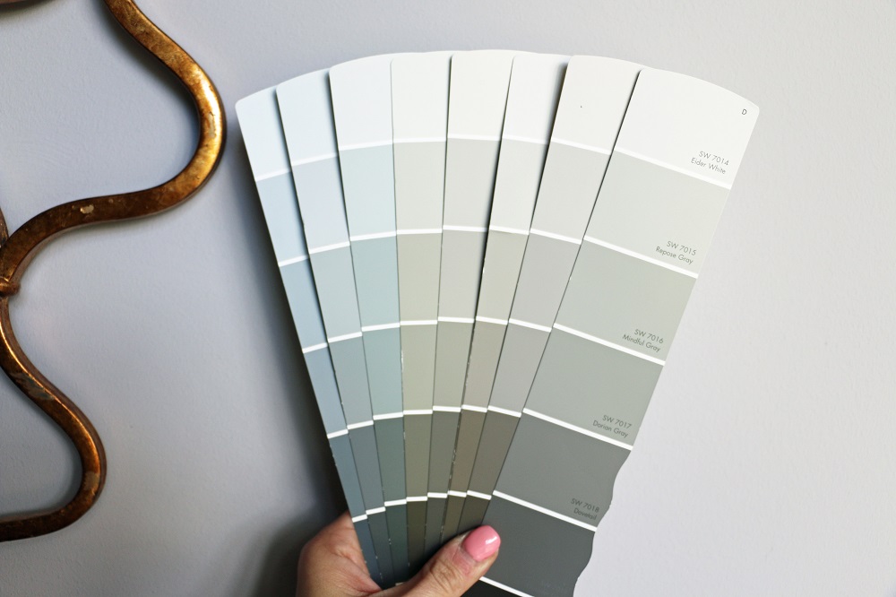
See these grays? Individually they all just look gray. But when you look at them all TOGETHER, you can hopefully start to see the “undertones”…
The undertones are those little drops of color they’ve added to a basic black/white combo to give it that warm or cool undertone. The colors on the far left have cool undertones while those toward the right have warmer undertones. If you want your wall color to “disappear”, choose a color that is the same “color temperature” as the other features in the room (i.e. both warm or both cool). If you want it to stand out, choose a color that is opposite in “color temperature” (i.e. one is warm and one is cool).
Okay so blah blah blah, how do I ADD color to a space? First, decide if you want to tiptoe into the color adding process or if you want to really make it count. If you want to tiptoe, choose colors that are the same color temperature as other features in the space. This will create a harmonious look that does not stand out or seem “busy” to the eye. If you want to truly add a POP of color, choose a color that is opposite in color temperature.
Here are some examples…
Same Color Temperature
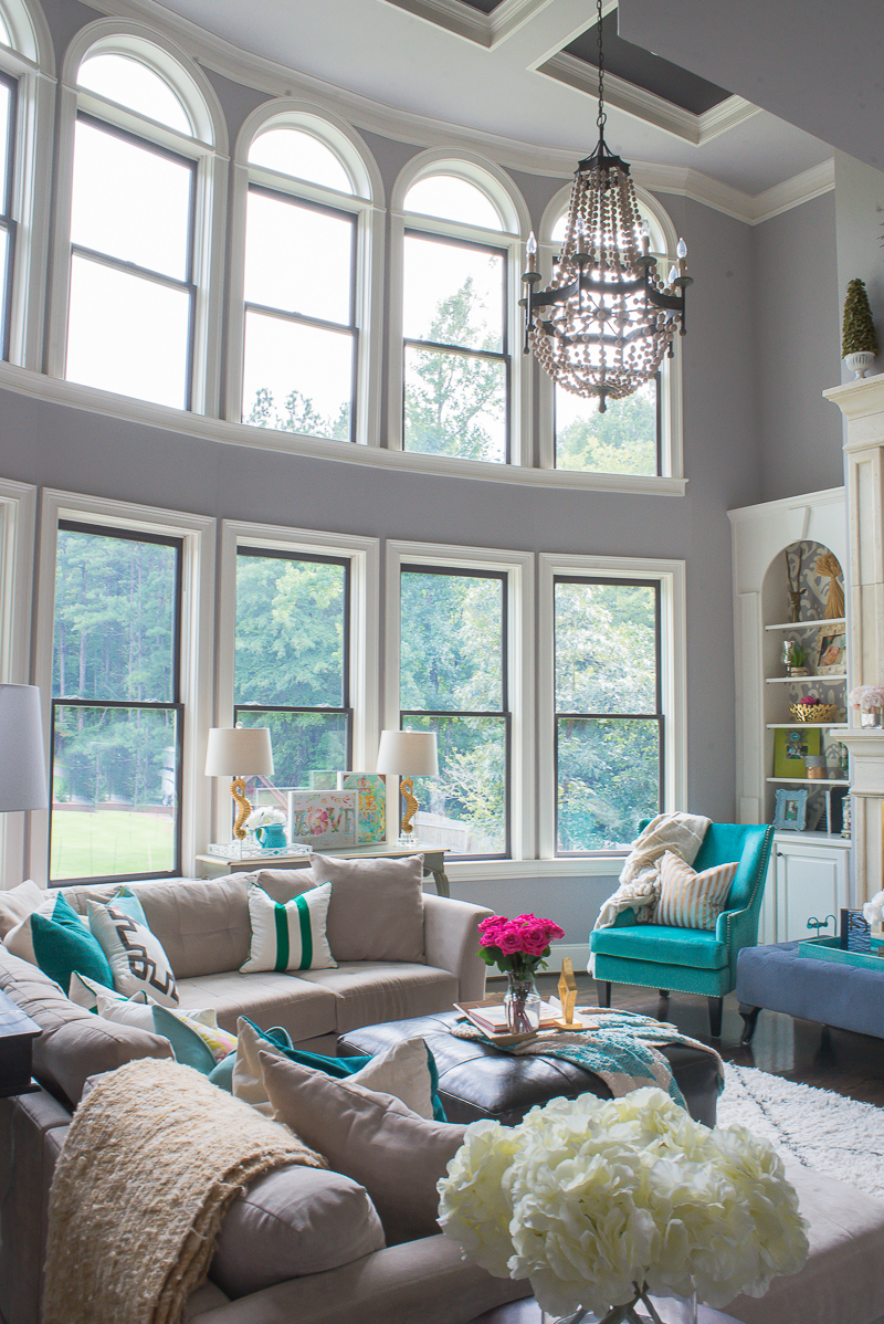
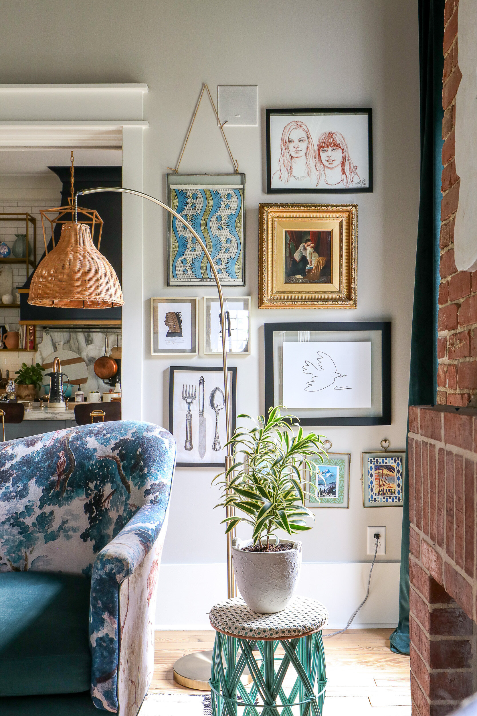
With the exception of the roses (which you can tell POP against the cooler colors), most all of the colors in our living room have COOL undertones. The teal chairs, green pillows and gray walls with a light purple undertone and accessories from HomeGoods all work in harmony to create a calming space…
Scroll to Shop Our Living Room!
Throw Blankets, Gold Striped Pillows & Lamps- HomeGoods
Opposite Color Temperature
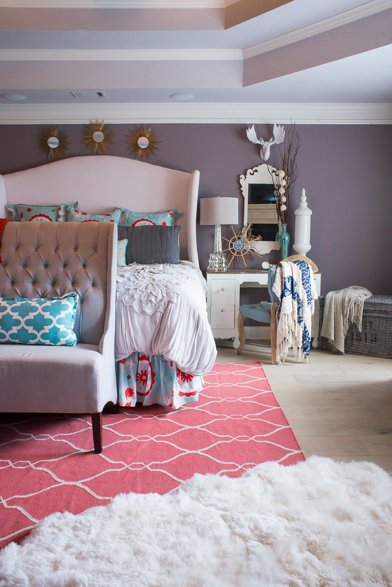
In our master bedroom, the cool walls and blue accessories are offset by a simple pop of deep coral that takes this space from relatively monochromatic to bold and eye catching!
Scroll to Shop Our Master Bedroom!
Gray Bench, Mirror & Throw Blanket- HomeGoods
Okay so now that you’ve learned a little more about color temperature, what are some super easy ways to add a little color and fun to your space?…
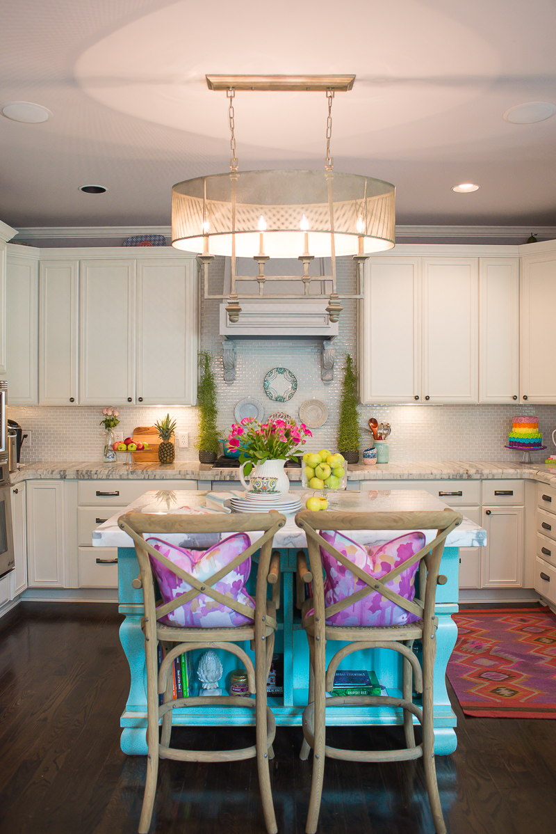
1.Take a neutral space from monochromatic to drool worthy by simply painting a piece of furniture. Whether it’s a kitchen island or a side table, this simple addition can completely change the look of a space…
Scroll to Shop Our Kitchen!
Pitcher, Kitchen Accessories & Topiaries- HomeGoods
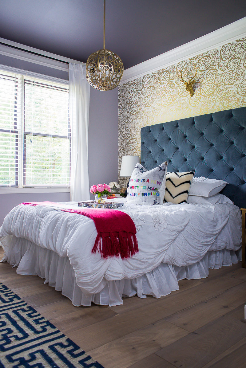
2. Add some fun pillows or throws! If you’re afraid to take a “permanent” plunge, the addition of several cute and colorful pillows or throw blankets will add interest to a neutral space without breaking the bank or making you tied to a new color scheme…
Scroll to Shop Our Guest Bedroom!
Gold Deer Head, Throw Blanket, Tray & Flowers- HomeGoods
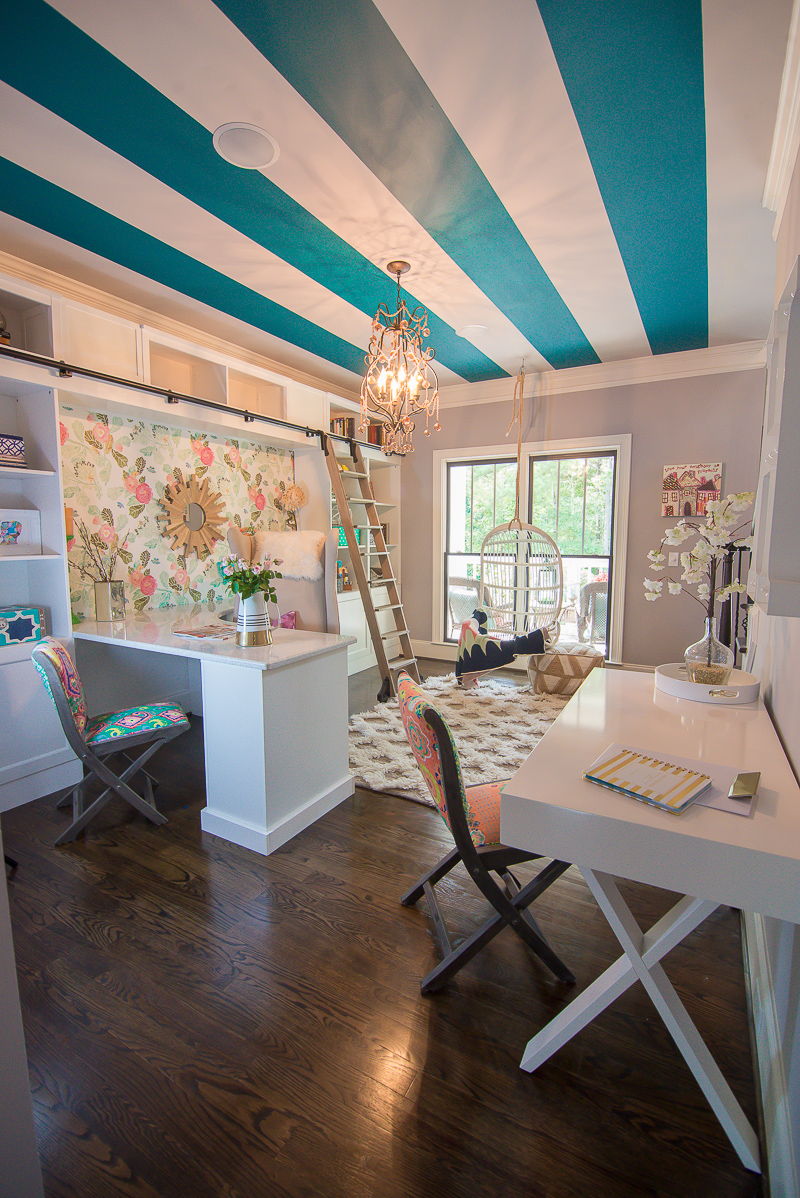
3. Feeling brave? Create a bold focal point by creating an accent wall or ceiling or BOTH! The teal stripes and floral wallpaper take this completely neutral room to the next level for a one of a kind office space…
Scroll to Shop My Office!
Bookcase Accessories & White Tray- HomeGoods
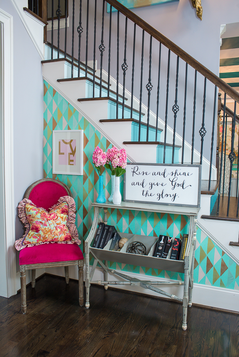
4. Have some fun in a little nook! This small foyer wall got a bold dose of color with a custom stencil feature and a fuchsia side chair that add some fun to the room without committing you to an entire room of color…
Scroll to Shop Our Foyer!
I hope these first steps to understanding color help you to start making your home a fun and inviting space that are a reflection of you, your family and your style.
XOXO, Brittany Hayes
+ view the comments
