“Ponder”-ing your Wall Color?
Re-Post from September 09, 2014:
I’ve decided to get a tattoo. It’ll be across my forehead in bold, black font. It will read as follows…
HOLD ON… I know you’re tempted to close your laptop and run to the paint store but wait just one second. Here’s where things get tricky. My wall color may not be for you. What?!? Yes, just like your lipstick color may look atrocious on me and fabulous on you, the same exact thing goes for paint colors. Let me explain…
Of course I am kidding. I am honestly flattered that every picture I post on instagram gets the same question, “what is your wall color?”. However, I cringe every time I see it. I want to respond but I don’t want everyone to spend thousands of dollars painting their home “Ponder” and then wonder why it looks completely different in their home than it does mine. You see, I LOVE color. I am sure you are well aware of that by now between my bedding work and my personal home but you may not know that I really study color. I am obsessed actually. I feel like that may be my “gift” with the risk of sounding crazy. I studied color in my interior design classes in college and I feel like I have a pretty good eye at seeing undertones, knowing what colors work together and using a whole lot of color in one space. And that is exactly why I want to help you choose the right color for you.
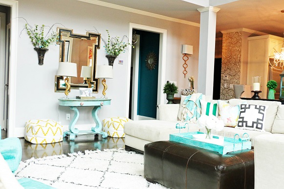
Choosing paint color very well may be the number one reason you need a designer, decorator or a second opinion. If there was one thing I would suggest you hire a designer for, it would be in choosing the right color. Just like every good work of art needs a good canvas, your home needs the perfect canvas as well. The problem is that every canvas is different. Confused yet? I promise I am trying to explain more than I am trying to confuse. Point in case is the assortment of greys in just one paint deck…
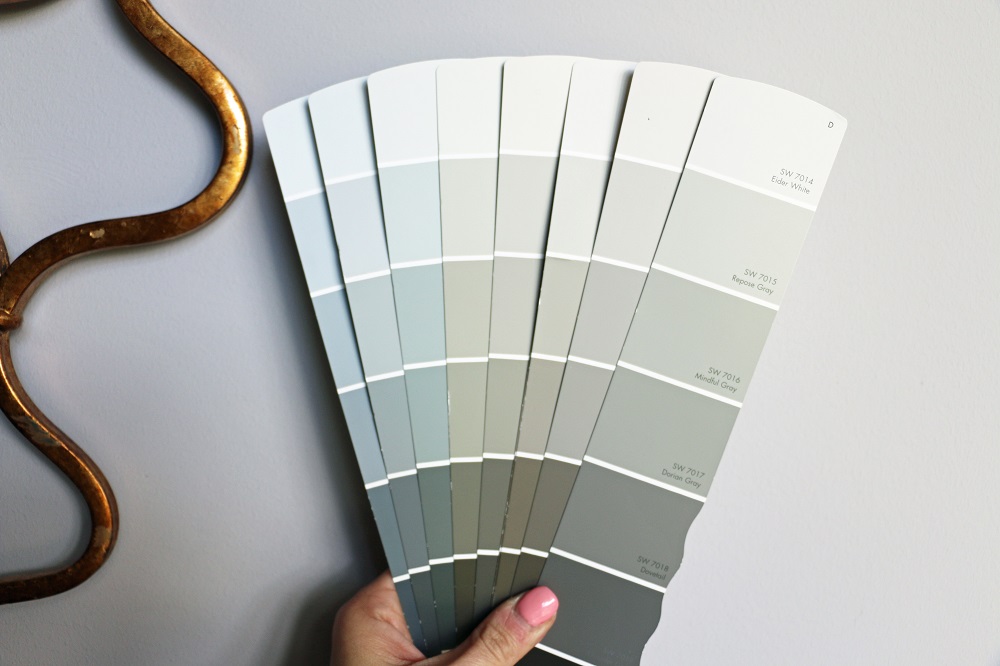
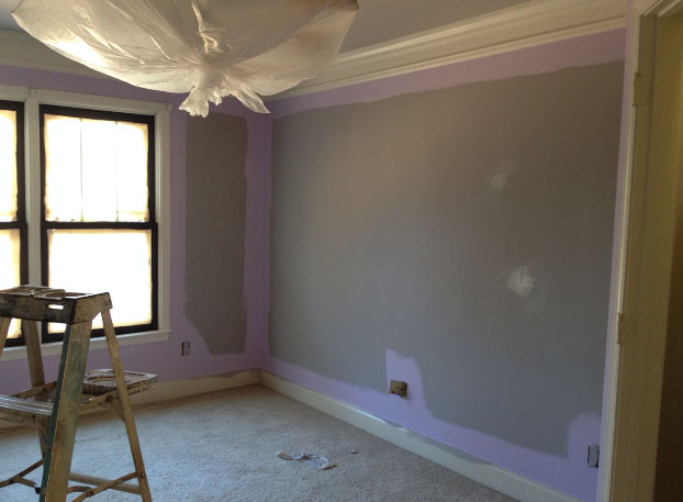
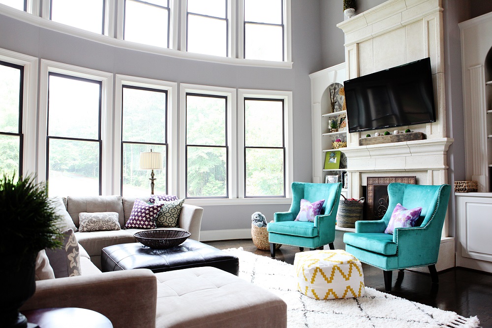
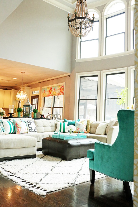
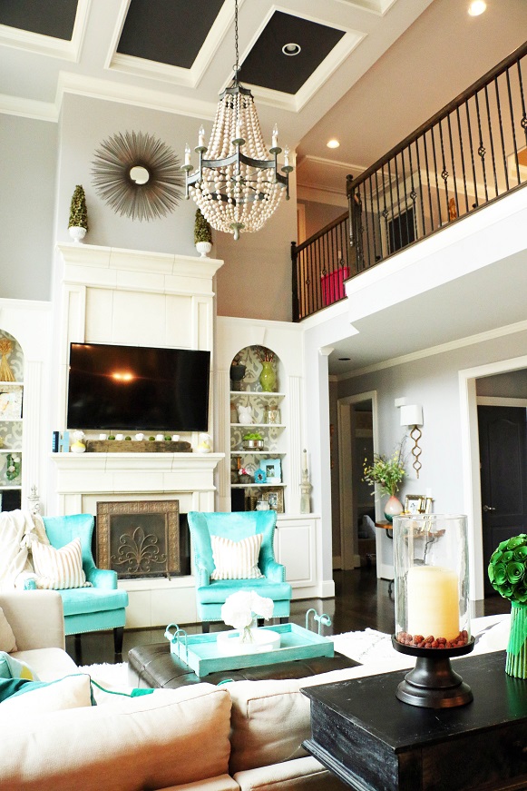
Ponder is a beautiful grey, yes. I am obsessed with it actually. However, it has violet undertones that may not work in every interior. I thought long and hard about our wall color because it extends into every main living area. Like I said before, Ponder has violet undertones which makes it a cool neutral. When we purchased our home and started renovations, the paint was one of the first projects we tackled. At the time, our home was empty. The floors were the original “orange-ish” oak color and the lighting fixtures were oil rubbed bronze which has a red undertone. Once the paint went up, I got a phone call. “Umm babe, are our walls purple?” I am not going to lie, I had a slight freak out moment. They really looked lilac. I thought I had just painted our entire home purple. Crap. I stuck with it though, trusted my instinct, and kept moving right along. Once everything was complete, the wall color is perfection.
I remember sending this picture to my husband of our daughter’s room being painted purple after they’d sprayed every room with a primer of Ponder to prove to him that the grey wasn’t actually purple…
So, why does this work in my home?
1. I primarily decorate with cool colors. Teal, blue, green, are all cool colors and I use a lot of those colors in my home.
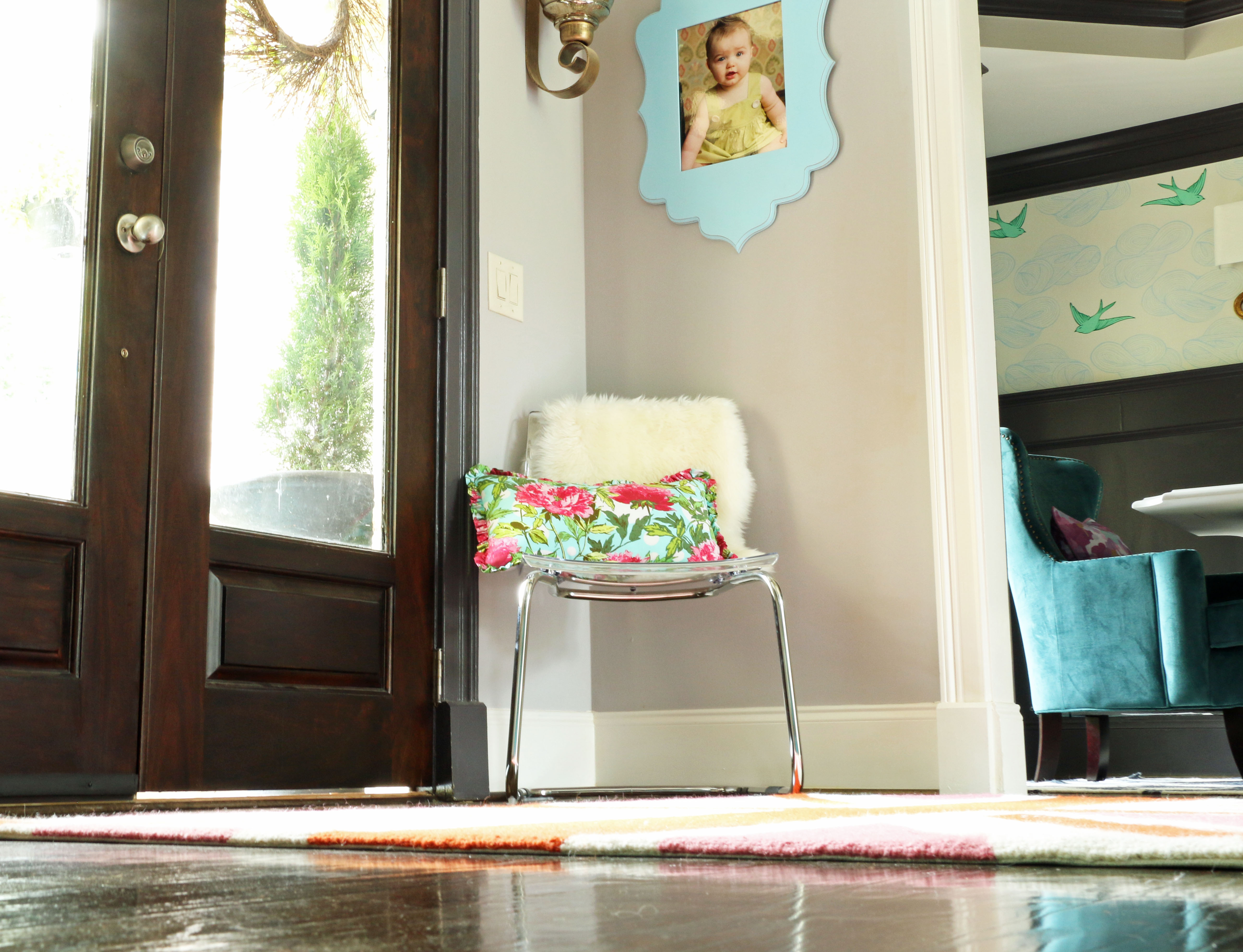
2. I love gold. I adore gold lighting and most all of the fixtures in our home are gold. Gold has a yellow undertone. Purple and yellow are complimentary colors therefore they look splendid together.
3. Our re-stained hardwoods are super dark and no longer have the orange tint which accentuated the violet in the wall color.
4. We have a LOT of natural light. Natural light will show a color in it’s purest form whereas incandescent and fluorescent lights can give off different warm and cool tones changing the look of the color.
So maybe you’ve decided that Ponder will not actually work in your home. What next? I will be putting together a comprehensive list of MY suggestions of beautiful greys that work with every style and color scheme so stay tuned!
SHOP OUR LIVING ROOM:

XOXO, Brittany Hayes


What is the color of your daughter’s room? It is gorgeous!
I’ll have to look it up and get back to you 🙂 I can’t remember! I will be posting her room soon too. Thanks!
Such a great post!!! We just went through the same
Exact thing!!! Gray is a gorgeous color throughout the home but definitely has lots of different undertones. We went with requisite gray by sherwin williams. Love your posts, home, style and of course I think you’re pretty great too. Halt for you!!!
Thanks so much April! Yes, Requisite is a great color too! Thanks so much for your sweet comment!
Happy for you :)…whoops!!
I have to know where you got that rug!! Such a gorgeous room!!
Thanks! It’s from Joss & Main. Link under TOUR 🙂
Looking forward to your piece on choosing grays!
Thank you so much!
This rug is back on Joss & Main! I had to back track to this post to double check that it was the same as your rug…yay!
Where did you get wallpaper on shelves in living room?
It’s from Spoonflower 🙂
Hello do you know color of your daughtes paint?? Thank you
I’m not sure right now. I will look it back and up and I’ll be blogging her room soon 🙂 It’s a purple Sherwin Williams color. Thanks!
Hi,
Any luck finding the purple color used in your daughter’s room?? I am ready to paint over the next weekend & am eager to see how the color you used would look in her room.
Thank you and Merry Christmas.
Good morning! It is filed at my office and I have been out for the Holidays. I will look it up when I get back to the office next week. Hope you had a wonderful Holiday season!
Good afternoon! I am so sorry for the delay! Her bedroom color is Potentially Purple SW6821 by Sherwin Williams. Thanks so much! http://www.addisonswonderland.com
Hi! Just came across your blog today! My hair stylist was telling me about your suggestions for grey paints. Since I’m new to your blog did you post your list of the shades of grey you recommend? We have chosen Barbara Barry, Poetical in Blush Pink for our bedroom, so let me know what you think! Excited to follow along!
Good afternoon! I have not yet but I will be soon! Thanks so much!
Ok I KNOW you get a million questions a day and I made sure to comb your blog back and forth before I ask. And if I missed it please tell me where to go but I was wanting to know where you bought your guest room gold wallpaper and its name. I would like to also ask what color you did the ceiling in that room. Thanks in advance! Dan
Not a problem at all! Here’s the link… https://addisonswonderland.com/be-our-guest/
Hi there! I was visiting your great blog a few months ago and saw a beautiful carpet that I thought might work for me. I have been thinking about it and now that I have returned to your page to find the info on it, I can no loner find it. It is the smaller area rug you have in your upstairs landing. It was a pink rug that is just lovely. Could you give me the information on where I can buy this rug please. Thanks and I love you blog.
Yes, absolutely! Here you go… http://fave.co/1DP1ses
hi. I love your living room grey color. may I ask what is the paint color and the make please. thank you.
Awe thank you!! It’s on this blog post 🙂 Ponder by Sherwin Williams.
Brittany, love your home and the inspiration you give all of us DIY’ers!
I have combed your website, looking for the paint color in your coffereds in the great room! It looks like Gauntlet Grey SW but I wanted to ask…
We are painting our house this weekend, going with either Requisite Grey or Dovetail Grey, but I wanted an accent color!
Thank you so much!
Jocelyn Lewis
Grayson, GA
Hello! What type of finish did you use for your walls trim celing and doors? I know selecting the wrong finish can completely change the look of the color… Please help!
Good morning! I almost always use flat for walls and semi-gloss for trim and doors. I love the look of a satin or eggshell on walls but it shows every single imperfection in the walls. Hope that helps! Thanks!
Hello Brittany,
I have been following your blog, facebook and instagram. Love all of your great designs. I am truly inspired to make my home colorful as yours. I have a question about rug color choice for my own living room. I have a goldish color couch with a paisley design through it that has threads of navy, red, and green that are very small to see unless you are up close. I have dark chocolate brown floors. I have a navy chair. I am painting my living room a gray color still trying to decide on the gray paint color. I have white trim. I love your rug in the dining room and thought this would be a good choice for my space. What do you think? Any advise is greatly appreciated. Thank you. Kind regards, Karen
Brittany, my girls are in love with your playroom… everything about it. We have decided to make our girls playroom a “big girl room” now and they want it like yours. I found the Wallpaper and got it ordered but it will not arrive for 8-10 days. My painter is coming on Monday to paint. Do you know the what paint colors you used on the walls and ceiling? Thank you so much!
The struggle is all too real… we had a major problem trying to find the perfect grey paint for a bathroom that lacks any natural light. I went through three different colors, the first being requisite gray, which I have in our other bathroom and absolutely adore. I ended up bringing our shower curtain with me to the store and matching it as best I could and now I’m quite happy with the outcome, but boy was that frustrating!! Painted the same room three times over… not my idea of a good time.
Awe yes it is SOOO hard!! There are so many shades of gray and they all have a different undertone. It’s best to sample sample sample instead of re-painting. That’s for sure! XOXO
This article about Ponder helps so much. I fell in love with the chip months ago, but wanted to be sure it did have that “violet” undertone before committing. Thanks sooooo much for settling it!
Teri
Rosenberg, TX
I chose ponder for a condo in Florida. It is very difficult because I am not there. I called the painter and asked if the walls are a pretty grey. He said the walls aren’t grey, they are mauve. I am having a melt down. The walls were not completely dry. I have a lot of natural light. My furniture will be creams and greys. My artwork will have whites, greys and blues. Will this help to make the paint look more grey? Or will it hurt? Help!