I know, I know. I am about a year behind sharing a bathroom project… And this one isn’t even in our home! I do PROMISE I will do our powder room in the very near future. Anyways, although we’ve done our fair share of home projects galore for the last 10+ years, this property is our first of hopefully MANY quick flips. When I say quick I mean that we finished it from top to bottom in less than 30 days!
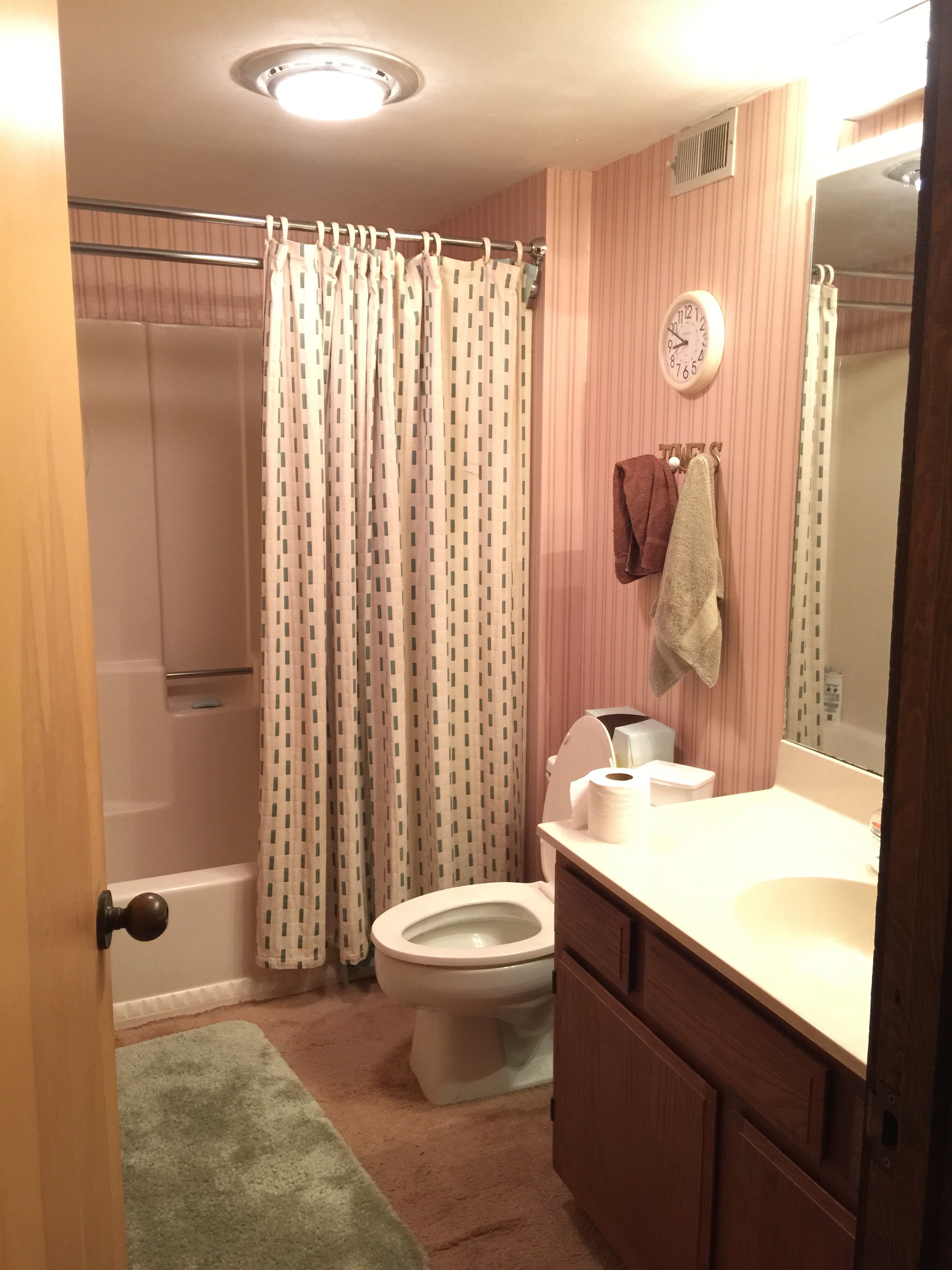
Is it crazy that we choose homes based on how “ugly” and dated they are? As in, the more dated and moth ball scented they are, THE BETTER! So this one, untouched for possibly centuries decked out in wallpaper, bathroom carpeting (who EVER thought that was a good idea?!?) and striped wallpaper, was a match made in flipping heaven. I really would like a quick transport back to the 1970’s. Just once. To simply ask “what were you thinking?!?” And everyone needs a clock above their toilet, right?!? Maybe then my hubby would realize he actually does spend thirty minutes in the bathroom everyday. Like for real.
Before
Selections
Flipping design is a LITTLE bit different than designing our own home. Although I love to add of pop of me into everything, I do try and keep bathrooms and kitchens somewhat “normal”. Even in our own home. Since these type of investments are more time consuming, much pricier and just plain difficult, I try and create a more timeless look. Neutral. Wow I said and used the word neutral. See, I can do it…
Wall Color- Alabaster by Sherwin Williams
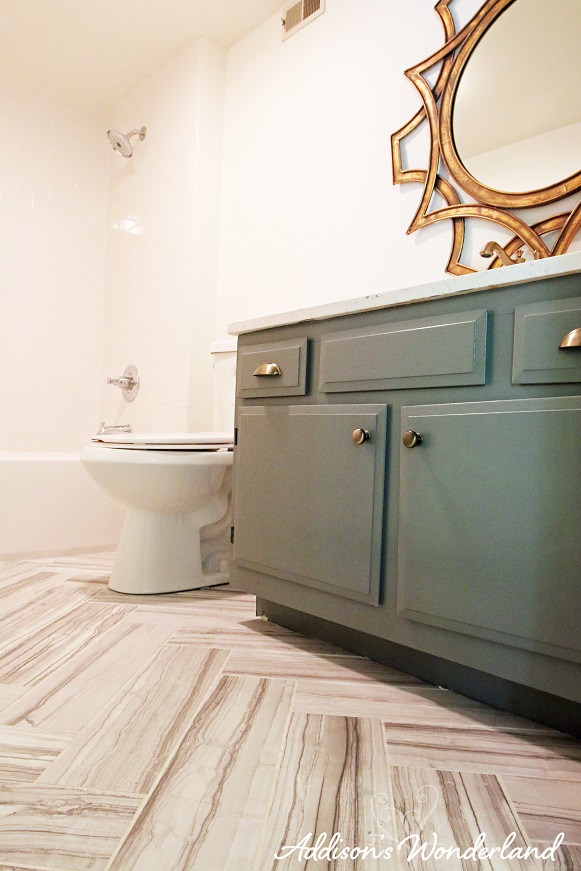
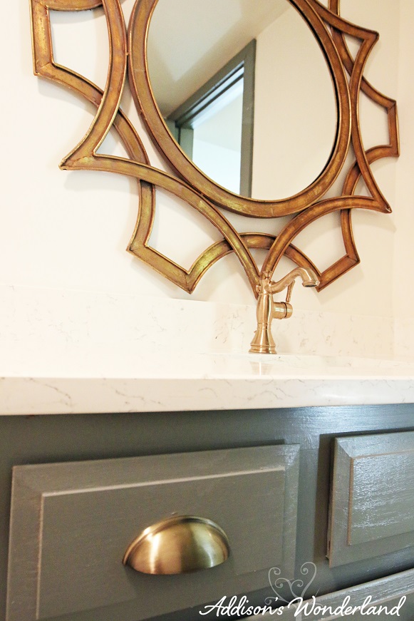
Cabinet Color- Cityscape by Sherwin Williams

Haida Quartz Countertop
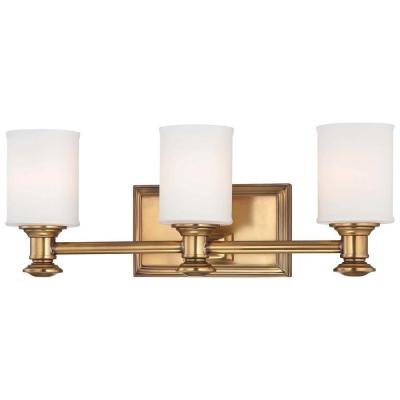
Minka Lavery Harbour Point 3- Light Gold Bath Light
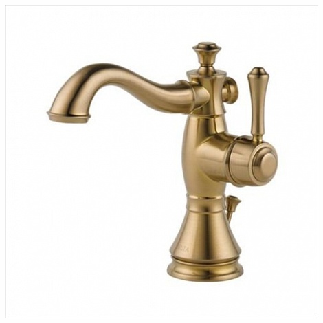
Cassidy Single Hole Lavatory Faucet
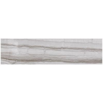
6 in. x 24 in. Porcelain Floor Tile
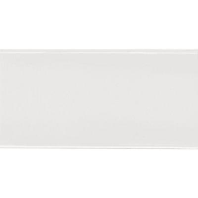
Bright White 3″ x 6″ Ceramic Wall Tile
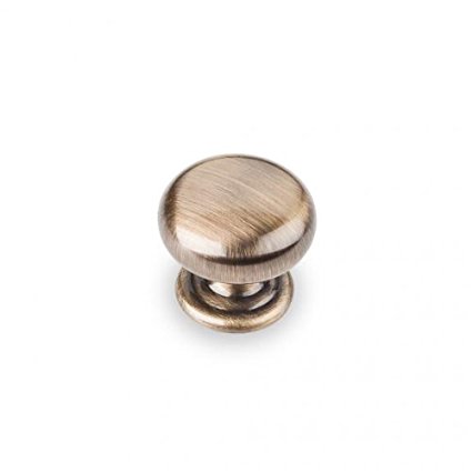
Elements Florence Cabinet Knob
Construction
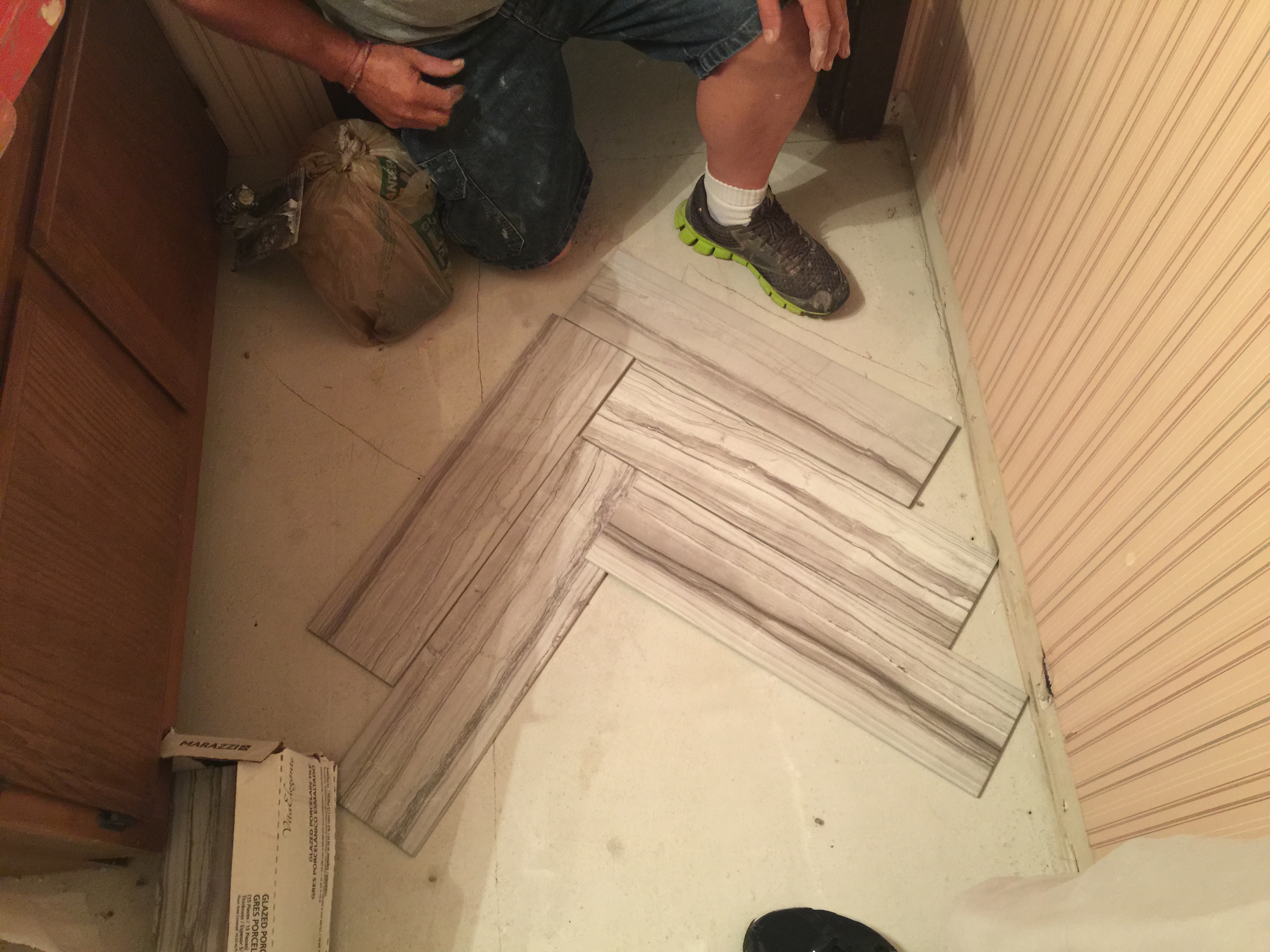
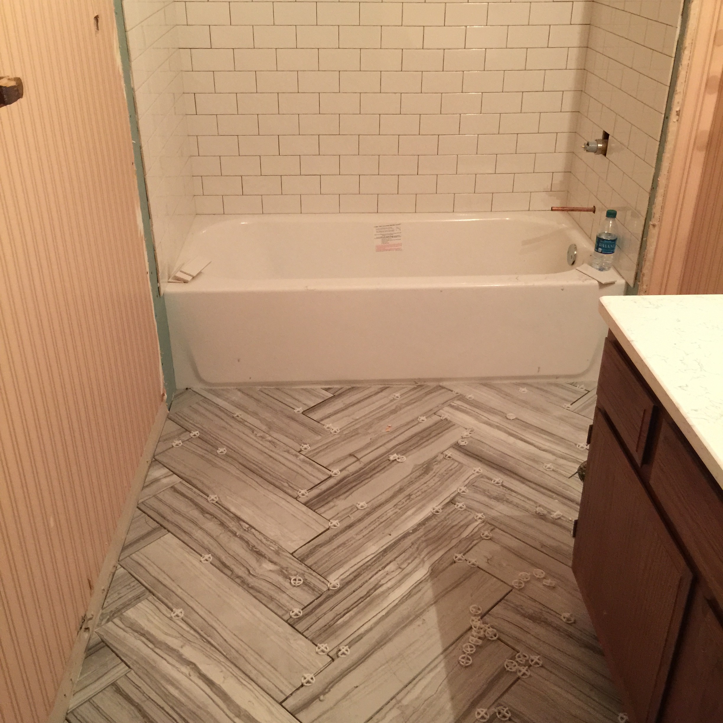
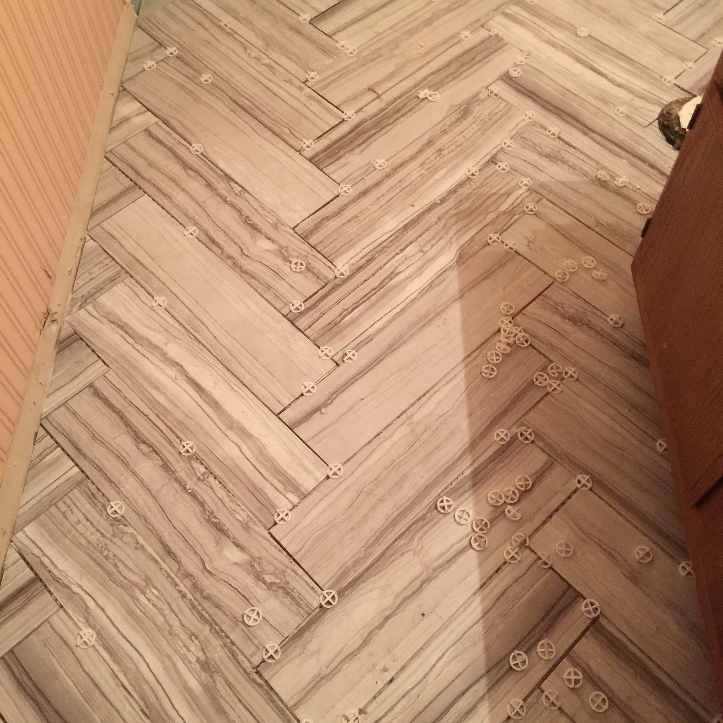
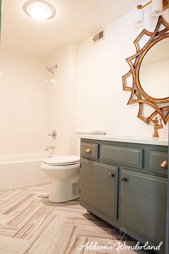
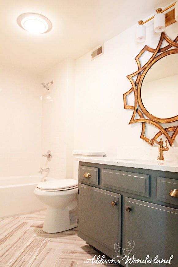
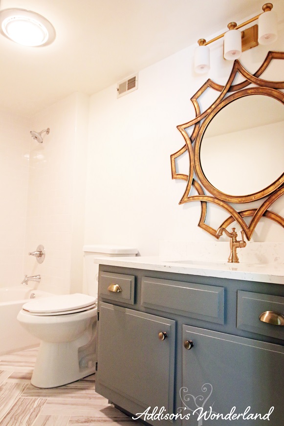
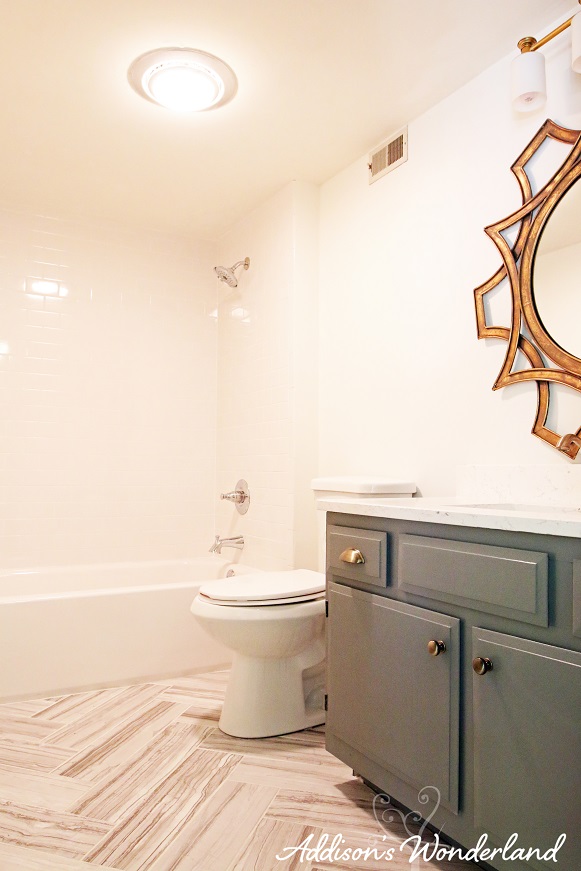
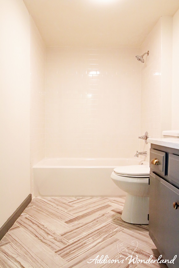
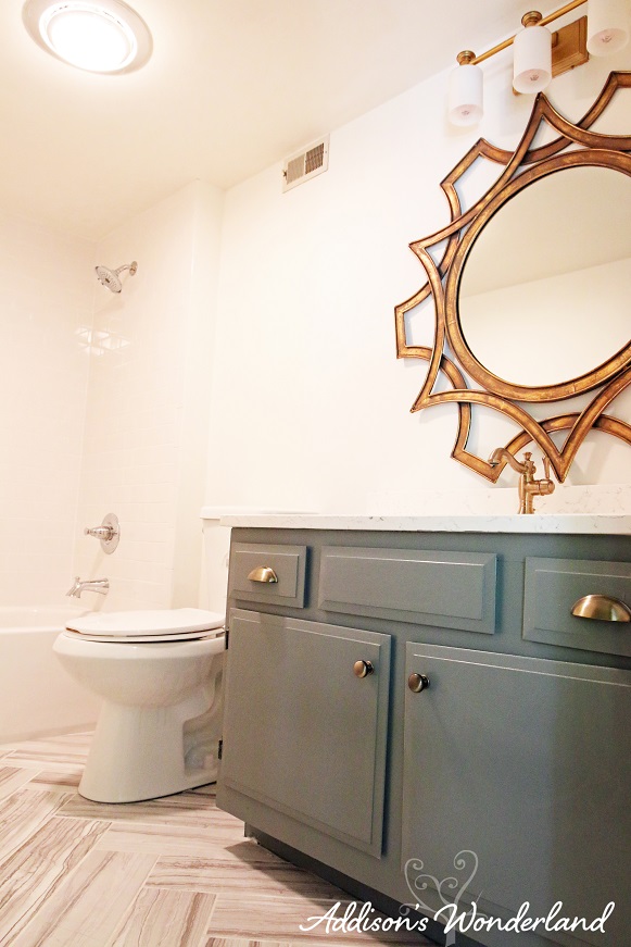
As tiny as it may be, I did want to create some unique features in this bathroom. With a zero budget for accessorizing and limited options on making it super high-end, I decided to play with patterns. Instead of simply laying the tiles in a straight pattern, I chose a herringbone pattern. I am sure my hubby and his guys were thrilled with that decision. I really do think it made a huge difference and really visually opened up the space. The next budget saver was keeping the exisiting cabinet. It’s amazing what a coat of Cityscape by Sherwin Williams and some new hardware can do!
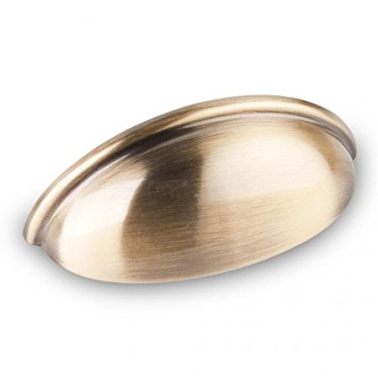
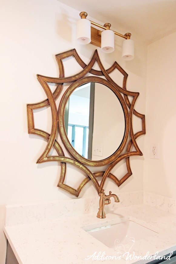
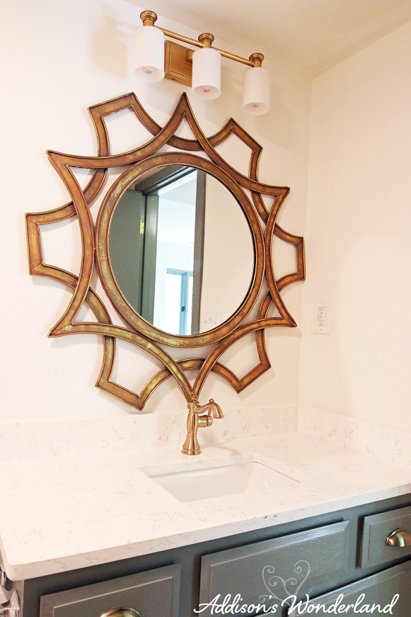
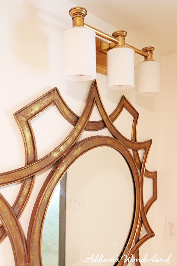
Next, I went a little outside the box and tried to think ahead in trends and chose GOLD fixtures. Gold?!? Not your grandmother’s brass like you may be thinking. It’s gold. The faucets are a new finish called “Champagne Bronze” otherwise known as “Heavenly” and the lighting and hardware are an antique gold finish. Gray and gold are a match made in color/finish heaven if you ask me!
After
XOXO, Brittany Hayes
+ view the comments
