I will be the very first to admit that I am not the master of the edit. I think I was absent that day or week or month that we learned to edit interiors in design school. To take away, simplify and accentuate the focus. Blame it on “my style” or the fact that when I love something I get it (if I can and over the course of the last 14 years) or amazing companies send it to me or I get the opportunity to blog about awesome products. But over and over, it all piles up and I find a place for it. By darn if I love it, I find a place for it. I also just love that look. I love the layers. I love the visual “busy-ness”. I love the challenge of making it all work. I love it all.
However, last week I had the opportunity to spend the entire day with a master stylist. As you may have read in my “Behind the Scenes: BHG Shoot”, Thea Beasley came over and freaking knocked my socks off. Well she quite literally knocked off quite a bit of my stuff from the tables and shelves and then simplified and mastered our vignettes. With bags upon bags of HomeGoods goodies, she made our house seem even more like a home. Although I cannot share exactly what they did, and most of it was taken back with them, I did learn so much that I have since applied to our home. I learned the edit. And I have to admit… I love it!
Here are several of my tips on creating the perfect vignette…
Tip One: Vary Heights
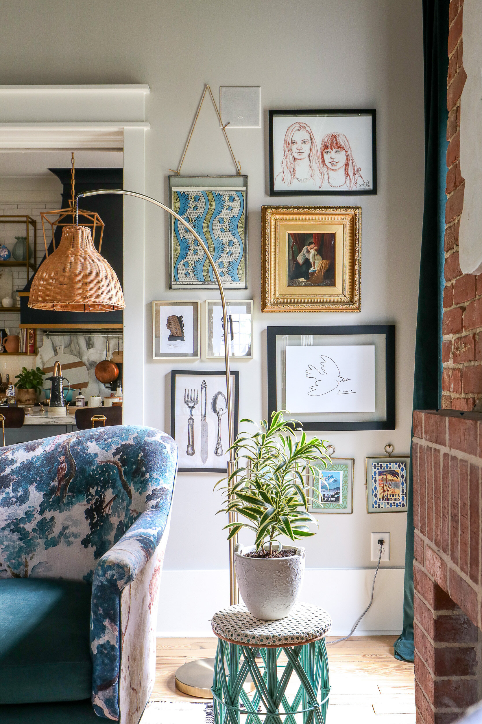
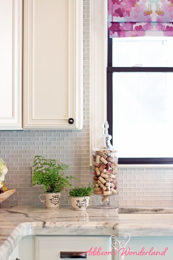
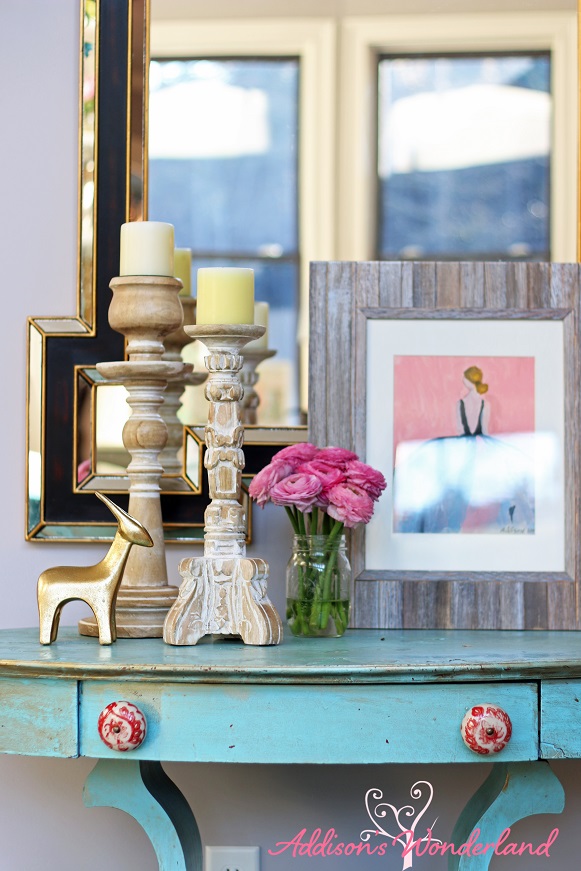
One of the best ways to layer accessories is to vary object heights. The goal is to lead the eye around the space, up and down and across the entire feature. This is visually appealing and makes it all just seem to work!
Tip Two: Heavy on the Bottom
After I wrote that, I thought that maybe did not sound so amazingly eloquent. I am definitely only referring to objects. Not people. LOL. Visual weight is mega important in interior design. For some reason, your mind and eye like to see things heavy on the bottom. In terms of literal size, quantity and color (dark to light). Place the darker, larger and largest number of objects toward the bottom and then work your way up!
Tip Three: Move Away from the Wall
Not everything needs to line up against a wall or invisible line. Move it all around. Place objects in front of one another. Place them in the middle of a table or even toward the front. Once again, create interest that moves the eye around the space.
Tip Four: It’s All About the Three’s!
One day our brains decided that three looks amazing. That magical number just seems to work. It looks more visually appealing. It’s not too many or too few. It seems to be just enough.
XOXO, Brittany Hayes
+ view the comments




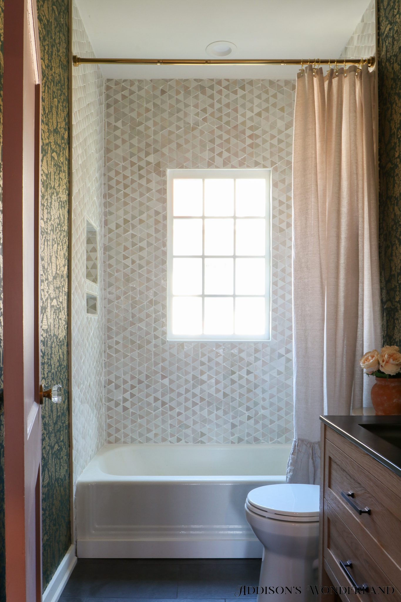
 Today I am SOOOOOO excited to be revealing the full renovation we just completed in the one and only bathroom inside our historic cottage renovation. Yep, we call it a […]