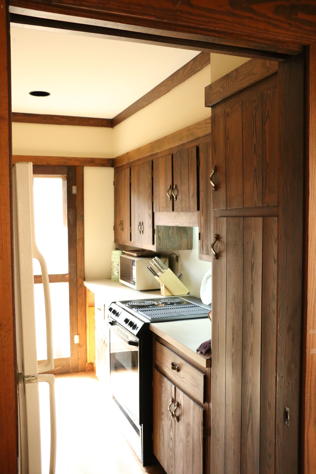
I think it’s pretty safe to say that the Brady Bunch probably vacationed in our cabin. I can literally see Carol Brady cooking a big ol’ Saturday morning breakfast at this stove, in this cabin. Built in the late 1970’s, our cabin was your quintessential 70’s dream vacation home. Cork flooring and dark wood must have somehow convened and convinced America that it looked amazing in homes. I, however, am not convinced…
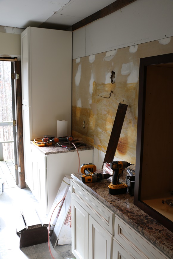
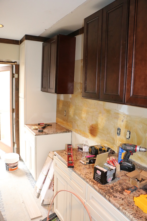
Before
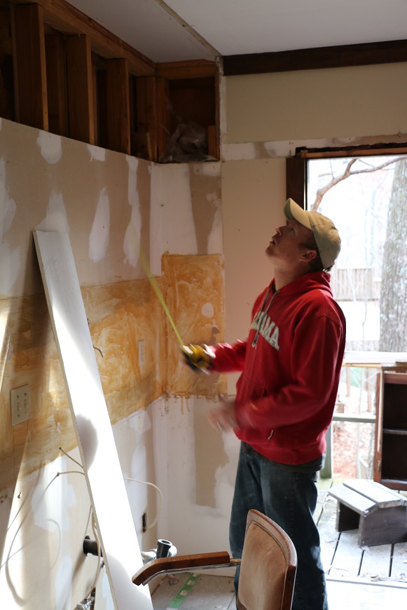
As you can imagine, we decided it ALL needed to go!
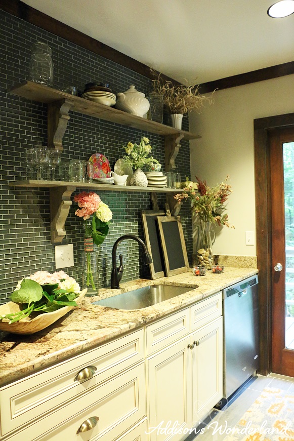
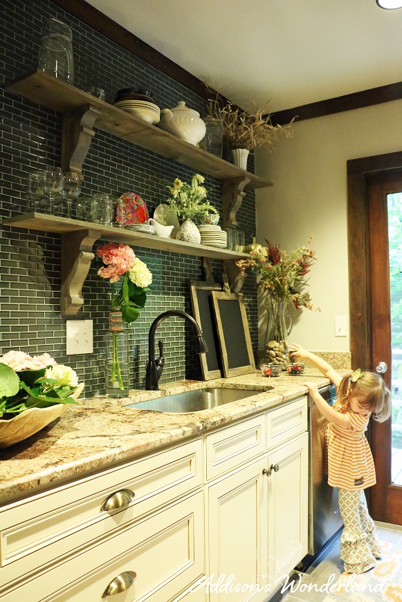
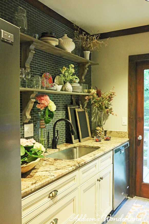
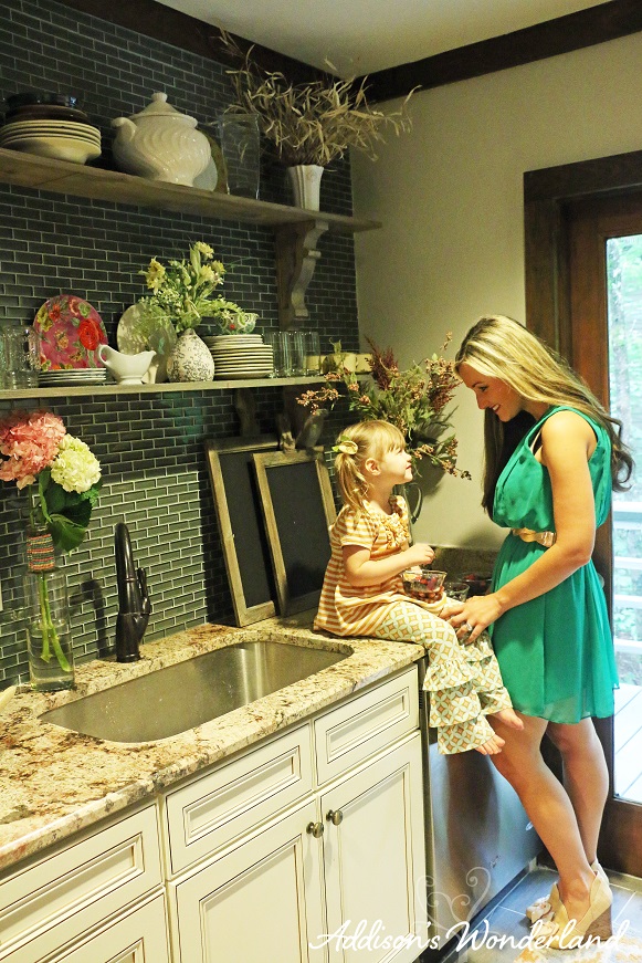
A truly blank space, a blank canvas, is a dream come true for an interior designer. Although incredibly tiny, I knew this space had potential. With lots of beautiful natural lighting and an opportunity to do something a little different, I embraced the chance to change things up a bit. As a second home, storage is not a HUGE issue so I chose open shelving rather than upper cabinets to really open up the space and create less of a chance of my claustrophobia kicking in. No really though… it is a TINY kitchen.
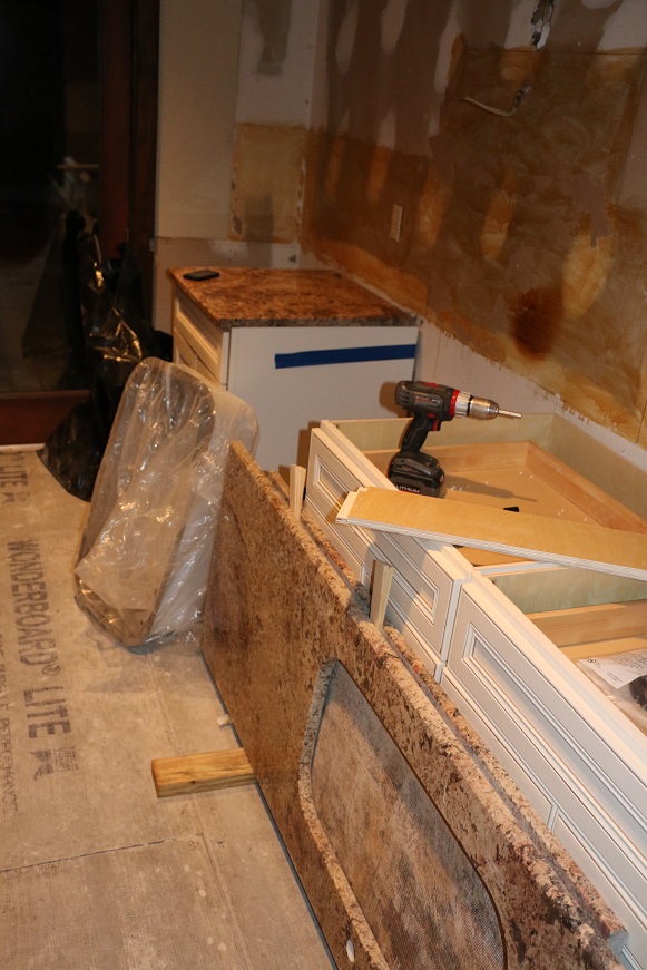
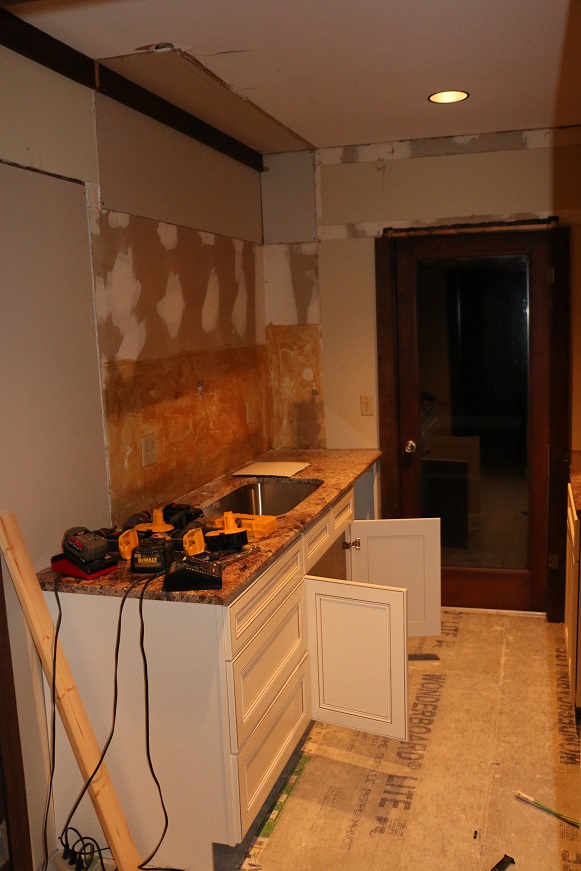
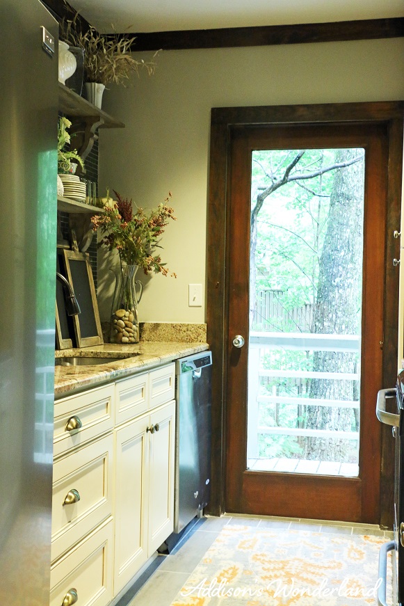
One of the major changes we made was to close up a doorway that went from between the sink area and refrigerator to the girl’s bathroom. The last thing this room needed was another doorway and another thing taking up wall space. We simply closed up the opening and extended the cabinets another 30″ against the side of the refrigerator. You can really see this in the second image below behind the area where the tools sit on the countertop.
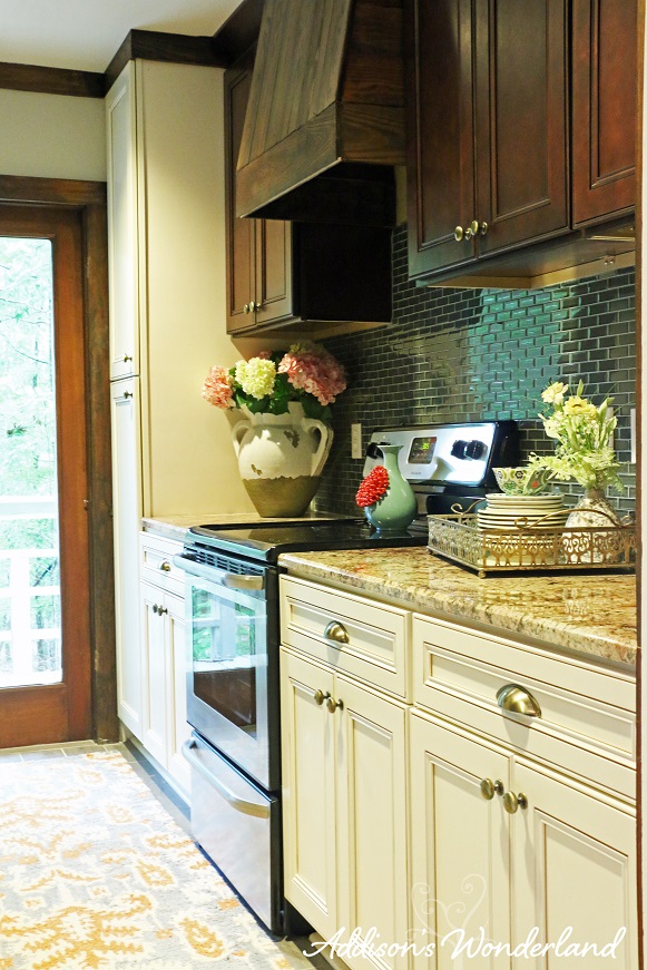
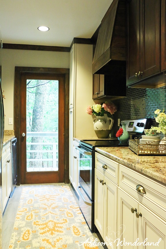
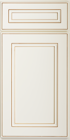
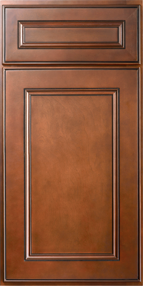
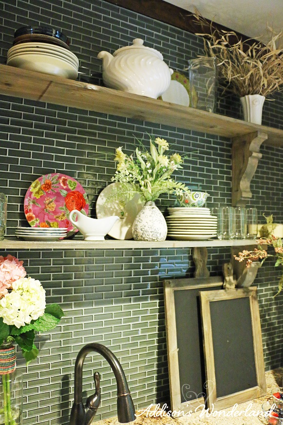
For the cabinetry, I chose to do a two-toned look to create visual interest and to create a rustic wood feel without making the space too dark. I knew I wanted some wood tones but not dark everywhere since the room needed some lighter colors. I chose an antique white for the bottom cabinets and a chocolate finish for the uppers. I almost always do the opposite for visual weight but I felt the “dark-ish” backsplash option would help to transition the lighter cabinetry to the darker uppers. Also, I knew I wanted a lighter look for the left side of the kitchen with the open shelves. With dark bases, a dark backsplash and dark shelving, I felt that look would bring us back to “blah-ville”. For the backsplash, I fell head over heels for this blue/green/gray 1″ x 2″ glass backsplash tile. It’s new and fresh yet still has a somewhat rustic feel creating interest, adding color and providing some wonderful light reflections brightening up the space.
My absolute FAVORITE part of the kitchen remodel absolutely has to be the vent hood. My hubby and one of his guys created a vent hood completely from “scratch” using the boards from the old cabinetry. I just love that we were able to honor some of the original features of the home in creating a fresh new look. From there, I just accessorized our custom shelving with lots of beauties from my favorite stores: Anthropologie, HomeGoods and World Market to complete the look…
After
Selections & Sources
Lower Cabinets-
Upper Cabinets-
Countertops- Ivory Coast Granite
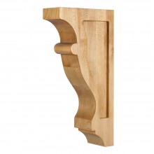
Corbels
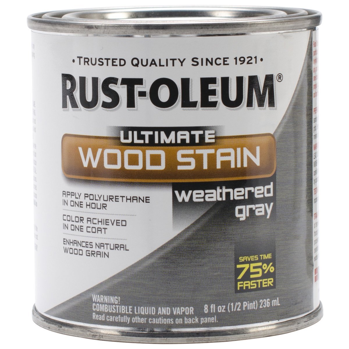
Corbel & Shelf Stain- Rust-Oleum Weathered Gray
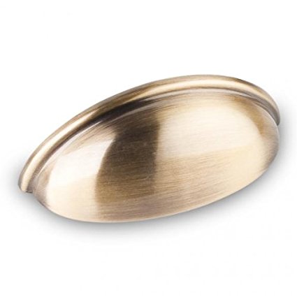
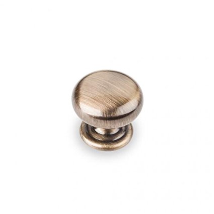
Cabinet Hardware- Elements Cup Pull & Elements Knob
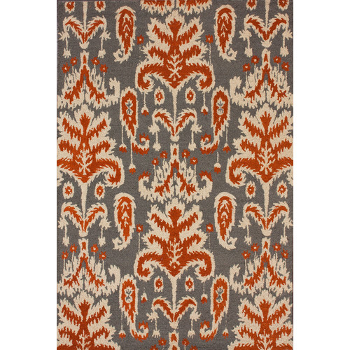
Rug- Ikat Smoke Rug
Decor- HomeGoods
Glass Tile- Floor and Decor
Dishes- Anthropologie & World Market
Chalkboards- Decor Steals
Large Vase- Pottery Barn
Teal & Red Vase- Anthropologie
Tray- HomeGoods
+ view the comments
