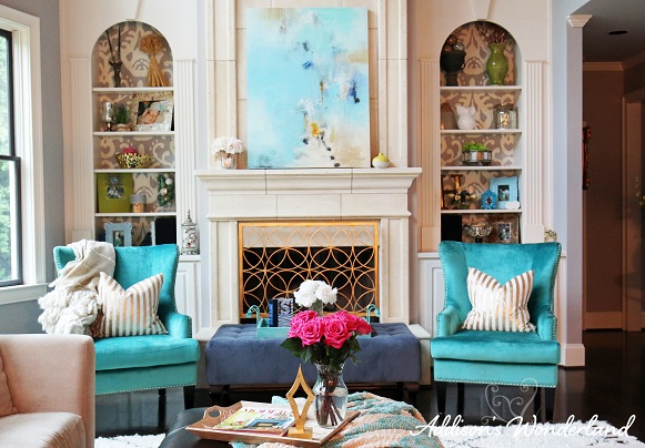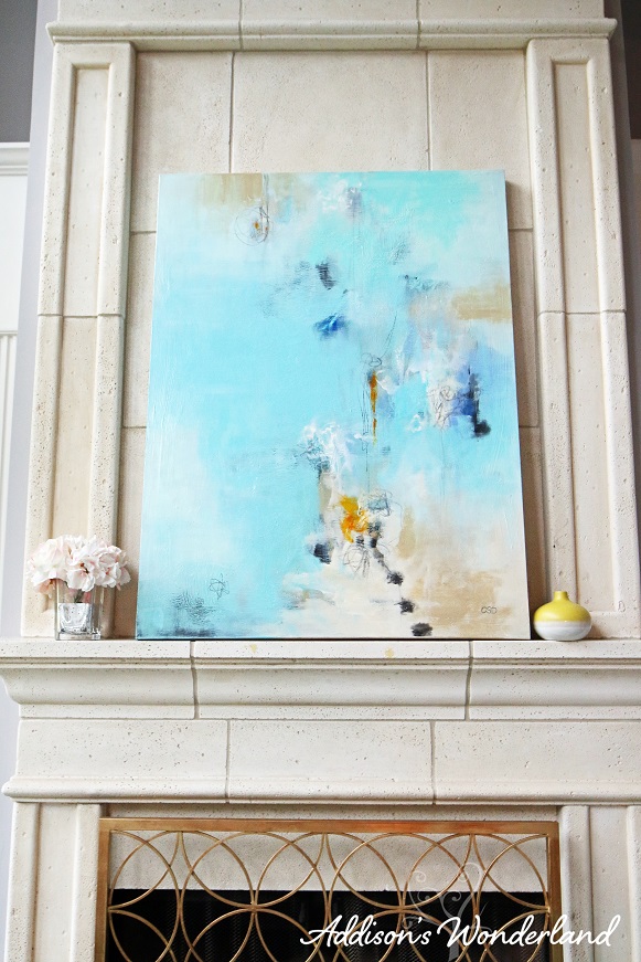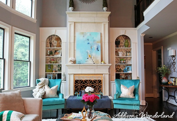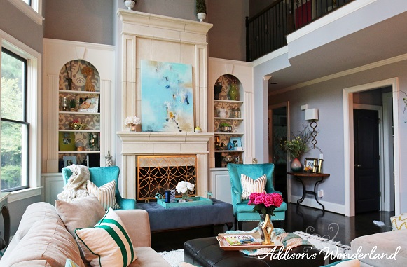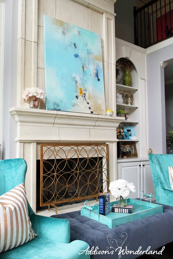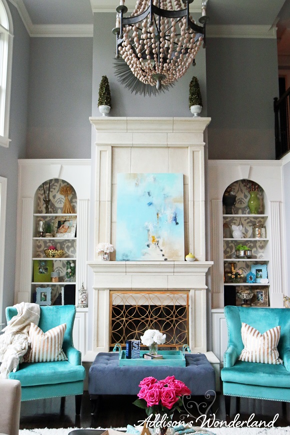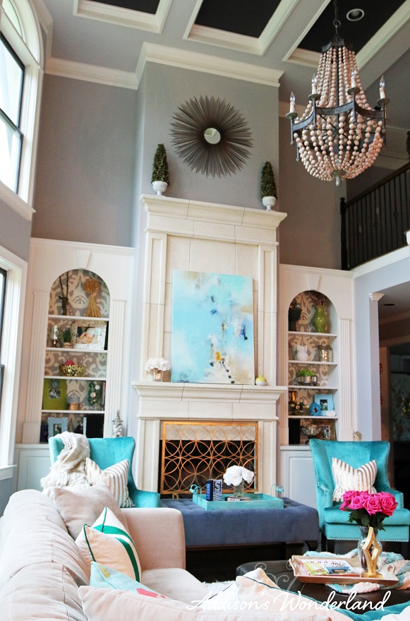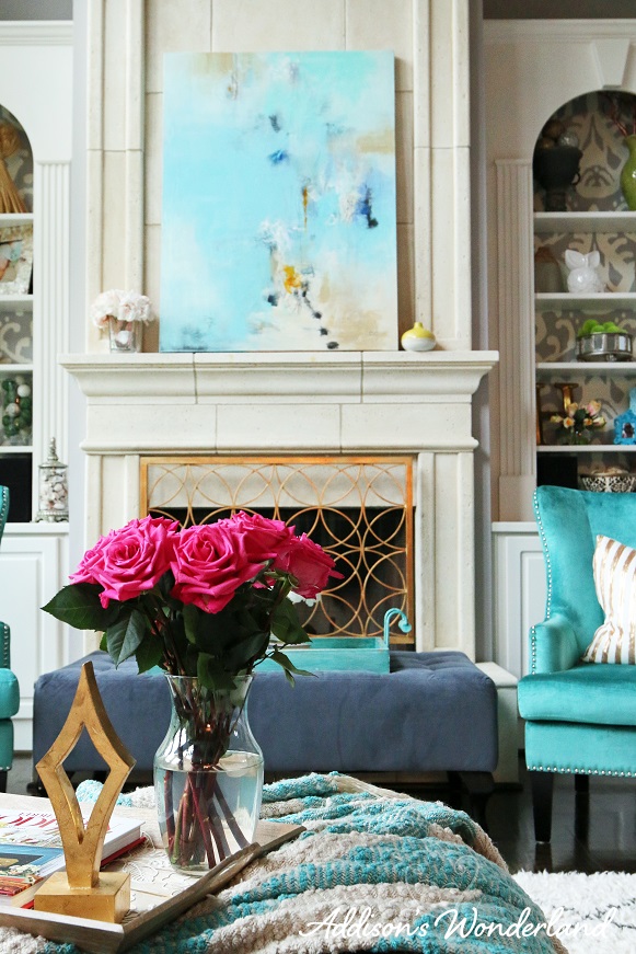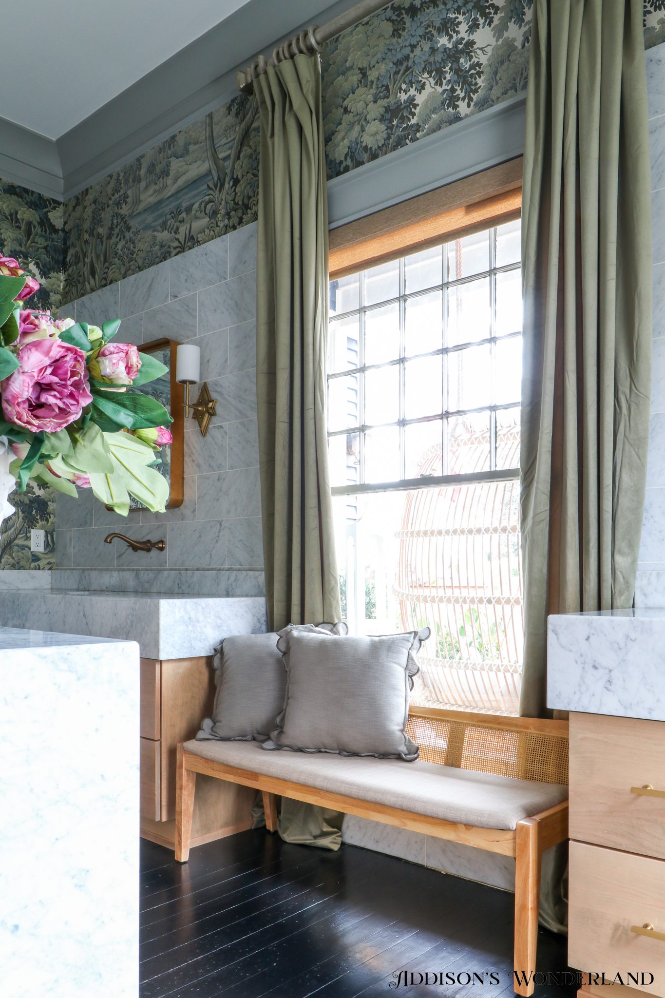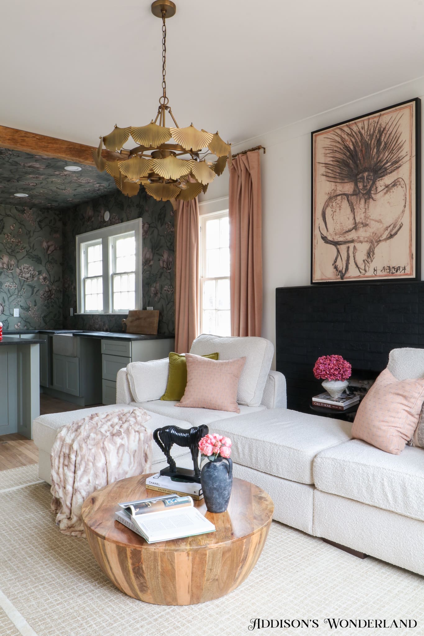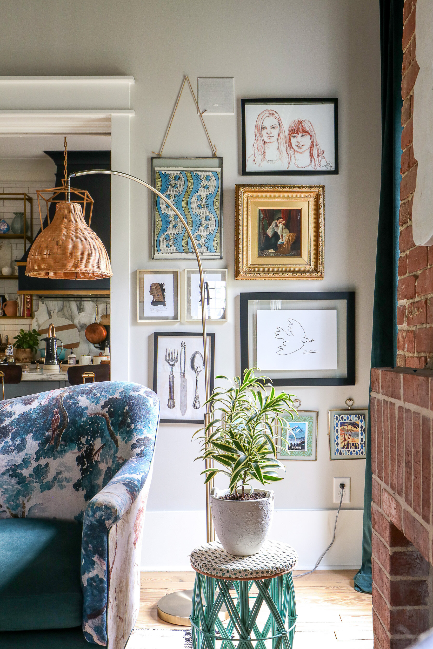
Wow, she’s lost it you’re thinking. This IS her living room! And yes, you’re 99.9% correct. However, you may remember my Mantle Wars post? Well, I won that fight for a weekend, a photo session weekend for an upcoming feature where my hubby took down our television and replaced it with this beautiful artwork from Huff Harrington in Atlanta. Amazing, huh?!? My friend Meredith Christenberry with The Christenberry Collection in Columbia, SC helped me find and secure the borrow and it was the perfect touch!
So, in addition to the professional photography done in our home that weekend, I did some of my own so that I could live vicariously through these images. And you better believe that I will be using these in my updated Home Tour! LOL! Although around here these days, it’s back to the too big TV over the mantle and little to no room for decor. Maybe one day I can twist Mark’s arm hard enough to let us be a permanent change. Until then, here’s my dream living room tour…
SHOP OUR LIVING ROOM:
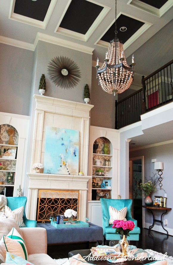
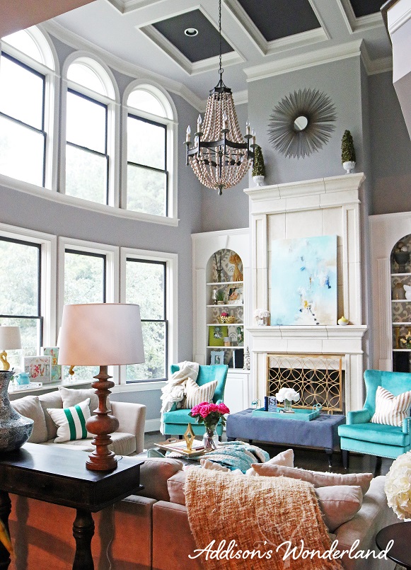
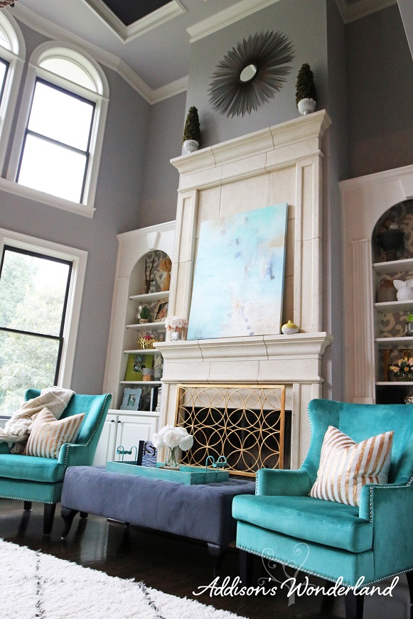
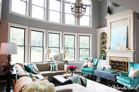
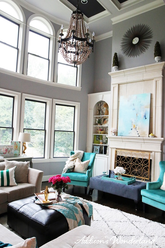
In designing this space, I knew I wanted a neutral backdrop to add my signature pops of color and pattern. The fact that this room has a huge wall of windows, a coffered ceiling and many doorways makes the space visually busy. Therefore I wanted to soften the room with a light and airy gray. I chose Ponder by Sherwin Williams for it’s cool violet undertones.
So why violet? Choosing a paint color is way more than seeing a color you love on Pinterest or on a paint swatch. It is really more about taking into account the other elements going on in the space. For our home, we have very few warm colors or undertones and I love to accent with a lot of gold. Since purple and yellow are complementary colors, the violet and gold make each other pop!
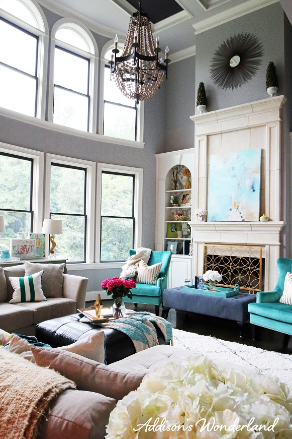
The architectural accents in the room are a huge part of what sold me on our home and I wanted to truly showcase those elements. Therefore I chose a custom mix of 1/2 Stunning Shade 1/2 Darkroom by Sherwin Williams for the coffered ceiling and the window sashes. You can read more about it HERE. This dark color adds drama and a sense of depth to these elements in the space.
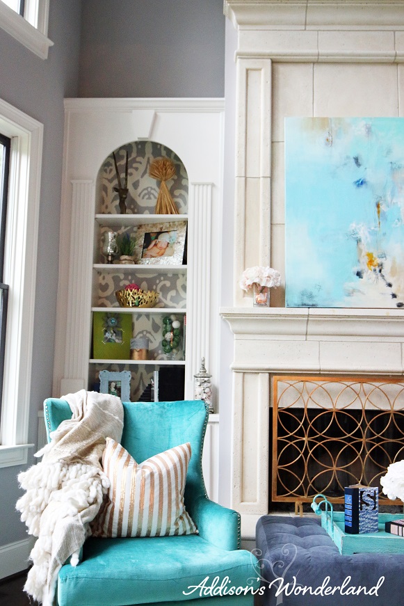
Next I wanted to showcase our stunning bookcases with a beautiful gray/white ikat print wallpaper in our bookcases. It adds just the right amount of color and print to beautify but not visually over complicate this area. One important thing to remember in adding a print or color to the backs of bookcases is to then keep your decor simple. You want to accessorize lightly as to still show off the beautiful paper.
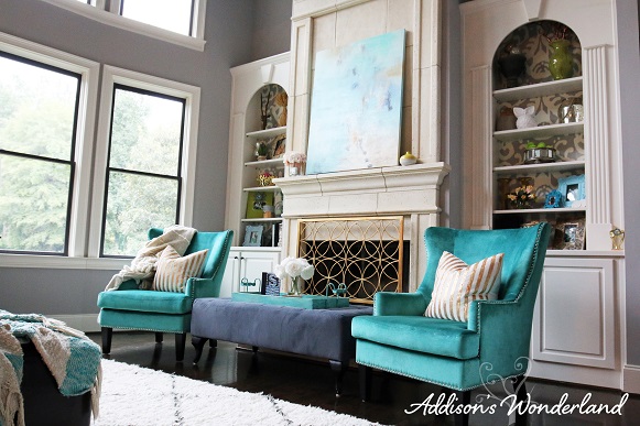
Next up, adding some POPS of color! As you know, NO Addison’s Wonderland room is complete without a little or a LOT of color. Although there are some bold pops in this room, I did choose to keep it somewhat “simple” and “neutral” since this is our main living space and it helps to break up the space between our super colorful dining room and funky office. In designing our entire home and keeping it cohesive, I chose one color as an overall theme… Really Teal by Sherwin Williams. This color can be seen in our ombre staircase, our butler’s pantry and in furnishings and accessories throughout our main living spaces. This keeps it cohesive without seeming like a Crayola box threw up in our home. The teal in this room is of course in these stunning wingback chairs that flank our fireplace. These chairs work to break up the neutrals and add depth to the overall neutral fireplace wall. It helps all of the elements to POP!
Oh the fireplace screen… I honestly didn’t realize what a WOW statement it would be until I finally splurged and purchased it. The gold really sets off the gray walls and adds such a sophisticated touch of glam.
The last major element in this space is our sectional. You may not see me as a “sectional kind of girl” but I pretty much cannot live without one now. Although I do keep it streamlined without any pop-up feet or rounded cushy backs, I love MOST of the newer types of sectionals. Ours can be found HERE and although I chose a very light color (Creme), it is SO functional, stain resistant (with the scotchgaurd package) and cozy. We all pile up on it nightly and cuddle up for TV time. It also adds an important light and neutral base for fun accent pillows and throw blankets. I can now so easily change up the space with new pillows and prints.
Lighting. Holy moly I could do an entire blog post on how important beautiful lighting is to a space. This amazing wooden beaded chandelier is a true show stopper in this room. At almost 4′ tall it adds drama and the perfect rustic touch for such an elegant and “soft” room. The ironwork and wooden beads roughen up the abundance of textiles in the space. Scale is so hugely important when designing a space and this 42″ beauty really shows off the 21′ ceilings…
SHOP OUR LIVING ROOM:
XOXO, Brittany Hayes
+ view the comments
