It’s happening! We are coming to the final days of restoration on Our 1905 Historic Wonderland. It somewhat seems like yesterday that we fell in love with this “pile of 2 x 4’s” and also kind of seems like we have been planning and renovating for like EVER. If you have been following along since the beginning you may remember that our home was once just that… a pile of 2 x 4’s. I am not exactly sure what it was about those studs but we fell hard for this historic “fixer upper”. It was literally three steps inside the front door at 9pm on a Friday evening when I was ready to sell our former dream home and tackle this rather huge project. There is just something about that historic charm.
First, I want to try and answer some questions that have been popping up a lot on my social media and blog comment thread… How did we envision and plan the restoration and how did we budget for the construction? To be completely honest, I think the answer to both would be a LOT of experience in the industry. We’ve owned company for the last thirteen years so we have tackled most every form of construction along the way. I think seeing so much through the years has given Mark and I both a mental reference manual of ideas, processes, timelines and job costing. If you are tackling something like this as a newbie, my advice would be to make a list. A HUGE one and take it line by line with estimates, timeframes, contractor/company references and everything BEFORE you even sign on the dotted line to purchase the home. Walk through a finished home and look at/think about everything that will need to be done to complete the project. Sometimes the smallest things are forgotten and can REALLY add up… doorknobs & hinges, plumbing fixtures, molding, the list goes on and on and on… Although I am undecided for now if I will share our budget for this project, let’s just say that it is NOT cheap to renovate or restore. Especially a project of this magnitude. And don’t forget that literally EVERYTHING may wind up being more than you budgeted. So plan accordingly.
As far as envisioning and planning for OHW, my thought process was a huge combination of a) what I’ve always wished for in a home b) what I know works for us/doesn’t work for us based on our previous homes AND c) that Pinterest board I’ve been pinning to for years. Yes, that one with 406,987 pins. Not really but ya know. For us, I am the visionary and Mark is the realist/contractor/budgeter. I tell him what I want, he tells me if it’s possible and then we plan/re-plan from there.
The floor plan for this home was FUNKY. So I took what we had to work with and then made a dream list… a large mud room, a bedroom/play space for the girl’s separate from the living area, a master suite, a large closet for us, a large and open kitchen… Originally, the upstairs was a master suite and the extra bedrooms were on the main level. With two small children, that just wouldn’t work for us in an ideal situation. SO, I completely re-envisioned the upstairs into a “kid oasis” and the entire left side of the main level as the master suite. More on the master suite later. So what was once the master bedroom became the playroom, the master sitting room became their craft/art room, the master exercise room became Addison’s bedroom and the master bathroom became Winter’s bedroom. Still following??
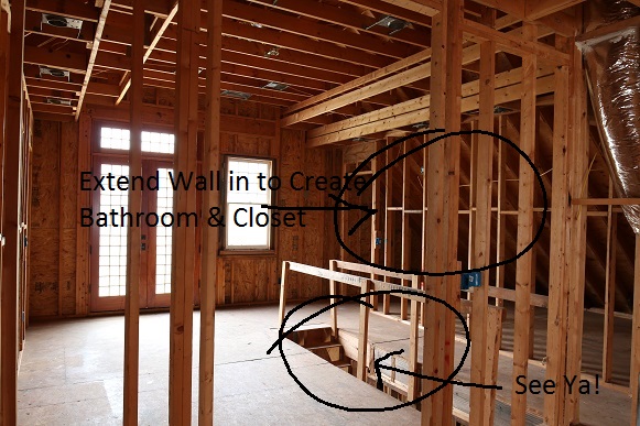
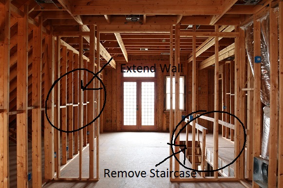
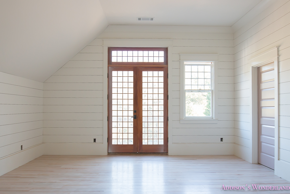
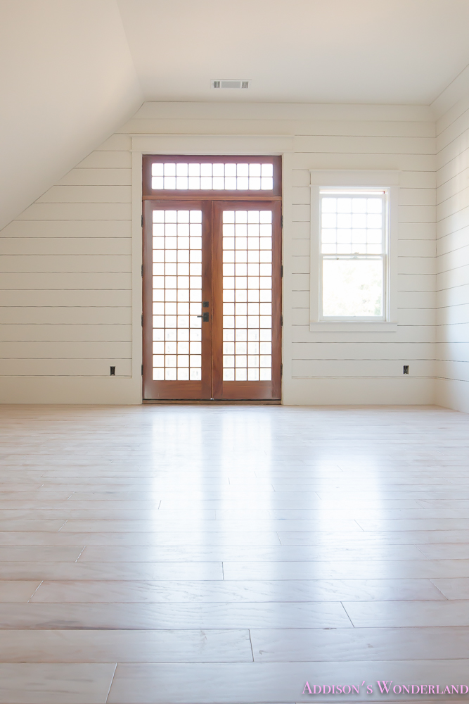
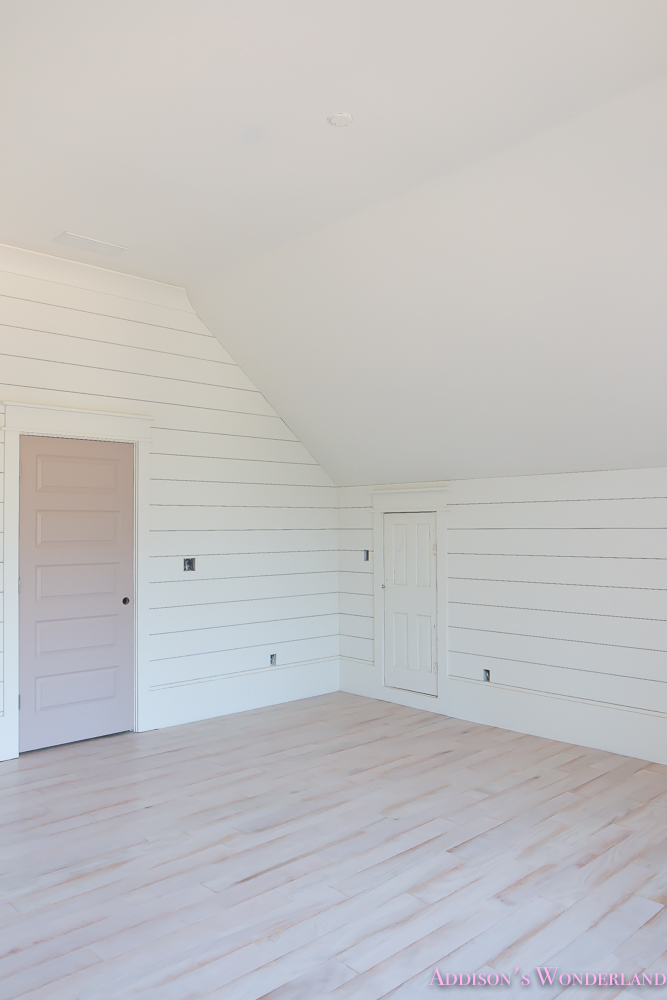
So let’s chat Addison’s bedroom… if you remember her bedroom was the back “master exercise room” with a second staircase. I saw that it could be such a beautiful space with the amazing exterior door so I decided to remove the staircase and make it her bedroom! We used the side attic storage area on the right to carve out her bathroom and closet and even a little loft/play area on the left side. We also extended the sides of the bedroom into the attic area to create a unique room shape and a larger bedroom. Here’s a peek at it all BEFORE…
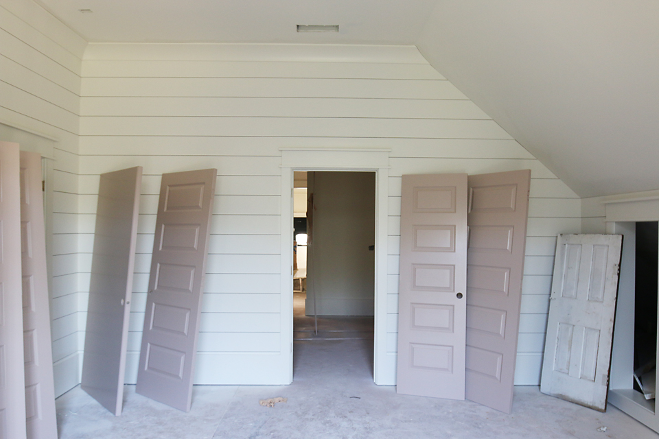
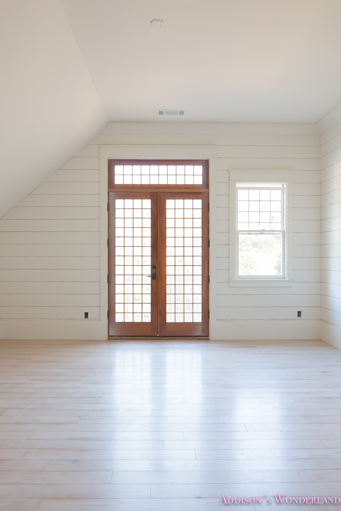
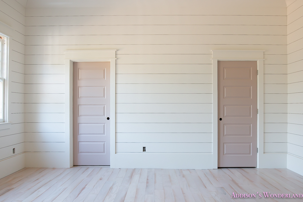
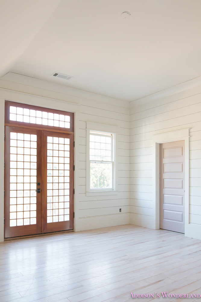
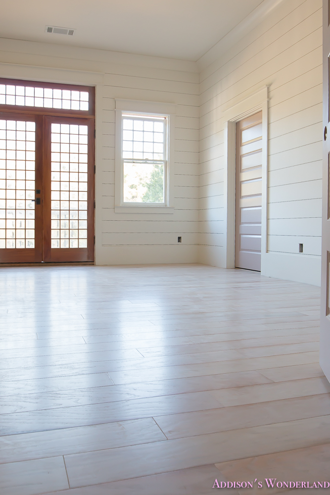
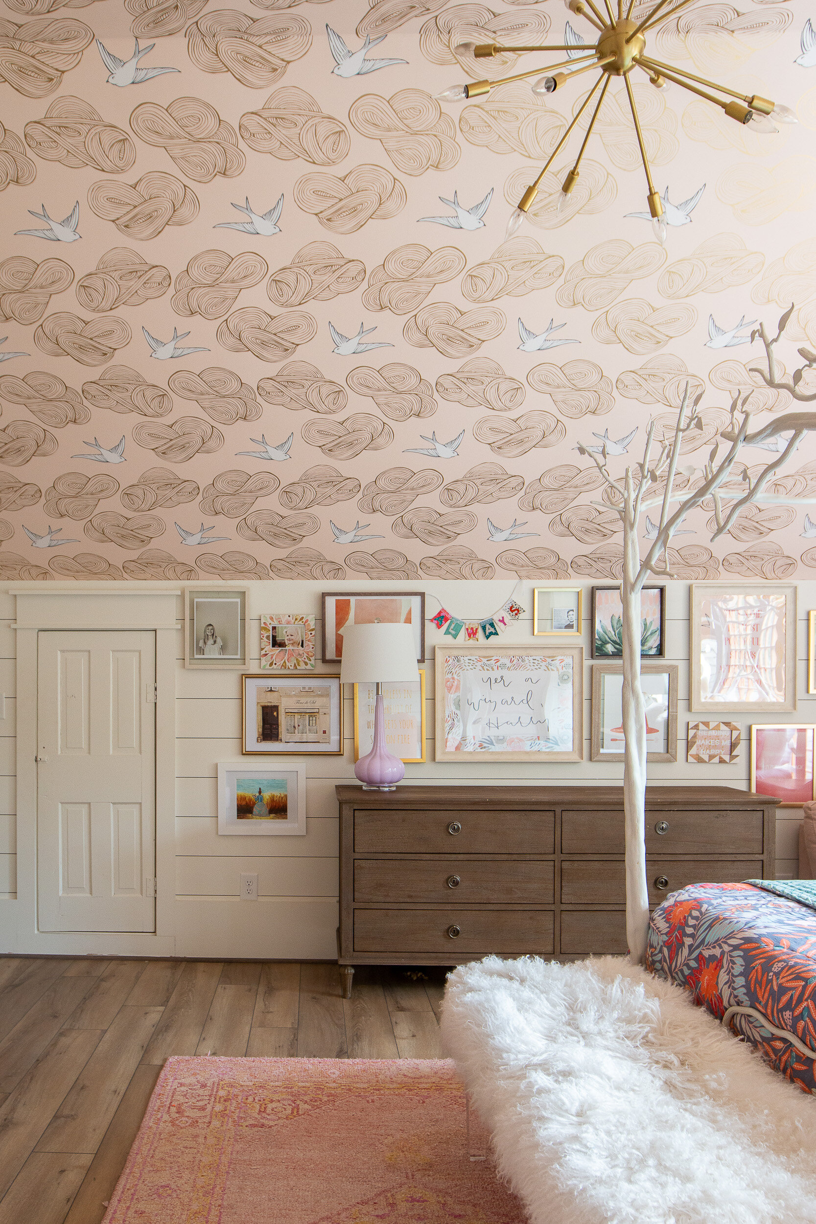
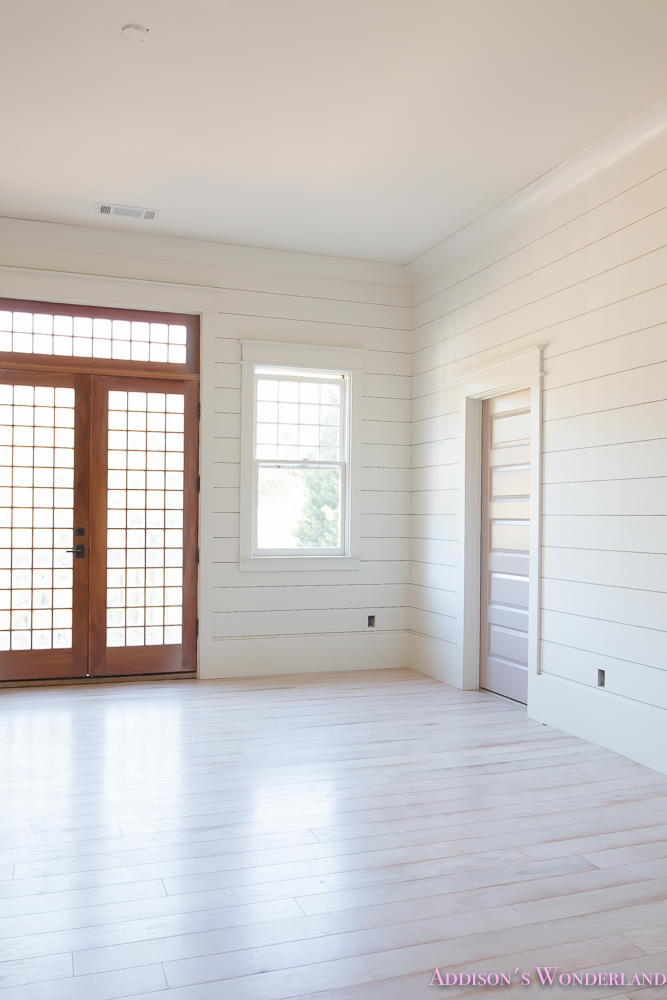
Once those changes were made, the plumbing and electrical were re-done, the insulation was sprayed and the sheetrock was installed, we were left with a HUGE, bright and beautiful bedroom. It turned out even more beautiful than I imagined. For the walls, we installed shiplap to accentuate the size of the room as well as the unique shape. You can read more about that HERE. And then it was time for flooring!
I am obsessed with flooring. To me, it’s the fifth “wall” of a space that can really make or break the final design. As I said before, this room turned out so bright! And I wanted to keep it that way. Next up in my decision making list was the fact that I determined with our last home that dark hardwoods DO NOT work for us. They were honestly a nightmare to keep clean! So with that in mind, I went hardwood flooring shopping! With none other than Shaw Floors…
I am SOOO excited and proud to be a Brand Ambassador for Shaw Floors for 2016 and 2017 as part of their new StyleBoard. In touring their enormous and incredible facility in North Georgia over the Summer, I am amazed at how much research and development goes into each and every product. They are committed to staying ahead of the trends while also maintaining their #1 rating in style, quality and design year after year! Not to mention that EVERY SINGLE member of their team is beyond wonderful, knowledgeable and so incredibly kind.
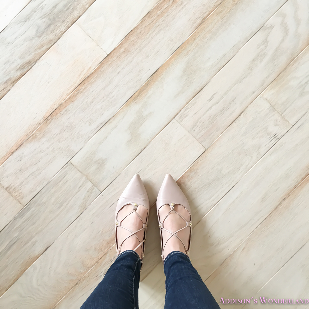
So here’s peek at just ONE of the whitewashed hardwood options that I fell head over heels for in their R&D facility late this Summer…
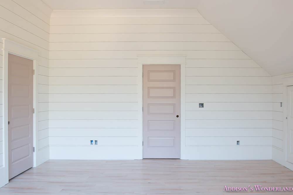
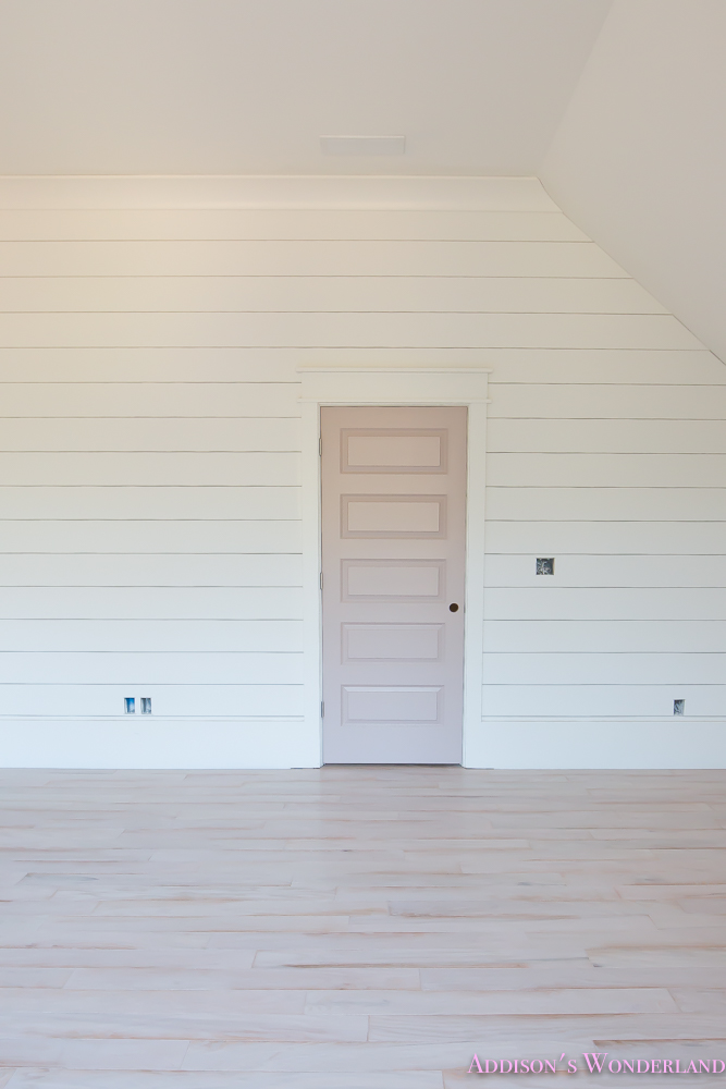
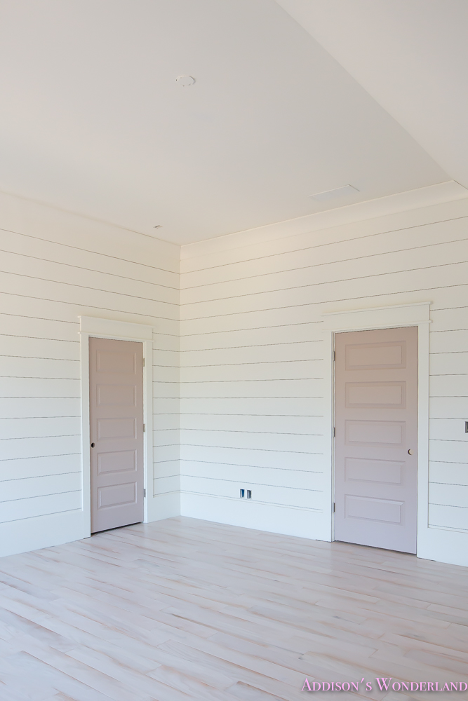
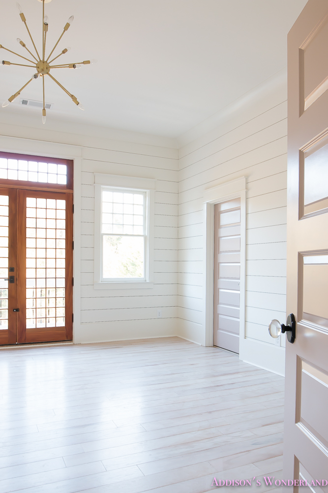
Whitewashed options can be so hard to find but Shaw Floors had so many light hardwood options that it was honestly hard to even decide! I ended up choosing THREE different light hardwoood flooring selections throughout our home. The Muir’s Park Bridal Veil is part of their new line and was installed in our master bedroom, Winter’s bedroom and Addison’s bedroom! So here’s a peek at Addison’s room today…
And one last thing… A HUGE shout-out to Dalton Carpet One who did an absolutely AMAZING job on all of the Shaw Floors installations! Thank you Shaw Floors!
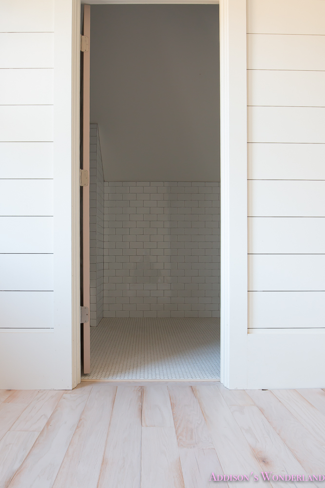
And here’s a sneak peek at her bathroom!
Make sure and follow Shaw Floors on Social Media!: Facebook, Twitter, Instagram, Pinterest, Houzz and even YouTube!
Wall & Trim Color- Alabaster by Sherwin Williams
Door Color- Doeskin by Sherwin Williams
And here’s a peek at Addie’s Bedroom post-construction!
Shop Addie’s Room:
XOXO, Brittany Hayes
+ view the comments
