It’s Time to Paint the Big Green Monster!
If you’ve been following our home restoration journey, you just might know exactly what I am referring to! And if so, you can continue on to the next paragraph 😉 If not, welcome to our journey! I have gotten so many new readers since my last “Our Historic Wonderland” post, and yes we are total dorks and did in fact name our home, that I thought I would give you a re-cap! To sum it all up… my husband Mark and I are crazy… self described home renovation junkies. We are on our fourth personal home and also flip homes as part of our company so we are a little obsessed with anything and everything home related. We can never ever pass up an amazing home project and are willing, ready and able to tackle just about whatever comes our way. And although we absolutely LOVE our current home, once we got word of a completely gutted 1906 charmer that had just gone on the market on our favorite street in town, we jumped at the chance to make our historic home dreams come true.
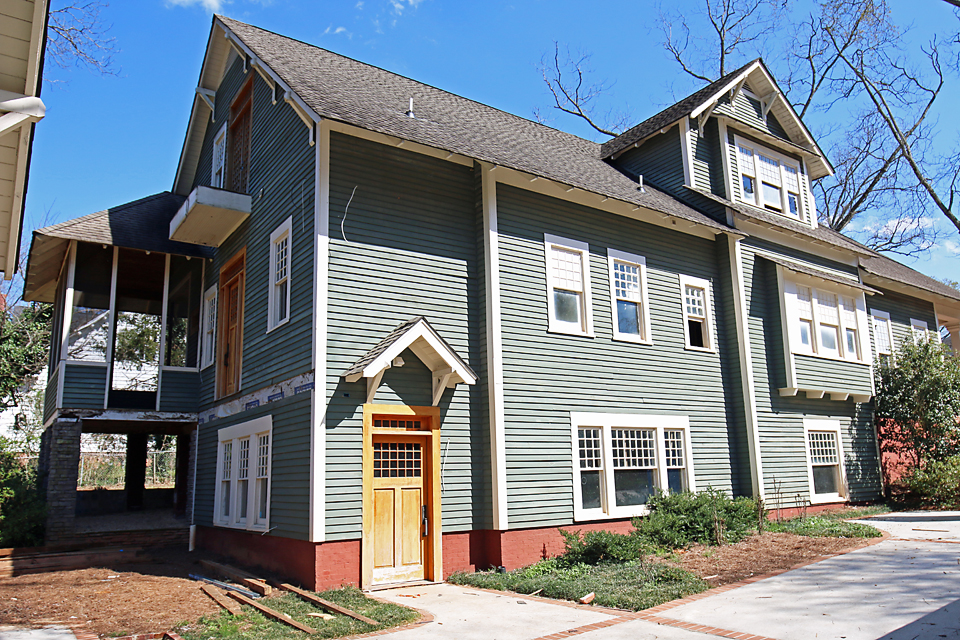
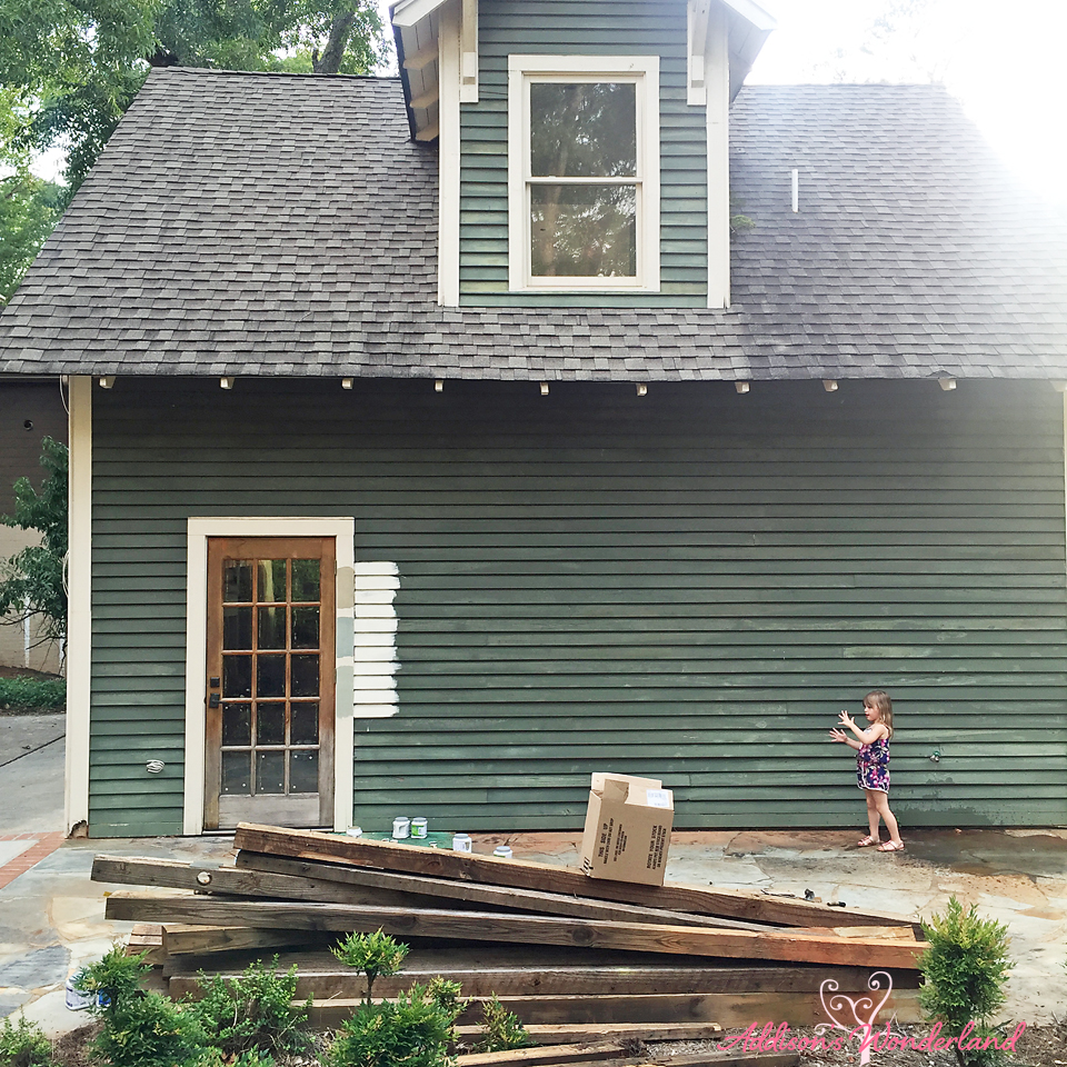
Last December, Mark and I purchased what some in town had dubbed the “big green monster”…
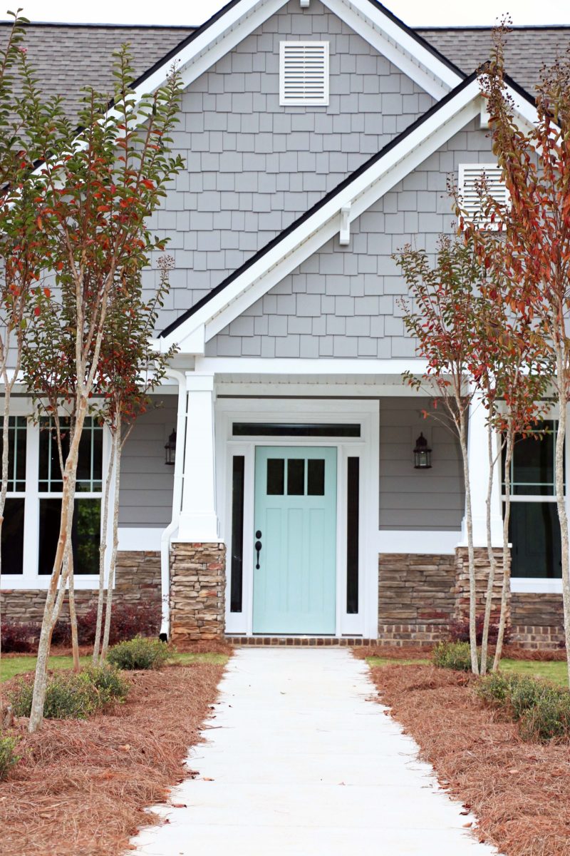
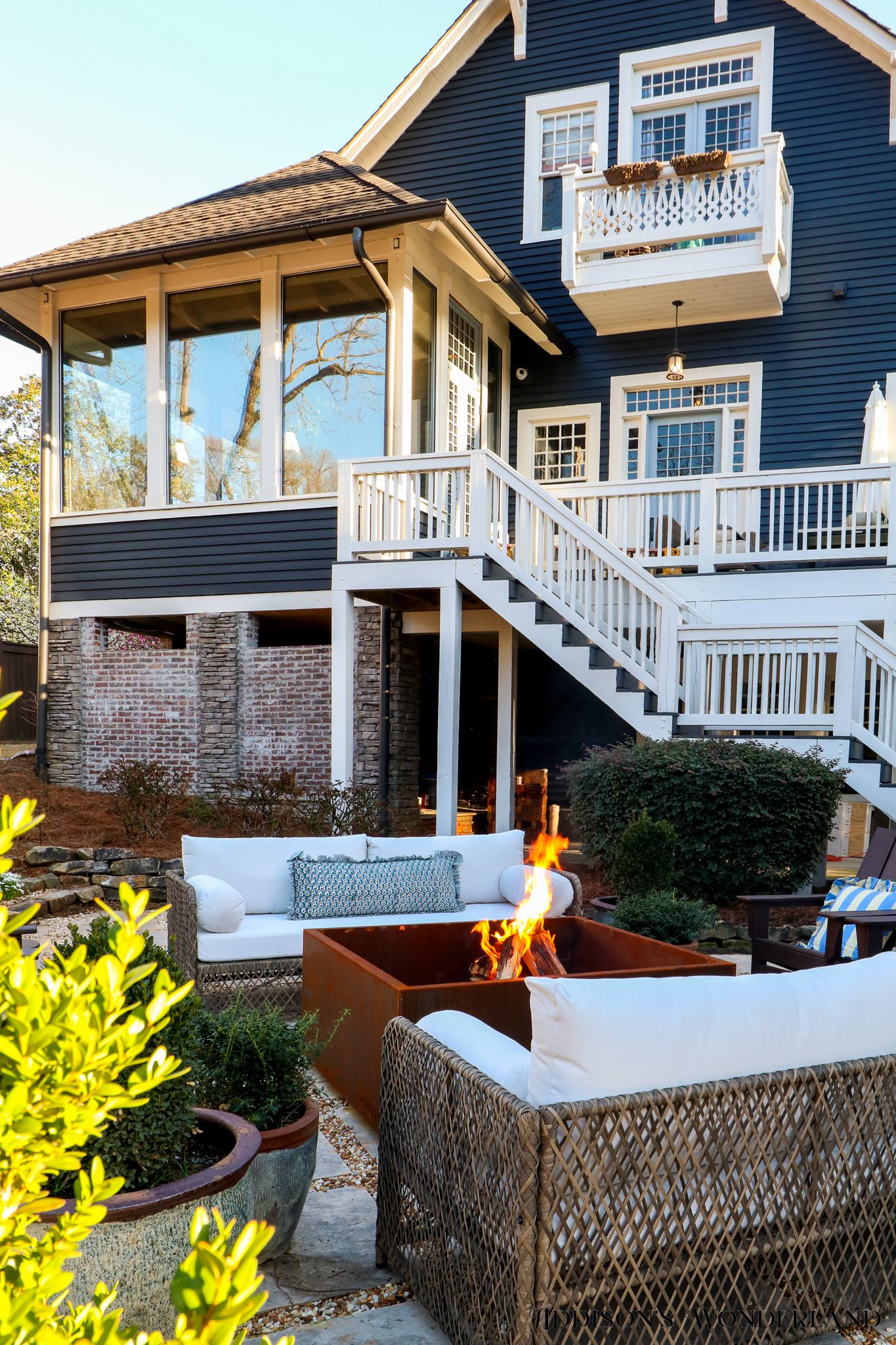
View the full exterior home tour here… “Our Historic Home Tour“
Otherwise known as our dream home. We have wanted to restore an older home for as long as I can remember. We almost purchased a much smaller home right down from this one over ten years ago but decided that was a bit out of our comfort zone at the time. Thank God. Oh and thanks Mom. Sometimes being married to someone equally as spontaneous and passionate can lead to not so great ideas.
So back to the “big green monster”. Although some of you absolutely love this color for some reason unbeknownst (I have never written that word. Ever. And it looks really strange written out) to Mark and I, we in fact do not personally like the green. Like really really want to change it. So next week is finally the day we have been waiting for for oh so long. Paint Day!
I had trouble deciding what to post today. SO much has changed and happened inside but the outside is literally getting painted early next week so I wanted to share my thoughts and ideas. But I STILL cannot wait to show you how much we have done inside! I just drank a Mountain Dew which is something I never ever ever do and so now I am wired. It was just sitting in the fridge calling my name and I needed something to motivate me to clean the house. So I drank it and decided to blog instead. Maybe not the best idea. Y’all are going to think I am nuts.
ANYWAYS, I am popping in to share my exterior paint ideas that we tested on the house several weeks ago. But first, back to things I do not like… this green color (in combo with the red brick) AND choosing exterior colors. Seriously so so hard. You’d think I would love it since I plan interior paint plans in my sleep but exteriors are tough! Plus, I don’t actually have too terribly much experience with them. Most of the homes we have done either didn’t need too much or were in planned communities with about four colors to choose from. Here is one home exterior that I did do a while back…
You can view all of the paint colors and see more images of this home here… “Home Sweet Home“
It turned out really beautiful BUT it was not easy, I did not like it AND it is NOT my forte! I was planning on sharing my inspiration images for our new house color BUT I learned last week at Haven that if you do not have written permission from the photographer, you can be sued. Like for real. SO, if you love me lots and would like to see them and share your feedback, they can be found on my Pinterest board… HERE. I just re-pinned them so they would be the first several that show up.
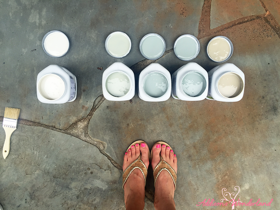
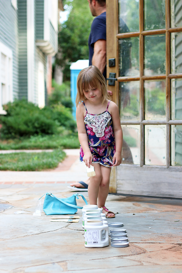
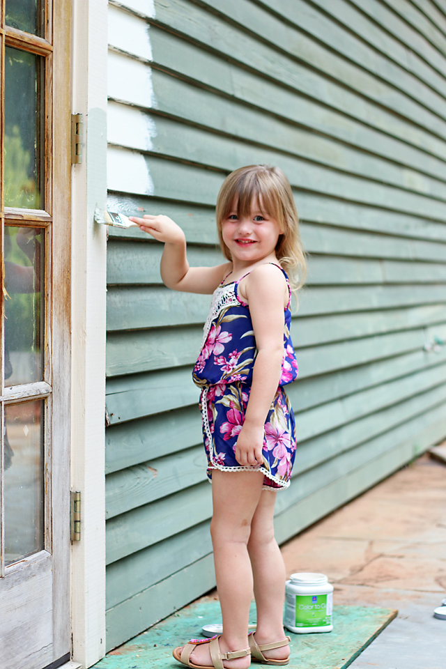
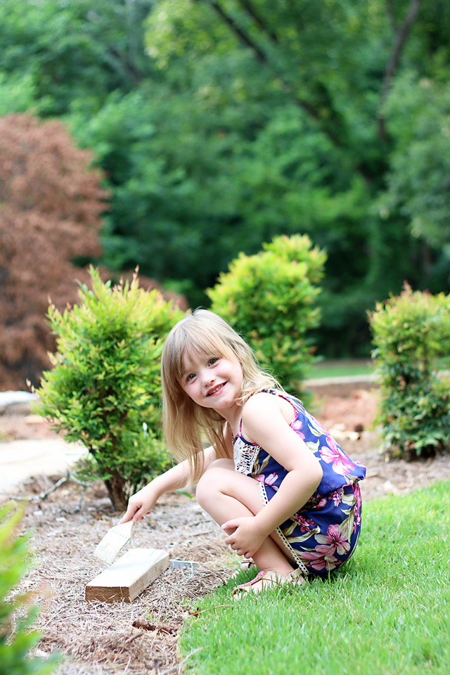
About three weeks ago while Addie was at the beach with a friend, Mark, Winnie and I picked up some sample quarts and had a little painting party…
Left- Ballet White by Benjamin Moore
2nd- Blue Gray by Farrow and Ball
3rd & 4th- Piedmont Gray by Benjamin Moore
5th- Brandon Beige by Benjamin Moore
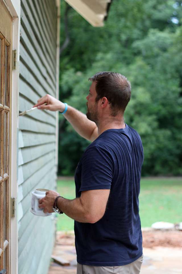
And here’s what we’ve got!
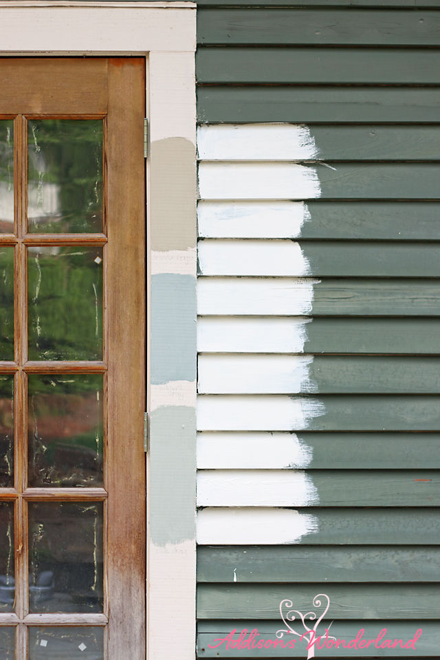
Main House Color- Ballet White by Benjamin Moore
Bottom Trim Color- Blue Gray by Farrow and Ball
Middle Trim Color- Piedmont Gray by Benjamin Moore
Top Trim Color- Brandon Beige by Benjamin Moore
So here’s the synoposis… I know, I think, that I want to do the exterior white. But not stark white. I love the creaminess of Ballet White by Benjamin Moore but Mark wants to try something a wee bit whiter. From there, I either want to paint the trim and/or the sashes a darker color. We both love Piedmont Gray which is the middle color on the trim. Would LOVE to hear your feedback!!
Stacy says
Not that I know anything about anything, but I’d also pick something “whiter” for the main house. But the middle trim color is spot on. So pretty! Good luck!!!!!
Brittany Hayes says
Mark definitely agrees! Thanks for the feedback! XOXO
Meada says
I personally really like the warmth of the base color. The bottom two are very beautiful colors but in the picture they “read” blue (middle) and green (bottom), maybe it’s lost in the photos but my personal concern would be that if a couple years down the road I wasn’t feeling the blue/green hue I’d be stuck. The top color looks warm next to the base and is neutral enough that you could switch out door/shutter/decor colors as you wish. But that is just what I’d do on my own house. Everything you do is great so I’m sure you can’t go wrong. Can’t wait to see!!
Tina K says
I did the squint test and the Piedmont Gray balanced perfectly with your choice of Ballet
White. I say get what you want and you’ll never have any regrets. You have such a great eye that no matter what you choose Its going to be beautiful. Good luck!!!!
Kelly says
Such a gorgeous home! I think the reason some people (including me!) like the existing green paint color is that it’s historically appropriate. You’ve got a pretty classic example of Arts and Crafts style (those sixteen over one windows are perfection), and homes of that style were almost always painted in colors that reflect nature: mostly greens, golds, and earthy tans. I know your style doesn’t lean toward warm colors, but perhaps you can pay homage to your home’s architectural style by choosing a warm gray tone rather than the whiteB (Something like this, perhaps? Black sashes are back in style! http://www.oldhouseguy.com/blog/wp-content/uploads/2013/09/craftsman-paint-colors.jpg ?) Unfortunately, white just isn’t a color that would have been used in Arts and Crafts exterior color schemes. Sherwin Williams has a line of historically appropriate paint colors that you could check out!
Mari says
I agree with, Meada in that everything you select is “spot on”. Not sure you have to stick with the “period” colors of the architecture unless you are keeping with “period” styling on the inside as well. Go with your gut and what you LOVE because in the end, that’s all that matters and the fact that you have a successful blog and business tells us all that you’ve got great taste and a talent. I personally love the middle Piedmont Gray for an accent color.
lbpv says
Although I personally like the green I can see that it needs an update and a “sprucing up”. I agree with the idea of paying homage to Arts and Craft style and I think you can do that in your unique way. Looking forward to seeing what you do! And I believe your blog is successful not only because of your design talent (you like a lot more color than me and thats okay) but because you have a great “voice” and you are interesting and I want to hear what you have to say and can ofter relate.
Kristen Cornelius says
I love the way the Piedmont looks with the white. I think it’s going to look gorgeous and totally different when yall are finished. I agree, the green, no not so much. Good luck and looking forward to the finished product:)
Brittany Hayes says
Awe thank you! Gosh it’s so hard to decide!! XOXO
Sarai says
I like the
Top Trim Color- Brandon Beige. I’ve seen many homes with similar colors and looks beautiful! Excited to see what you’ve chosen. 🙂
Brittany Hayes says
Yes, I loved that one too! So many homes I pinned were white with beautiful light brown trim. So traditional and stunning! XOXO
Laurie says
I loved the green! I went to your Pinterest board and I see a dark blue gray house, I like that one. But I’ll agree, the white with the Piedmont will work good. I look forward to seeing the end result!
Brittany Hayes says
Awe haha yes so many people have! Mark and I just aren’t really “green people”. LOL! And yes, you’ll have to read my newest post because I am starting to lean more toward the dark! XOXO
Brianna says
You and I are kindred spirits when it comes to color. Five years ago my house was painted and decorated in the exact same color scheme as your current house. As far as the new house… For sure the middle one for the trim. I’m of the mindset that you should do whatever you want to the house that YOU bought. Paint it teal with an orchid door if you want. Paint a mural of unicorns on the back. Sure it’s an historic home but it’s still YOUR home. Can’t wait to see what you do with it!!
Brittany Hayes says
Haha awe thank you!! Yes, I always agree that your home should reflect what YOU love! This one is just so hard because it’s historic and super traditional and in such a beautiful neighborhood. I may do something more fun with the front door but definitely doing my thing on the inside! Thanks so following along! XOXO
Karen says
Personally, I love the Ballet White. It has the warmth and looks a bit antique and aged, which is what an older house needs.
For the trim, I prefer the the bottom color, Blue Gray. It’s understated and will add a modern touch to the classic white base. That Piedmont Gray reads blue to me…. like, 1980’s blue.
Honestly, I’m really surprised by your choices. You have a fearless love of color, so I was really expecting something more bold from you. Looking at your Pinterest board, are you sure you don’t want to go with that dark, dark gray/black with white trim? I think it would be stunning.
Brittany Hayes says
Thanks so so much for the feedback! Yes, I definitely agree with you. Surprisingly I am much more traditional when it comes to exteriors. Especially in our new neighborhood! And yes, you’ll have to read my newest post because I am starting to lean more toward darker now! XOXO
Nicole says
I love the picture of the gray house with white trim and a colorful door! However I am a big navy blue with white trim person too. Ok I like light a light sage green too with white trim… I’m not helping lol. The gray house caught my attention the most especially that colorful door!