Addison's Wonderland

  • Blog
  • Shop
    • Fashion
    • Home Decor
    • Gift Boxes
    • Brick and Mortar
  • Stay
  • Design
  • About
    • Our Story
    • Contact
    • Press
  • Tour

August 15, 2016

Having Second Thoughts…

White Dove Piedmont Gray 2

WANT TO MAKE SURE YOU CONTINUE TO FOLLOW ALONG ON OUR RESTORATION JOURNEY?

Never Miss A Blog Post!

*
Deal of the Day:
FullSizeRender (4)
Up to HALF OFF Hunter Boot SALE! (Click HERE for Affiliate Link)
 
This weekend was comprised of serious first world problems… A severe loss of sleep (okay, kidding) over dang exterior paint colors. As I chatted about in my last post on this very same matter, exterior colors are my arch nemesis. I can plan interior colors in my sleep. Sometimes I literally create the best paint plans at around 11:30pm when my head hits the pillow. They look freaking amazing. In my head. And then come 7am the next morning, I can’t remember a single thing. Why is it that our brains work best around that hour? I tell Mark goodnight and he’s always like “ugh, you woke me up!”. I mean seriously (insert eye rolling emoji)…

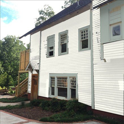
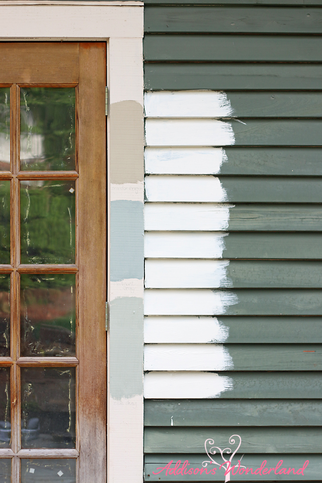
Back to paint colors… So I have been glued to Pinterest for about a week now. And every single time I search “craftsman white exterior” absolutely nothing comes up. Seriously try it. It’s crazy. I know… I know… I know… Craftsman homes aren’t historically white BUT I just had my heart set on something light and bright. Something different. But I just can’t seem to visualize it.

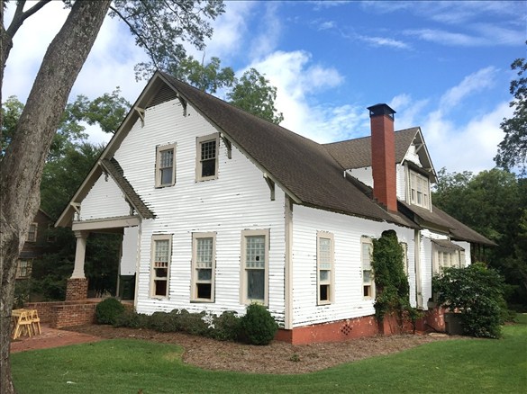
Sunday after church we picked up several more quarts at the paint store and headed over to OHW to try out a couple more. And I just CANNOT DECIDE!!! The painting crew is literally getting started today but they do have several days of scraping and wood repair before I actually have to purchase the paint. And then I got to playing on Benjamin Moore’s Personal Color Viewer paint visualizer. And I have to admit… I started to kind of fall IN love with a dark charcoally blue and fall a little OUT of love with the white. See what I mean?!?…

OHW Exterior

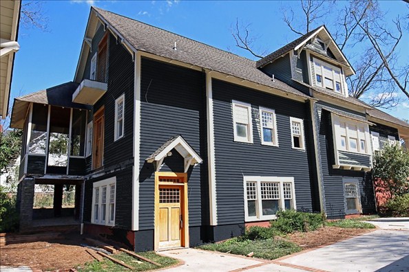
For some reason this image did not work the best with other colors so I found another image from another angle where the lighting was better and the color visualizer seemed to work better.

Here are some ideas and let me know in the comments below what YOU like best!

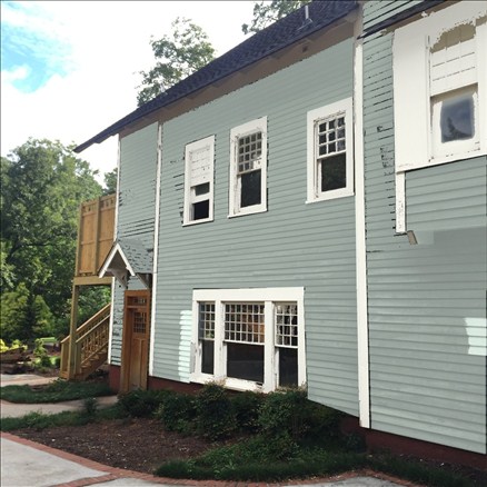
So here was our favorite combo from my last post…

Craftsman Home Exterior Color Ideas

Ballet White Siding & Piedmont Gray Trim (middle trim)

And here they are on the visualizer (you can see that it definitely doesn’t work perfect but it gives you an idea)…
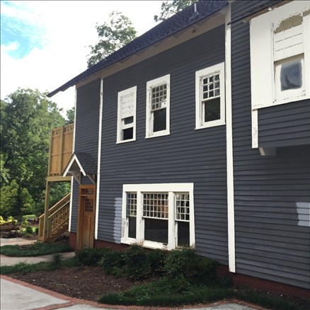
OPTION #1

Ballet White Piedmont Gray

Ballet White Siding & Piedmont Gray Trim

OPTION #2

White Dove Piedmont Gray 2

White Dove Siding & Piedmont Gray Trim

OPTION #3

Black Ink Pure White

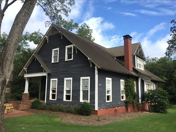
Black Ink Siding & Pure White Trim

OPTION #4

Charcoal Slte White Dove

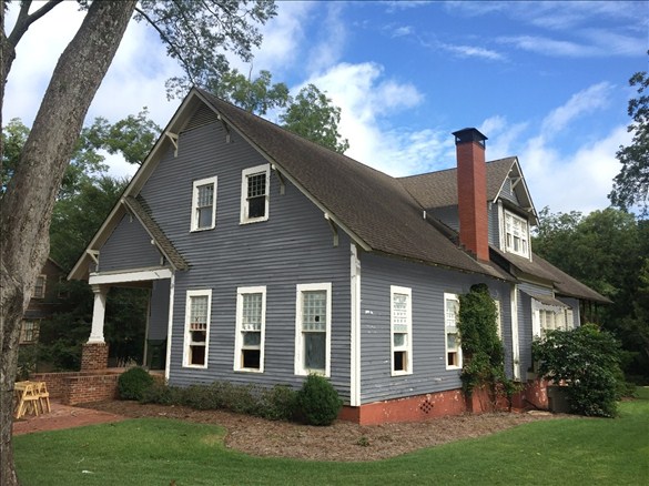
Charcoal Slate Siding & White Dove Trim

OPTION #5

Piedmont Gray White DovePiedmont Gray White DOve 2

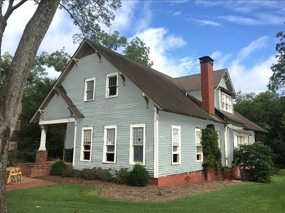
Piedmont Gray Siding & White Dove Trim

OPTION #6

Pure White Stone Hearth

Pure White Siding & Stone Hearth Trim

OPTION #7

Revere Pewter White Dove

Revere Pewter Siding & White Dove Trim

OPTION #8

Soot White Dove

Soot Siding & White Dove Trim

OPTION #9

Swiss Coffee Brandon Beige

Swiss Coffee Siding & Brandon Beige Trim

OPTION #10

Witching Hour White Dove

Witching Hour Siding & White Dove Trim

You guys are THE BEST!

XOXO, Brittany Hayes

126 Comments - Leave Yours

« It’s Time to Paint the Big Green Monster!
Come and Take A Peek Inside! »

Comments

  1. Karen says

    August 15, 2016 at 11:50 am

    Wow… I just commented on your previous post that I think you should go darker!

    #10…. hands down. That looks amazing and seems so much more YOU!

    Reply
    • Brittany Hayes says

      August 15, 2016 at 11:55 am

      Yay thank you!!!!

      Reply
  2. Heather says

    August 15, 2016 at 11:54 am

    #4 and #8 are my favorites! They really suit your house. I think light and bright is better suited for interiors, but that’s just me!

    Reply
    • Brittany Hayes says

      August 15, 2016 at 11:55 am

      Thanks so much for the feedback! Starting to agree! XOXO

      Reply
  3. Amy G says

    August 15, 2016 at 11:59 am

    I have a hard time picking out paint colors but I love the darker paint colors like option 10. Pinterest is a great tool for paint color searching but you end up being persuaded by whats on trend and not what you really like. I can’t wait to see it all finished especially what hardwood you pick out.

    Reply
  4. Wendy says

    August 15, 2016 at 12:00 pm

    I love #5 and 6 🙂

    Reply
  5. Katie Taylor says

    August 15, 2016 at 12:00 pm

    After I read your post last week I was going to suggest Roycroft Pewter SW 2848. It’s even in their “historic” paint line.

    Reply
  6. JB f/ HH says

    August 15, 2016 at 12:02 pm

    Love the Piedmont Grey with White Dove Trim! It’s been wonderful watching you all working on this house.

    Love your Blog BTW!

    Reply
  7. adrienne talley says

    August 15, 2016 at 12:07 pm

    #10!!! Before you even go to a dark navy charcoal, I was thinking a navyish color with white trim. My friend recently bought a brand new house and it’s a navy with white trim….beautiful!!

    Reply
  8. Tiffany says

    August 15, 2016 at 12:09 pm

    I like option #5

    Reply
  9. Heather says

    August 15, 2016 at 12:10 pm

    I love #1 and #4 – but I am way more drawn to the lighter colors on this home! I feel the darker colors, although beautiful, don’t make the house “pop”.. The historic characteristics stand out so much more with the lighter colors, it really draws your eye to the home.

    We painted our home a dark charcoal color with white trim four years ago, and although I love it, I am itching for something lighter and fresher in just four short years!

    But, ultimately, I know whatever you choose will be stunning! 🙂

    Reply
  10. Samantha Haringa says

    August 15, 2016 at 12:11 pm

    #3 or #8

    Reply
  11. Lindsay says

    August 15, 2016 at 12:12 pm

    Our house was originally a very light gray color. We repainted it Black Fox by Sherwin Williams with White Trim. We love it and get so many compliments. I vote for the darker color options!

    Reply
  12. Jen Robison says

    August 15, 2016 at 12:16 pm

    I love all of the dark options! I really wanted to paint my home dark, my favorite pin on Pinterest is of a home that’s dark with white trim. My hold backs on it were 1- someone told me the darker you go it’ll have to be repainted much sooner? 2- What does it do to your A/C bill? If you have a lot of trees shading your home (not the case with my home) then I’m sure it’ll help. All that said, my vote is dark!

    Reply
  13. Debbie says

    August 15, 2016 at 12:18 pm

    I think the white siding just doesn’t work…and I am always a white girl. I like #4, #8, & #10 the best…good luck

    Reply
  14. Angie Lutes says

    August 15, 2016 at 12:19 pm

    I vote for soot siding and white trim! I love the way the red brick looks richer with the soot color.

    Reply
  15. Sue says

    August 15, 2016 at 12:21 pm

    Love the navy with white trim. It’s so dramatic and beautiful.

    Reply
  16. Crystal says

    August 15, 2016 at 12:24 pm

    I love #10! Love the darker siding and pops of white!

    Reply
  17. Celeste Smith says

    August 15, 2016 at 12:26 pm

    We just painted the exterior of our home. I was like you, indecisive on the colors I wanted. I must have had 20 colors painted on the side of my house. It’s a huge decision! Finally, I made up my mind. I used SW paint colors, Shoji White (7042) for the body of the house, Pavestone (7642) for the trim, and Dutch Tile Blue (0031) for the porch ceilings and front door. Our home has red brick accents like yours 🙂 I am very happy with the way it turned out! It is similar to option #6 & 9 on the blog. Good luck!!! I know it will be beautiful!!

    Reply
  18. Miranda Anderson says

    August 15, 2016 at 12:31 pm

    Option 3,8 or 10 (if I’m reading the captions correctly) you can’t go wrong with that dark blue/gray/soot !!! I seriously LOVE that color ONLY on the right homes and this is one of them that it works. Honestly I don’t care for ANY of the white/lighter colors on this house at all. You have amazing style and I can’t believe that you could go wrong w any thing that you choose, but I totally get being stuck on picking out a color for something. I’m the same way. But seriously, go for the dark toned blues!!!

    Reply
  19. Meada Spencer says

    August 15, 2016 at 12:31 pm

    Option #3. The Black Ink Siding and Pure White trim looks fabulous!!! Although any of the darker base colors seem to just “suit” this house better than the lighter colors. Good Luck!!

    Reply
  20. Angela says

    August 15, 2016 at 12:32 pm

    I really like the contrast of a darker base with white trim. It really makes the house standout. Both #4 & #8 are great combos!

    Reply
  21. Vicki says

    August 15, 2016 at 12:32 pm

    I loved the green!!!! So disappointed you are not staying with that color.

    Reply
  22. Carrie says

    August 15, 2016 at 12:32 pm

    The white dove trim is gorgeous! I just can’t decide between #8 or #10, but if I had to choose I think 10 might be my pick!

    Reply
  23. kelmalley says

    August 15, 2016 at 12:35 pm

    Option #3 is by far my favourite!! Can’t wait to see what you choose!!

    Reply
  24. Cristi Dirks says

    August 15, 2016 at 12:45 pm

    I’m so glad you are leaning towards a dark body!! I’m voting #8 or #10!! You can use a fabulous punch of color for your doors!!

    Reply
  25. Jen Tyerman says

    August 15, 2016 at 12:52 pm

    I’d say dark with white trim. The dark colours capture the character of that old beauty so well!

    Reply
  26. Carol says

    August 15, 2016 at 12:55 pm

    Definitely go dark. Looks so much richer and brings out the craftsmanship of the home!! The light colors in this photo seem to hide to strong lines of the structure.

    Reply
  27. Kelly says

    August 15, 2016 at 12:56 pm

    Eeek! So many choices. I’m normally a white & bright kinda girl but the darker colors are screaming at me. 3 or 10 with beige trim is gorgeous! Can’t wait to see what you decide

    Reply
  28. Terri Stutevilke says

    August 15, 2016 at 12:57 pm

    Option 1. Don’t question it!!! Love it! It will look great with beautiful landscaping and lots of pretty flowers! Nothing and I mean nothing is prettier than a White House and I love the trim color in option 1

    Reply
    • Terri Stutevilke says

      August 15, 2016 at 1:09 pm

      And it would also look better with a metal roof!

      Reply
  29. Janet says

    August 15, 2016 at 12:58 pm

    Piedmont gray and white is my favorite! You love lively color and the dark/drab looks dead, it just is not you! And, all white is too boring!

    Reply
  30. Katie Platt says

    August 15, 2016 at 1:00 pm

    I love Revere Pewter! It looks fabulous
    on everything. It’s a great neutral that’s not too light or too dark.

    Reply
  31. Angie Duncan says

    August 15, 2016 at 1:16 pm

    I love #8!!!

    Reply
  32. Diana says

    August 15, 2016 at 1:16 pm

    #5 is my fave!

    Reply
  33. Lindsay @ Lindsay's Sweet World says

    August 15, 2016 at 1:24 pm

    #3 is definitely my favorite! You should definitely go darker!

    Reply
  34. Ashley Hayes says

    August 15, 2016 at 1:25 pm

    5, 8 or 10! As much as you love color, I think the white will leave you unimpressed after a while. I think all the colors are very clean and “safe.”

    Reply
  35. Cindy says

    August 15, 2016 at 1:29 pm

    I love 2, 8 and 10!

    Reply
  36. Nicole Wilson says

    August 15, 2016 at 1:31 pm

    #3, #8 or #10

    Reply
  37. Amber says

    August 15, 2016 at 1:32 pm

    Totally go with a darker option! The white does nothing for the exterior. The dark makes it pop! Good luck! I’m over here just trying to decide on a dining room color LOL!

    Reply
  38. Katherine B says

    August 15, 2016 at 1:36 pm

    Your first photo with the dark charcoal blue and white trim (not sure if it is also down below as one of the options under the official color name) is my favorite! The dark blue really makes your natural wood doors look fabulous! However, I am sure that whatever you choose will look beautiful!!

    Reply
  39. Stacey says

    August 15, 2016 at 1:51 pm

    #4 & #8 are my favs! The white colors just don’t do the craftsman justice.

    Reply
  40. Becky Mullowney says

    August 15, 2016 at 2:01 pm

    I agree with many of the other comments…Use a darker color on the house and white trim. My favorite colors are the Piedmont Gray, Charcoal Slate, and Witching Hour. If you are going to use a darker color….which one looks best against the brick?

    Reply
  41. Shannon says

    August 15, 2016 at 2:04 pm

    To me, the darker colors are more reminiscent of a traditional craftsmen’s coloring – black ink, soot, witching hour. I love all of those.

    Reply
    • Elle says

      August 15, 2016 at 2:24 pm

      Those 3 are my favorites too.

      Reply
  42. Jayne says

    August 15, 2016 at 2:19 pm

    #8 is my favorite, but #10 is right up there. Don’t go light on this house!!

    Reply
  43. Ali says

    August 15, 2016 at 2:19 pm

    10, 8 and 4! 10 is my favorite!

    Reply
  44. Alesia says

    August 15, 2016 at 2:33 pm

    3 a d 10 are my favorites!

    Reply
  45. Shannon haunie says

    August 15, 2016 at 2:35 pm

    I like the darker colors.. I think the lighter colors lose the charm of the house… Beautiful house…

    Reply
  46. Lucy Thurston says

    August 15, 2016 at 2:49 pm

    I love the darker color on that house. I think it gives it more character!

    Reply
  47. Kate says

    August 15, 2016 at 2:50 pm

    MUST DO 8 or 10!!! Those look much more appropriate with the house size and style and personally, I RARELY can get behind trim that is darker than the main house. I love white trim and think it looks the classiest for sure. 🙂

    Reply
  48. Jeannie L Swanson says

    August 15, 2016 at 3:11 pm

    Love the dark with white trim!

    Reply
  49. A. Boland says

    August 15, 2016 at 3:22 pm

    Option 5 is my favorite, with option 8 being my second favorite. Good luck!

    Reply
  50. Debbie says

    August 15, 2016 at 3:49 pm

    #3, #8, and #10 colors look great for your house! I’m not sure what it is either but maybe the height of the house and lighter color just makes it less impressive. Maybe if there were window shutters on all the windows and doing a darker color on those to contrast the lighter color on the siding that may work.

    I love the paint colors you chose for your parents’ house, and it fits it so perfectly. I was just thinking about those colors and may need to pin it for future reference.

    Reply
  51. Ashlee says

    August 15, 2016 at 3:52 pm

    Definitely darker! I love #3 or #8. Also, if you are painting the doors, a pretty AQUA would look great with the dark siding/white trim! Can’t wait to see the finished product!

    Reply
  52. Annie says

    August 15, 2016 at 3:52 pm

    I love #10, but it’s your house! 🙂 I don’t know how you’re going to decide! It’s not even my house and I had a hard time making a decision.

    Reply
  53. Beth S. says

    August 15, 2016 at 3:53 pm

    Option 8 or 10! Have you considered a violet neutral? I can’t remember the name of the color we used from Lowes for our 100 year old craftsman but I really liked the way it look with brick and white trim.

    Reply
  54. Mari says

    August 15, 2016 at 4:56 pm

    #10 Witching Hour!
    Gives it a rich look with depth.

    Reply
  55. Cassie says

    August 15, 2016 at 5:38 pm

    3, 8 , 10….LOVING the darks!!!

    Reply
  56. Darcy Potter says

    August 15, 2016 at 5:51 pm

    Love any of the darker combos with white trim!!! I am somewhat partial as we painted our house a deep blue, but I wish we would have gone darker. I like Blank Ink, Witching Hour and Soot for sure based on these pictures, but go with your gut and first instinct! You may regret going dark after wanting a light bright and white house 🙂 I think that in the end this house is such a classic it could pull off any color combo! Good luck and can’t wait to see what you decide!
    Hugs, Darcy

    Reply
  57. Latrelle says

    August 15, 2016 at 6:06 pm

    #10 looks great although the original green color still has my heart. This is a tough one, but it will be stunning just the same!

    Reply
  58. Jennifer says

    August 15, 2016 at 6:53 pm

    Witching hour! love the dark with the white contrast!!

    Reply
  59. Diane says

    August 15, 2016 at 7:18 pm

    #10 or even #8 for sure! I just think the light trim on dark looks so classy and the colors just pop! And plus the name Witching Hour???!!! How fun!

    Reply
  60. Ribyn says

    August 15, 2016 at 7:48 pm

    Option 10!!! Love the dark!

    Reply
  61. Tammy Damore says

    August 15, 2016 at 8:01 pm

    I like either 8 or 10, dark siding and white trim!!! It’s rich looking, has a lot of depth and goes best with the roof!

    Reply
  62. Kelly says

    August 15, 2016 at 8:49 pm

    Option #10 is my personal choice. Light colour choices just wash this house out and seems to lose all character. I say stick with the Dark exterior with light trim
    Good luck!

    Reply
  63. Laurie says

    August 15, 2016 at 9:17 pm

    Option 10, 5, 4 in that order!

    Reply
  64. Devin Self says

    August 15, 2016 at 9:39 pm

    3, 8, and 10!!! I have always LOVED the darker with bright, white trim! But, you have an amazing design style so anything you choose is going to look amazing!!!!! I can’t wait to see what you choose!

    Reply
  65. Allison says

    August 15, 2016 at 10:03 pm

    #7 is my favorite but also really like #4! Good luck!!

    Reply
  66. Tiffany says

    August 15, 2016 at 10:27 pm

    Definitely 3! Loving the ink and white. I’m sort of over the white trend. The dark pops:)

    Reply
  67. Jill says

    August 15, 2016 at 10:40 pm

    I love 3/6/8! So excited to see the outcome!

    Reply
  68. Melanie says

    August 15, 2016 at 10:47 pm

    The roof is so dark. IMO that is why the white doesn’t look right. I redid a 1970’s home and used a white but I have a cedar shake roof. White house with pitch black roof is harsh. The darker house color looks better with the dark roof.

    Reply
  69. Brittany Echols says

    August 15, 2016 at 10:47 pm

    Hmmmm…. Not loving the white body my 2 favs are 5 and 10… The dark seems to make the house pop more especially the fabulous Windows and doors and brick…

    Reply
  70. Stacey McGinty says

    August 15, 2016 at 11:00 pm

    None compare to #10. By far the best choice!

    Reply
  71. CBurrow says

    August 15, 2016 at 11:17 pm

    8 and 10 really pop!!

    Reply
  72. Jessica Iturrey says

    August 15, 2016 at 11:19 pm

    Hi, I am liking the darker options for your style of house. Particularly options 4, 8 and 10 really make it pop. It is always so hard to decide and it’s a pretty big commitment lol. I know whatever you decide it will look beautiful. Good luck!

    Reply
  73. Sarah says

    August 15, 2016 at 11:24 pm

    #7!

    Reply
  74. Chelsea says

    August 15, 2016 at 11:30 pm

    Witching hour siding with the white trim. It’s so.much more dramatic. Love it so much!

    Reply
  75. Monica Wagner says

    August 15, 2016 at 11:48 pm

    Exterior paint is sooooo hard for me! We built a custom home almost 2 years ago and I missed the paint color. The stone and the hardy just blend together, it just doesn’t have that pop! I swear the sample looked darker 🙁

    Just have to work on the hubs for a do-over! Lol

    Reply
  76. Elizabeth Good says

    August 15, 2016 at 11:50 pm

    Love #10. I think Gauntlet Gray would look beautiful!

    Reply
  77. Sandy says

    August 16, 2016 at 12:03 am

    Love the dark gray and white trim.

    Reply
  78. Kathryn Keith Sims says

    August 16, 2016 at 12:24 am

    Option 5 is my favorite of these but I can totally see your home in a deep teal with dove gray trim and a bright yellow or pink door!

    Reply
  79. Lorrie says

    August 16, 2016 at 12:37 am

    I love the darker colours with the white trim. Or you could go simple & classic with a White House and black/navy trim.

    Reply
  80. Ashley Gonzales says

    August 16, 2016 at 12:41 am

    # 4 Hands down, it’s a great combo of color not so dark and not too light

    Reply
  81. Kristin Z says

    August 16, 2016 at 12:48 am

    I love option 3. I also think a deep grey would be gorgeous. I just don’t love the white with the red brick. Option 10 is gorgeous, too!

    Reply
  82. Megan C. says

    August 16, 2016 at 2:11 am

    Definitely option 3. It’s just richer and has more depth.

    Reply
  83. Meg says

    August 16, 2016 at 7:11 am

    It know your feeling. I oversee reno’s. Residential and commercial (all personal). So there’s always that personal investment. I would definitely go with #4. Craftsman is by far my favorite architecture and a darker true to craftsman color really exsintuates the lines of the home. LOVE #4.

    Reply
  84. Kim says

    August 16, 2016 at 7:25 am

    Witching Hour with Dove White! Love it!!

    Reply
  85. emily says

    August 16, 2016 at 7:25 am

    darker!!

    Reply
  86. Eileen says

    August 16, 2016 at 8:37 am

    Oooh 2nd thoughts seem to have taken you in a gorgeous direction!! I love witching hour and/or soot with white dove the most. Then charcoal slate combo, then Revere pewter combo… the lighter options are very pretty too but I just love the crisp boldNess of the darker combos and how they make the details on your windows pop. Good luck!!

    Reply
  87. melissa atkinson says

    August 16, 2016 at 8:52 am

    i am gravitating toward 3 and 8 . Can’t wait to see what you decide!

    Reply
  88. Kimb says

    August 16, 2016 at 9:02 am

    I love 10!

    Reply
  89. Leigh says

    August 16, 2016 at 9:27 am

    Definitely go dark!! I like 4, 8 and 10

    Reply
  90. KaraLee says

    August 16, 2016 at 9:41 am

    I diffently like the darker color’s #8 & #10 are my favorite.
    You are amazingly talented & love your inspiration !!!
    God bless!!

    Reply
  91. Katie Hayes says

    August 16, 2016 at 9:45 am

    I love options #3, #8, and #10. The dark, rich colors just really seem to enhance the features of the house. I think lighter paint colors look better on maybe smaller homes with a little more feminine detail. Darker paint with light trim definitely seems to be the direction to go with OHW, but I know it will be absolutely stunning no matter what you decide!

    Reply
  92. Bridgette says

    August 16, 2016 at 10:12 am

    I would 100% go with White Dove! Stop second guessing your visions.

    Reply
  93. Louise says

    August 16, 2016 at 10:26 am

    It’s such a big house, you can afford to go so dark. I feel your pain, though. I agonized for weeks over the color choice for my sunroom. Something about outdoor light just changes paint so much. Good luck!

    Reply
  94. Robin says

    August 16, 2016 at 10:37 am

    As much as I love a white house, I really love the way the dark paint looks on your home. I would go with 8 or 10. But, of course, at the end of the day you get to come home to this beauty so go with what makes your heart sing!

    Reply
  95. Debra Priest says

    August 16, 2016 at 10:38 am

    option #1, for sured!

    Reply
  96. Ashley says

    August 16, 2016 at 10:49 am

    Love #4. It’s not to dark and makes the house pop. I think hat color would look amazing with some stained wood accents maybe your deck and front door.

    Reply
  97. Charla says

    August 16, 2016 at 10:55 am

    I know that in this modern day, light and bright seem appetizing. BUT this house has an aura from a different era, so I think option 10 (I actually think the green that it has now looks best!!!!) might be the only way to meld the inside with the “spirit” outside. ♡♡♡ Love this blog!

    Reply
  98. Jill Lee says

    August 16, 2016 at 11:08 am

    I definitely think the dark siding with white trim is the best, it showcases the beautiful brick and makes all the trim pop! I made this decision on our house 13 years ago and have never regretted it! and have fun with the front door color if you can, I change mine every few years! Can’t WAIT to see this house when it’s done, as I’m sure you can’t either!

    Reply
  99. Amy says

    August 16, 2016 at 11:23 am

    Oh I normally would say go with the white but these dark colors look AMAZING on your house. I love #8 and 10. So much so I’m going to try these on our house. Thank goodness my hubby owns a painting company.

    Reply
  100. Gwen says

    August 16, 2016 at 11:25 am

    #8
    Love Revere Pewter always

    Reply
  101. Rebecca says

    August 16, 2016 at 11:40 am

    Option 10 makes the white trim pop. It is such a clean line. That’s my vote.

    Reply
  102. Michelle says

    August 16, 2016 at 12:10 pm

    I like #4 but #10 just screams crisp & clean to me!!!

    Reply
  103. Deborah H says

    August 16, 2016 at 12:19 pm

    For your home, I’m drawn to the darker colors with the navy undertones. I get warm, cozy, historic vibes yet still it’s still fresh. I especially like the darker color against the red brick and the tone of the doors. Best wishes! PS- I just painted the exterior of my home all white with greyish/blue shutters and LOVE it, so I’m surprised too that I’m drawn to the darker colors for yours.

    Reply
  104. Debbie Morgan says

    August 16, 2016 at 12:33 pm

    Without shutters the only one I like is the dark color. Your house has a historical feel, with the colonial red, have you considered the Ben Moore Historical collection…. i have used them many times and mixed them with brighter colors as well. They are definitely one of my go too’s!…

    Reply
  105. Courtney says

    August 16, 2016 at 2:34 pm

    I love options 8 & 10. This is such a charming (humongous) home. I think the light is too safe of a choice. The darker (navy) shades give it tons more personality!!

    Reply
  106. Carrie says

    August 16, 2016 at 2:41 pm

    I don’t know… I think I like the lighter colors for the exterior. i would say just go with your gut and what you like. Also, I found tons on Pinterest by searching white craftsman house. I think they look good!

    Reply
  107. Melissa S. says

    August 16, 2016 at 2:59 pm

    10! The darker the better – stunning!

    Reply
  108. Shari says

    August 16, 2016 at 3:41 pm

    Definitely option 4 or 10. We have a craftsman style home and I love the color which is grey with white trim. Just so classic looking. Good luck and go with your GUT instinct

    Reply
  109. Morgan says

    August 16, 2016 at 4:23 pm

    8! I love the dark with the blue tone on your home!

    Reply
  110. Cathy Clark says

    August 16, 2016 at 6:36 pm

    Any of the darker colors for body and light for trim!

    Reply
  111. Regina Simpson says

    August 16, 2016 at 8:45 pm

    I think #9!

    Reply
  112. Debbie Tavares says

    August 16, 2016 at 10:48 pm

    Really love #8 and #10 the darker colors look best and really bring out the red brick beautifully!!!!!

    Reply
  113. Christy Ennis says

    August 17, 2016 at 9:47 am

    Are you painting the red brick? Because that would make a huge difference in the exterior color choice. If you are leaving the brick as is, I would go with option 6 or 8.

    Reply
  114. Yessy's Designs says

    August 17, 2016 at 10:46 am

    I love #10… The house is gorgeous and I am sure what you choose will be gorgeous… Can’t wait to see what you do on the inside. Enjoy all the process

    Reply
  115. Abbey Browning says

    August 17, 2016 at 11:07 am

    Love Option #1 and Option #7!! I say follow your gut, I personally love the light color!

    Reply
  116. Andrea says

    August 17, 2016 at 11:48 am

    I’m a little late commenting, but definitely dark siding color!! There are a few houses near me with the dark blue gray ish siding and white trim and they just look gorgeous!!

    Reply
  117. MissHazel says

    August 17, 2016 at 2:36 pm

    Any if the darker options!!! Love them! Be bold!

    Reply
  118. Natasha says

    August 18, 2016 at 10:23 am

    There is a house down the street from us that was just built… Big beautiful craftsman… In white

    Reply
  119. Heidi says

    August 18, 2016 at 2:38 pm

    I just went through the same thing – over analyzing hundreds of colors! I feel your pain!
    My two cents- i like the piedmont siding!

    Reply
  120. Janette Moreno says

    August 21, 2016 at 9:04 am

    I love the charcoal slate and Piedmont gray options! ♥️

    Reply
  121. Andrea says

    August 25, 2016 at 12:29 pm

    4, 5 and 9

    Reply
  122. Farah says

    April 19, 2018 at 10:40 pm

    Dark for sure!!! #8 is my favorite!!!!

    Reply

Leave a Reply Cancel reply

Your email address will not be published. Required fields are marked *

If you follow me on stories, you know that making If you follow me on stories, you know that making homemade pasta and sauce is a regular thing around here! #ad Finally sharing a full tutorial with the simplest of ingredients and cutest kitchen accessories all from @walmart ♥️ #Walmart 
Follow my shop @addisonswonderland on the @shop.LTK app to shop this post and get my exclusive app-only content!
#liketkit #LTKhome #LTKunder100 #LTKunder50
@shop.ltk
https://liketk.it/40aLn
Gotta leave the house with a good cup of coffee AN Gotta leave the house with a good cup of coffee AND a beautifully made bed? ME TOO!!! 🙋🏻‍♀️ A few days ago on stories I was chatting about how huge, fluffy pillow inserts can MAKE a pillow sham! I feel the same about a comforter or duvet insert too. Layers and fluff make all the difference 🥰 P.S. My personal fave… @brooklinen is having a HUGE SALE so I linked it in my bio. Not sponsored… just love it and sharing. Happy Weekend!!!!!! 
Follow my shop @addisonswonderland on the @shop.LTK app to shop this post and get my exclusive app-only content!
#liketkit #LTKstyletip #LTKunder50 #LTKhome
@shop.ltk
https://liketk.it/3ZUQe
Is your house still recovering from all of the gli Is your house still recovering from all of the glitter, snow and pine needles? Don’t worry… you have one whole month until the next Holiday! 🤣 We’ve been through one too many stik vacuums over the last few years but between the lack of suction and the inability to stand up on their own, they’ve all driven me CRAZY!!! Last Fall we got the Brand New @hoover Emerge Stik Vacuum and immediately ordered one for my boutique and our cabin! It is LIGHT YEARS better than any we’ve tried so happy to say… our hunt is over! P.S. It also converts into a hand vacuum with attachments for everything from vacuuming out your car to cleaning your baseboards! #HooverPartner
The perfect addition… to cozy up your kitchen ♥️ One thing about these rails is that although they are often thought of as something you hang over a stove, you can actually hang them most anywhere in your kitchen. Almost any backsplash spot, a side wall or even over a console. I actually love when people double them up and hang tons of pots and pans! P.S. If you are worried about things getting dirty over your stove, simply hang items you use often and they’ll make their way through the cleaning cycle quite a bit. Even this little basket can be thrown into the wash 🥰 Everything is linked on today’s blog post and right here…
I know… I know… Christmas 2022 is well in the I know… I know… Christmas 2022 is well in the books BUT I did have four unexpected surgeries in December so technically I feel like I should have four extra weeks of Holiday shares… right?!? 😉 But I’ll leave it at one… AND technically it isn’t mine so I’m just bragging on my girl Ab 🥰 Hehe I’ll stop blabbing and leave y’all with a peek at Ab’s beautiful Holiday home she shared on the blog a few weeks back (linked in bio). If you want to see more of Ab AND more AW design, pop over and follow our new “behind the AW design scenes” page she’s running… @keepingupwith_aw ♥️ We also have some big news about Ab and her role with AW but I’ll save that for later too. WHEW! I think I’m done now. Goodnight friends!!!  Follow my shop @addisonswonderland on the @shop.LTK app to shop this post and get my exclusive app-only content!  #liketkit #LTKunder50 #LTKSeasonal #LTKhome
@shop.ltk
https://liketk.it/3ZciM
WE FINALLY DID IT! 💃 Made it back onto the gram WE FINALLY DID IT! 💃 Made it back onto the gram after a rough month AND created my very favorite DIY project EVER! Can you believe this is our new trash can?!? Once we figured out how to make it work and got to rolling on it, it was smooth sailing! Today on the blog I shared a very very detailed tutorial so you can make almost any cabinet you find into the cutest trash can EVER 💗 So happy to be back! Missed y’all bunches! XOXO, John & Brittany
Rushing around getting Holiday ready? Two weeks fr Rushing around getting Holiday ready? Two weeks from today is the day! 🎄 #WalmartPartner I may not be able to help you turn on the trees, light all the candles, wrap all the gifts or clean the house but I can definitely help you look cute while you’re doing it all! I ordered so so many cute pieces from @walmartfashion and I’ve rounded up all my personal faves. From hot pink heels that’ll instantly dress up any look to metallic pants that’ll make your hubby do a double take ♥️ Linked them all right here… #WalmartPartner 
Follow my shop @addisonswonderland on the @shop.LTK app to shop this post and get my exclusive app-only content!
#liketkit #LTKSeasonal #LTKunder50 #LTKHoliday
@shop.ltk
https://liketk.it/3X2lg
Living in a historic home is pure magic ✨ John a Living in a historic home is pure magic ✨ John and I both always say that we aren’t sure we could or would ever give up our 1908 home ♥️ So many fun nooks, features and little surprises around every corner. Including our five fireplaces!

Visit Addison’s Wonderland

Please call Abigail with any questions! 678-206-7272

Copyright © 2023 · Addison's Wonderland · Design By Alpine Lane · Privacy Policy