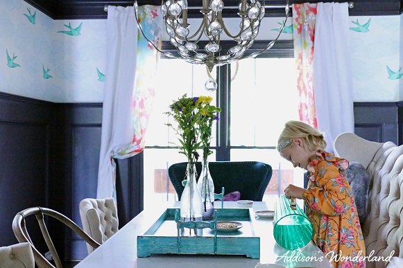
Whimsical Elegant Dining Room
Re-Post from November 19, 2014:
SHOP OUR DINING ROOM!

I have to say that I am super duper pumped to be sharing my favorite room in our home today. I wanted to create a whimsical elegant dining room with a unique and colorful mix of colors and patterns. Drumroll please… Our Dining Room! I am a dining room kind of girl. Although it is the least used room in our home, I do believe that it is one room I cannot live without. A home without a dining room was a definite “no” during our home buying process. I just love that when you come in the front door, you are greeted by a room that’s beautiful, clean 363 days a year (we host Easter and Christmas), and a true expression of my design style from top to bottom. Since it is rarely used, I felt the need to go a little overboard. I mean why not?!?
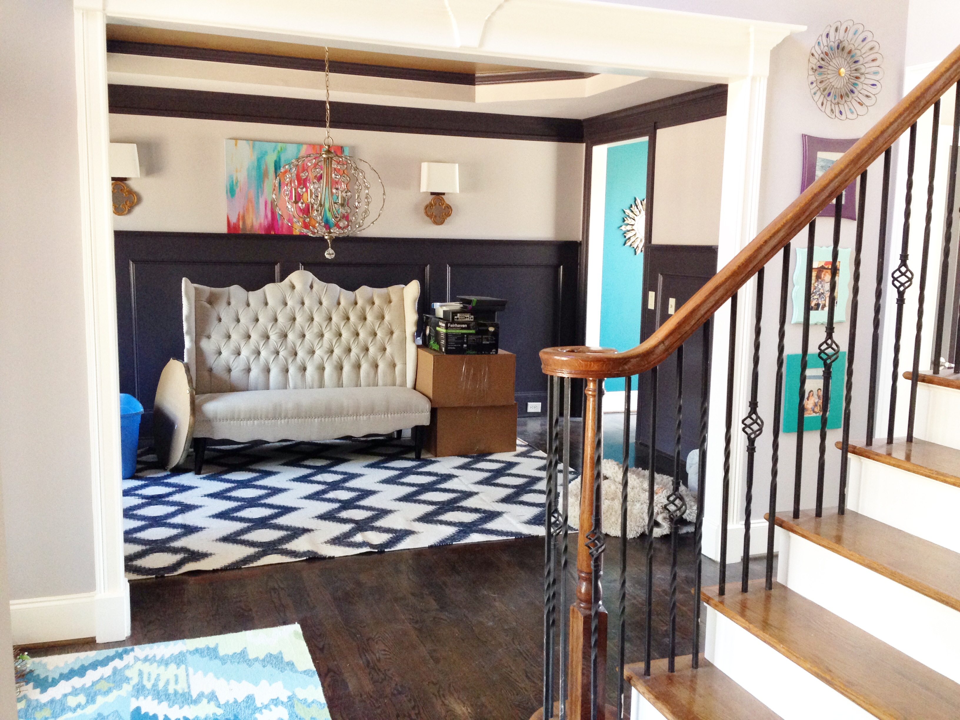
Before
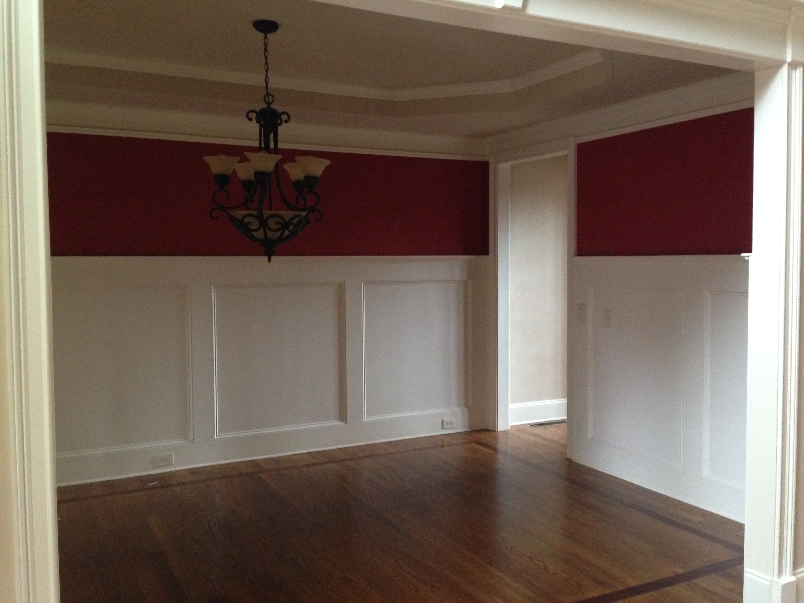
Above is an image from when we first purchased our home. It was a beautiful room before, just not my style. As you may have seen me mention on my Instagram page, I am NOT a fan of the color red so that was the first thing to go. The room had really great molding but the sheet-rock on the ceiling was in bad shape and the floors were extremely scratched and damaged.
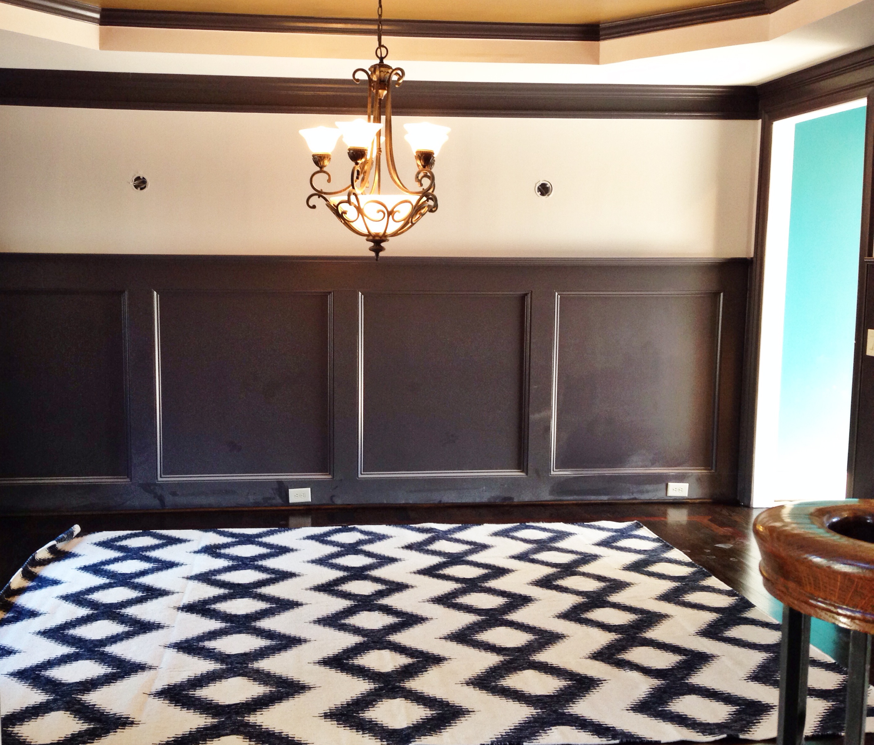
Step One: Paint
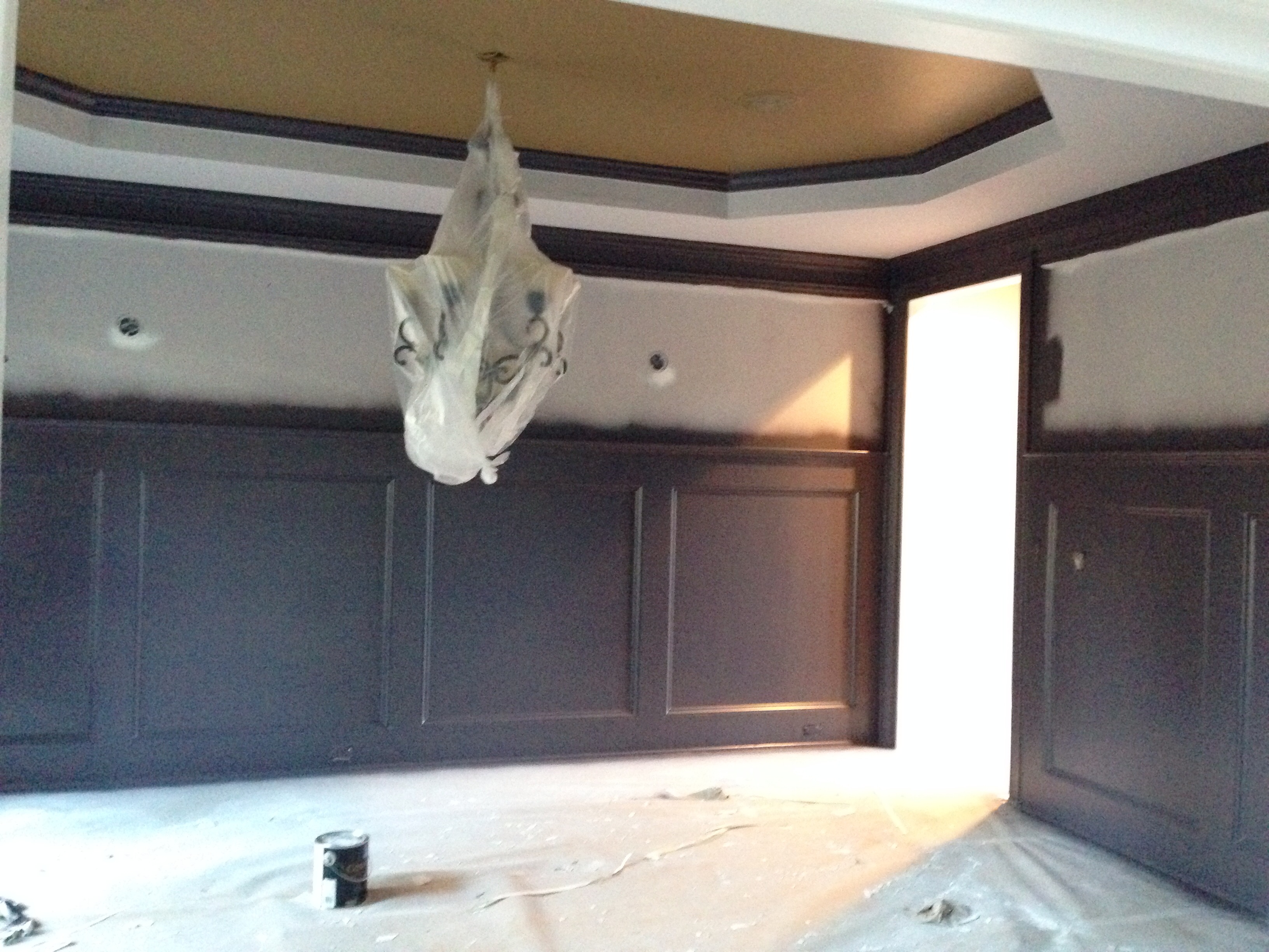
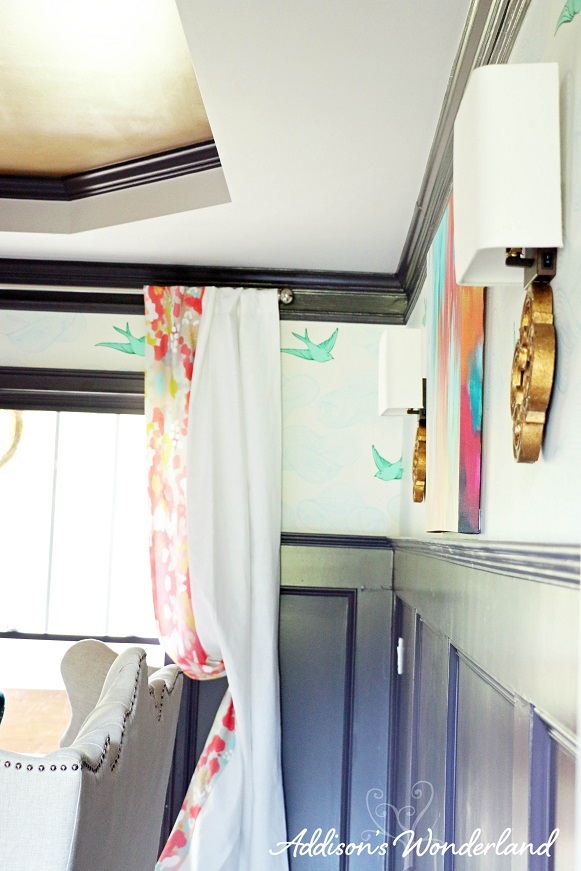
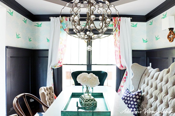
Molding: Custom Mix of 1/2 Stunning Shade 1/2 Darkroom by Sherwin Williams
Lower Ceiling: Minute Mauve by Sherwin Williams
Vaulted Ceiling: CARDBOARD METALLIC by Sherwin Williams with a basecoat of CARDBOARD by Sherwin Williams
Step Two: Floors & Rug
Floor Stain: Minwax Jacobean Wood Stain
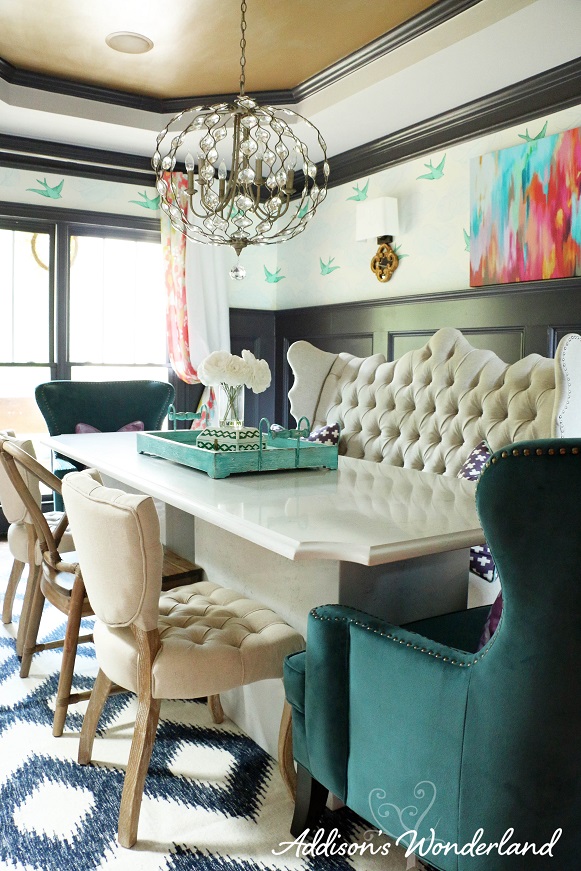
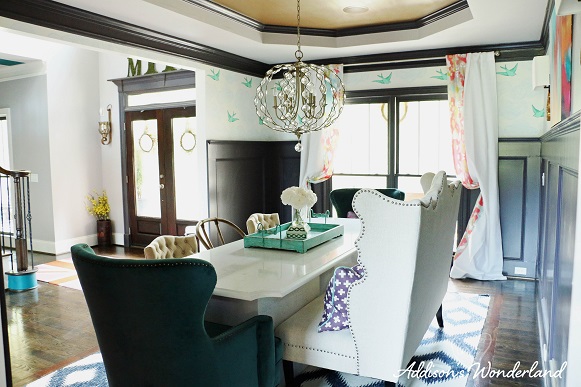
After our home was completely re-painted, we had all of our hardwoods sanded and re-stained much darker. As you may have noticed, I have a hard time “doing neutral”. I wanted a simple rug to offset the more colorful ideas I had for this room so I fell in love with this amazing rug. I love mixing patterns and I felt the geometric pattern was perfect to coordinate with the bird pattern wallpaper and watercolor ikat print fabric I had chosen for the room. Stay tuned for a future blog post on how to successfully mix patterns.
Step Three: Lighting
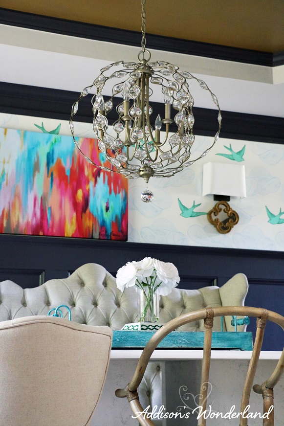
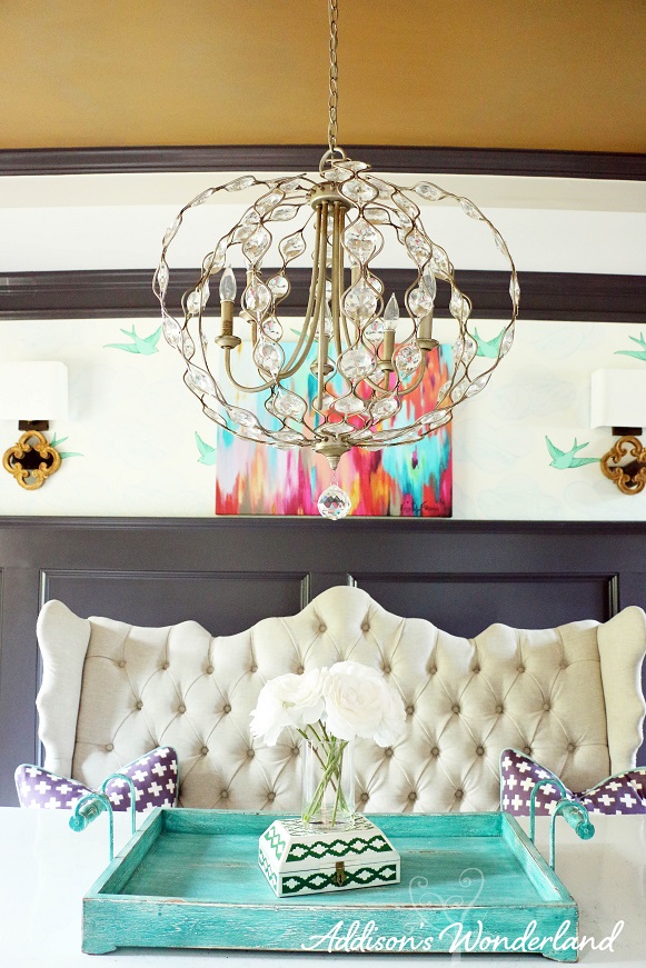
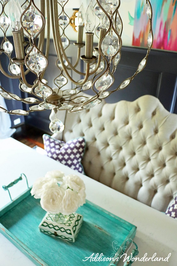
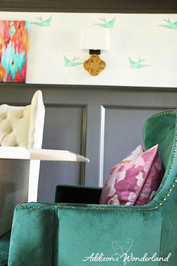
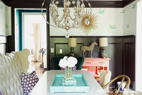
Choosing lighting is one of my absolute favorite parts of the design process. A gorgeous fixture can absolutely make an entire room. We have replaced every single fixture in our home and I adore the variety of styles we have in each room. I’ve always loved the look of sconces so we had two sconces wired into the back wall of our dining room before it was painted. I chose these beautiful gold sconces to flank the artwork I had purchased and they were the perfect size for the small space above the molding.
Step Four: Wallpaper and Furnishings

When I saw this delicious wallpaper by Julia Rothman, I had to have it. The print is called Daydream Green and it is available HERE. It is the perfect splash of color and whimsy for a typically formal space like a dining room.
For the furnishings, I found this amazing scalloped, tufted and nailhead trimmed bench as well as this watercolor ikat artwork. Those were my inspiration pieces for the room design. I then sketched out the design for our dining room table to be fabricated and installed. The table needed to be long and narrow and they fabricated an extra design detail to the ends as well. For the chairs, I searched high and low and found all of the additional chairs. Individual chair links are listed below. I wanted a unique combination of chairs and I love the mix of fabrics and wood tones against the stone table. For the pillows and drapery, I found these beautiful prints at Candy Kirby Designs. The purple watercolor ikat and purple plus sign print fabrics were actually baby blankets that I purchased and had cut down and sewn into two pillows for the end chairs and two for the bench. Finally, the drapery were a custom creation with Candy Kirby Design’s Watercolor Ikat fabric and Fabric.com’s White Linen fabric. I designed white linen panels with a border of the ikat print on the edges to add a touch of color and print without it being too busy against the wallpaper and molding.
The Reveal


Full Source List (links to items if available):
SHOP OUR DINING ROOM!
Molding: Custom Mix of 1/2 Stunning Shade 1/2 Darkroom by Sherwin Williams
Lower Ceiling: Minute Mauve by Sherwin Williams
Vaulted Ceiling: Cardboard Metallic by Sherwin Williams with a Basecoat of Cardboard by Sherwin Williams
Custom Quartz Dining Room Table
Wallpaper- Hygge & West
Watercolor Ikat Fabric (drapery): Candy Kirby Designs
White Linen Fabric (drapery): Fabric.com
Purple Plus Sign Pillow Fabric: Candy Kirby Designs
Purple Ikat Pillow Fabric: Candy Kirby Designs
Coral Console Lamps & Vase: HomeGoods
Coral Console: See “The Coral Console” Blog Post
Thanks for touring our home!
XOXO, Brittany Hayes


SOOOO Glad someone else “doesn’t do red”. As a graphic designer I HATE to use red. Glad to know that I’m not the only one!
I LOVE your dining room! Great work!
Wow thank you! Yes, people always think I am crazy about the red thing but I just really don’t like it! I guess we are just weird 😉
Can you please come to my house and decorate?? Love this!
Haha sure! 😉 Thank you so very much!
Gorgeous! I looove this bird wallpaper but my dining chairs have a blue and green medallion print and don;t know if it will look to busy : (
Thank you so much! E-mail me a picture and I will let you know 🙂 [email protected]
Fab dining area! Way to trust your own gut and create a home that makes you happy!
Thank you so so much!!
I love this wallpaper. Did one roll cover this?
Thanks! No, it took 3 double rolls to do the entire room.
This room has inspired me! My daughter is ready for her 2nd room upgrade … from baby to kid now young girl. I am thinking navy, hot pink and orange. I told her this one has to make it until college!!
Awe thank you!! Haha yes absolutely! I love navy and bright colors mixed together. I think that color scheme could definitely transition her from young girl to young lady. I hope it turns out wonderful! XOXO
Hi,
I was just wondering about your bench/banquette in you dining room…i think I think it’s so gorgeous and would like to purchase a similar one at World Market. But I’m worried about it getting dirty fast! I have 5 little ones and i’m thinking about spills! What are your thoughts? How is yours holding up? Did you have to treat it any specific way to make clean up easier?
By the way, I love your style! You have such great taste and we both share the love for color! I’ve been enjoying all of your posts!!!
Thank you for your time!
Miriam
Thank you so very much! Honestly, that settee is in our dining room which we hardly ever use. We only really use it when we have friends over or during holiday events and the adults sit in there. We did have a light grey one in our previous home in the breakfast room and we didn’t have any problems with it getting ruined. Our youngest was still in a high chair at the time so we only had one kid sitting on the bench. I just didn’t let her sit there when had spaghetti or something like that. Thanks so so much and I hope that helps!
awesome . nice dinner room ………
Hi there! I’ve already bought the chairs and painting for my dining room 😉 Just curious… what was the white linen fabric you purchased… I search it and 81 results came up! Also home many yards of each did you purchase?
Here’s the link… https://www.fabric.com/buy/bv-965/medium-weight-linen-white Thanks!
Did your Hygge and West promo code expire? I just tried and it and it was not recognized.
Thanks! Sara
Yes, it expired a month from the blog date. Sorry about that!!
Okay, thanks for responding!
Oh. My. Word. I am in color Heaven! I LOVE your dining room & your entryway. They make me unbelievably happy… I just cannot quit pulling your blog up & looking at the photos! I pulled the 2 up and showed my husband & he may be on board with me painting our stairs once our new home is built!! *fingers crossed* I wanted to ask you a question: I have found the watercolor ikat print on One Kings Lane 🙂 Which size do you have? 36×27 or 48×36? Again, I love your blog & I am so glad I found someone who adores fun, colorful decor with a splash of girly!
Goodness, thank you SO much! You make my blogging adventures worthwhile with your sweet words 🙂 My print is 36×27. Thanks again!!
can i send a photo of my grey sette and ask your opinion of what fabric to get to make pillows for it? i love your style and color/pattern choices! 🙂 Thank You you much!! I’m on instagram @poshbeautybar_lashes
Quick question: I love your door color. I know it’s 50 darkroom and 50 stunning shade but when I went to my local SW, they told me that they couldn’t mix two paints together. But they could do Stunning Shade at 150%. Would that be the same? Or Am I telling them wrong?
Good morning! Just saw your e-mail too! Gosh that’s so strange, I always mix colors!! I am honestly not sure about the 150% but I would think so! It’s darker than Stunning Shade so as long as that makes it darker. Thanks!
Thank you SOOOO much for the quick reply. I am going to email you a photo if you don’t mind taking a look at it. Thank you!
I love this post! I’m in the process of selecting new lighting for my house (full remodel) and wanted to ask what resources are your favorite in selecting lighting? I’m in overload now with selections. Thanks!!
Your house is just beautiful! I love it!
Your work is the most inspiring… Even to my 8 yr old that has chosen the wall paper for her new bedroom we are designing. We are designing the look around the green bird on the wallpaper. Headboard is grey, white furniture, white bedding, green rug, green accent table… Now for the paint color on the non- wallpapered walls… She wants grey. I see your home is “ponder” grey. Do you think that would coordinate? Thanks so much for your inspiration!
Awe wow thank you!!! Yes, absolutely! Ponder is a slightly “purple” gray but since the wallpaper is cool tones I think it would work great! Thanks again!
I love the sunburst mirror. Where did you purchase it?
Home Depot 🙂
First of all, I thought I’d let you know I’m obsessed this your home. Every inch of it, I love it! OK, so on to my questions, is the mix of black color the same for your doors and the vaulted ceiling areas in your home? And, what teal color did you use in the little hall area off the dining room? And one more, about how many inches are the birds in the wall paper? Thank you so much for all your amazing talent and for posting it all for us to enjoy!
Beautiful! What size is your dining room and what size is your table?
I am definitely a neutrals girl, but I love seeing how you mix colors and patterns. It opens up my mind to new possibilities <3
What size is your table? Also what is holding up the table top?
I love the way your curtains tuned out in your dining room, I want to purchase the fabric that you used, would you mind sending me the link from fabrics.com for the fabric of the white linen you used, they have tons and without having it all in my hands it’s hard to tell what goes best with the watercolor fabric. Also did you use a liner for the drapes and if so what do you recommend? Thank You for your help! I know you are moving so if you are selling anything please let me know!
Can you please let me know what color your rug is?
Navy & Cream 🙂
Hi
I love your work. Do you mind telling me where you get the table and how much it cost?
Thanks.