The Grand Color Scheme
So as crazy as this sounds, the design for Our Historic Wonderland has been mega stressing me out. Well, I am not sure if “stressing” is the right word, maybe just overwhelming me. I’m not sure if it’s because I love our current house so much… or that I want this one to be “perfect” since we will likely and hopefully be here forever… or because Mark has been giving me mile long lists of deadlines (hehe love ya babe)… or maybe because I feel like so many people are “watching” me now… Yes, I wrote it out and it does in fact sounds crazy. I guess I just hadn’t found that mega source of inspiration that I have been searching for to make it all make sense. As promised, I am taking you through every single step of my design process. And for me, inspiration is where it all begins. You see, I did find ONE a while back but just an inspiration in the sense of the overall FEELING of the home…
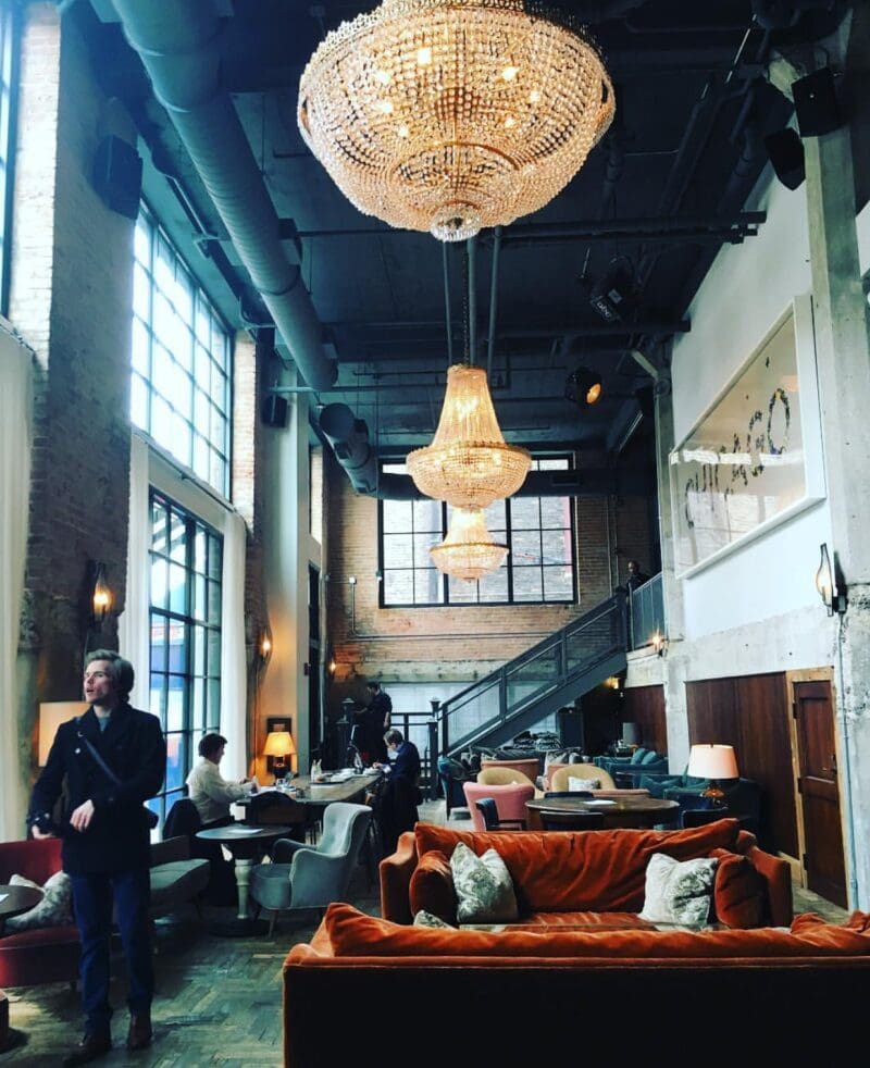
Image: Soho House Hotel in Chicago shared by @danejensen1…
There is just something about this space that literally just speaks to me. Not any one thing in particular just the vintage glam yet slightly rustic and industrial feeling that creates such drama and elegance. Okay, I am sounding obsessive. Anyways, so I had the “feeling” down, now I was on a hunt for the color scheme…
First, I knew I wanted something completely different than what we have now. Next, Mark and I are OBSESSED with the Jonathan Louis velvet sectional that we have in our basement and plan on using it in our main living room in this home. You can read more about THAT HERE. And finally, I am IN LOVE with this color…
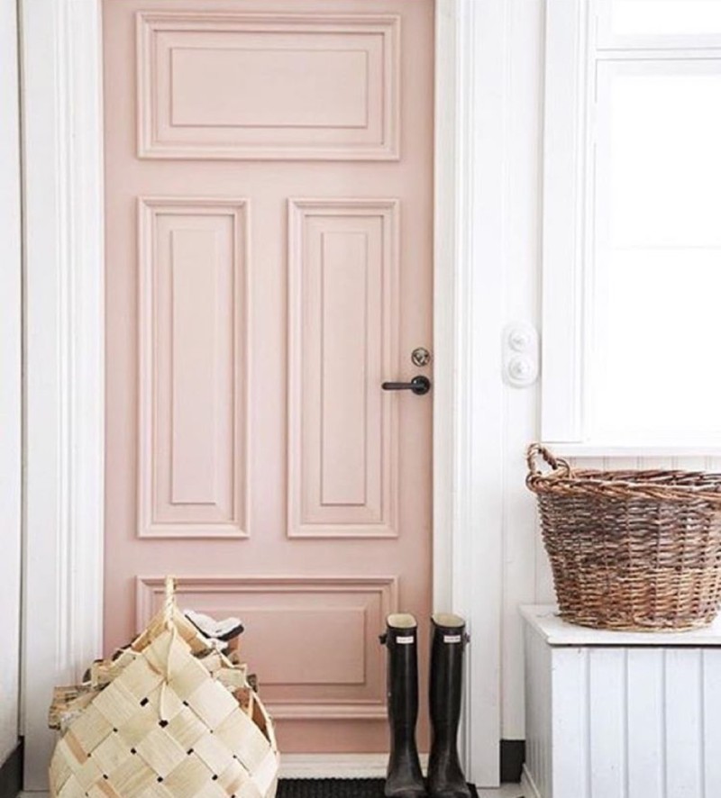
Image Via: @livingwithlandyn
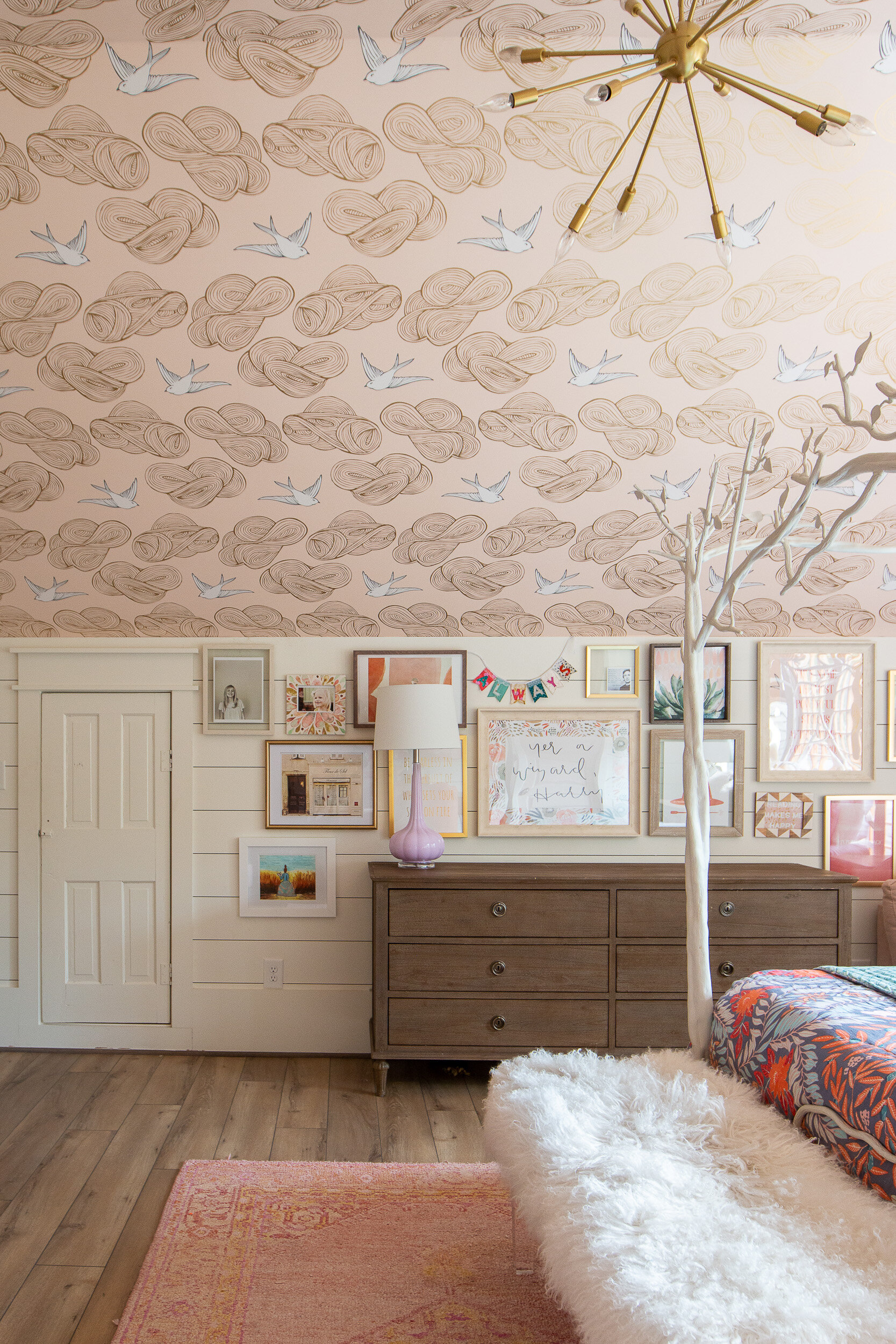
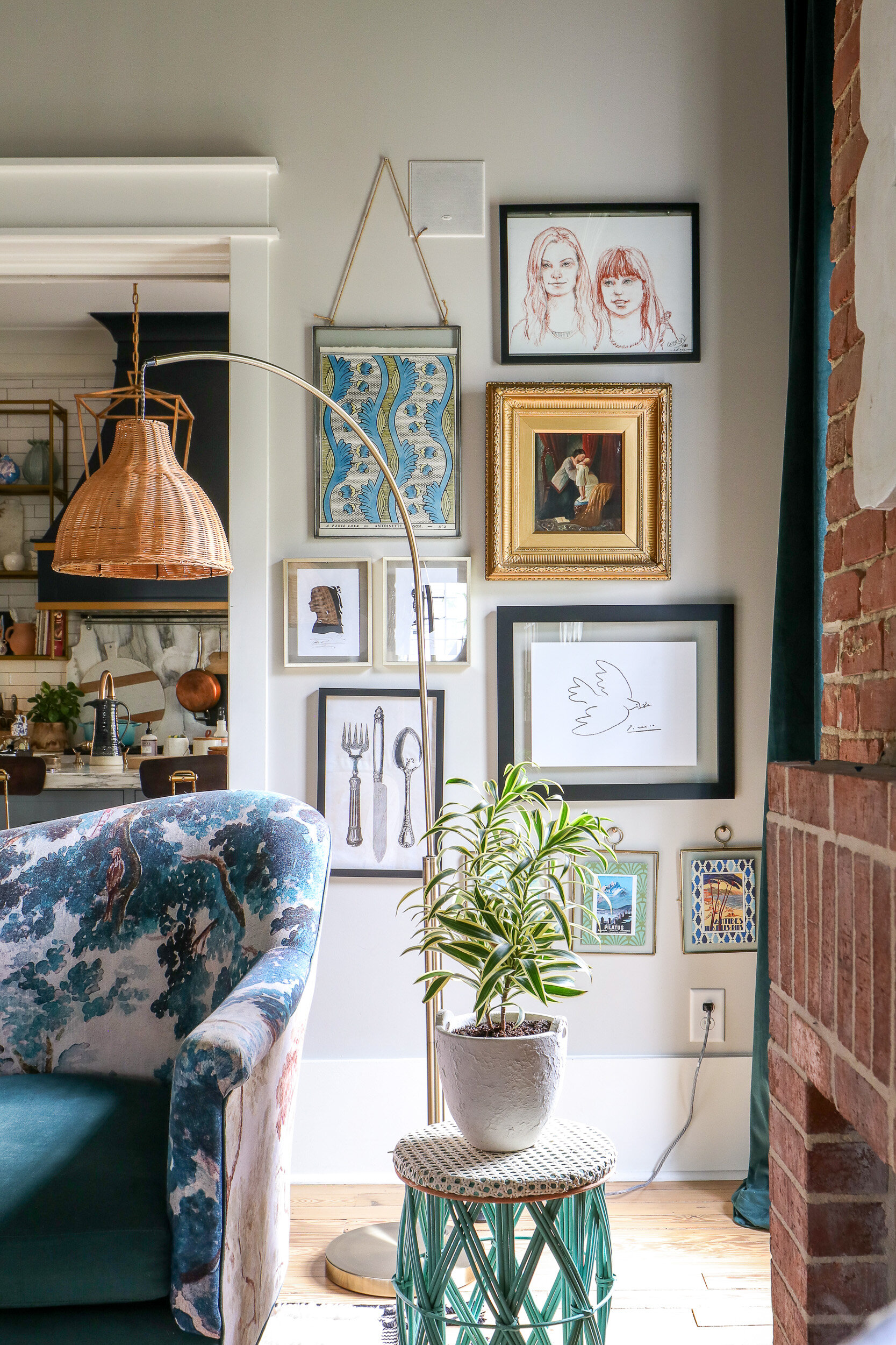
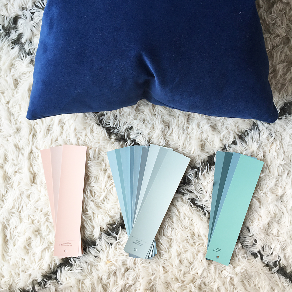
So that’s where my head was….. different than our current home, a color scheme that works with our navy/indigo velvet sectional and somehow incorporate rose quartz into the color scheme.
After that was all squared away, I took to Pinterest (follow me on Pinterest RIGHT HERE) to mesh all of those ideas together… (post contains affiliate links)
Color Scheme Inspiration
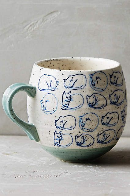
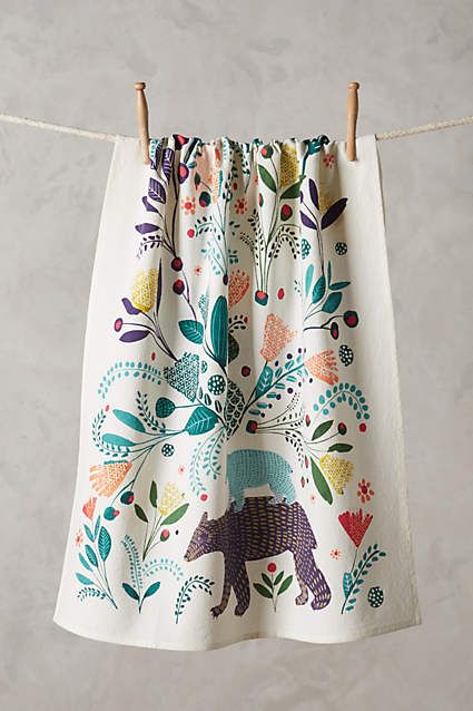
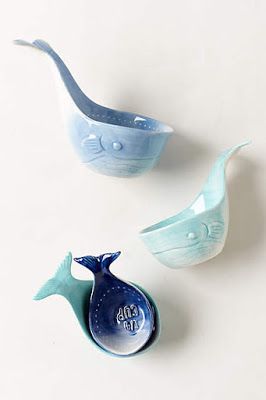
Yep, you saw that right. A dish towel, mug and measuring cups brought it all together for me. And here’s your first look at my Our Historic Wonderland color scheme…
So what do you think? I’ll be sharing more of the plan this week so stay tuned!
XOXO, Brittany Hayes
Jana gwyn says
This is absolutely perfect!!! I can’t wait to see it all come together! I’ve been trying to figure out how I can use the rose quartz and navy in my home….really feeling excited about it now that I see your color scheme! I already have the aqua shades! But growing tired of it so I think if I add the navy and rose, I’ll fall in love!!!!
Brittany Hayes says
Awe yay thank you!!! Yes, rose quartz and navy are soooo gorgeous! My new faves for sure! Thanks for reading and for following along! XOXO
Vicky Bright says
I just discovered you on Instagram. I love your use of color and things you love. Thanks for the inspiration.
Vicky Bright says
I have just discovered your Instagram. I love your use of color and things that inspire you.
Brittany Hayes says
Thank you! That means so much! XOXO
Carissa says
Girl, I’ve been waiting for this post since you first shared that you were moving again!! Super super excited about your color scheme and to see how you create that vibe that you are inspired by. Thanks for sharing your ideas!
Brittany Hayes says
Awe how sweet of you!! Thank you! I appreciate that so so much!! I am SO super excited for it to start coming together! XOXO
Erika M. says
I love the colors because they are different and still fun and playful. I also love that you found your inspiration from the mug and apron. I’ve always felt like inspiration can come from anything that jumps out at you and I love that you can see that as well. I am excited to see how your home progresses. Enjoy the journey of creating your dream home and just take some deep breaths if things get overwhelming. 🙂
Janet Bergeson says
I cannot wait to see it all come together, beautiful. Your play with color is incredible!, such a God given gift!
Valier Igel says
I really like it! I can’t wait to see what else you do!
Leslie says
Looking at that dish towel and the colors you picked reminds me of a quilt that someone in our family made in the 1930s. So many different prints in the fabrics, but they all went well together. I am also reminded of the vintage Fiestaware colors.
Nicole says
Blues and greens all day long! Those are my accent colors! And I’ve definitely developed a love affair with blush pinks and I am not a pink person at all. There’s something cozy and warming With a touch of elegance about the blush pinks 😉 nice choice! Finally subscribed to your blog . Looking forward to the renovation. My dream is to renovate a historical home, especially a craftsman! To die for! Or even a plantation home in the south. Good luck on your journey, I’ll certainly be following it!